
This post explores how web fonts can cause layout shifts, negatively impacting your Core Web Vitals scores and user experience.
How do web fonts cause layout shift?
Layout shifts occur when visible elements on a page change position unexpectedly. They can be frustrating for users, especially if they cause accidental clicks or make the page difficult to interact with.
One common cause of layout shifts is the use of web fonts. When a web font is slow to load, the browser may display a fallback font initially, then swap to the web font once it's ready.
When a fallback font is significantly different in sizing or character dimensions from the web font, the transition between the fallback font and web font can cause a layout shift.
Here's our video walkthrough of identifying and fixing layout shifts:
Measuring the Impact of Web Fonts
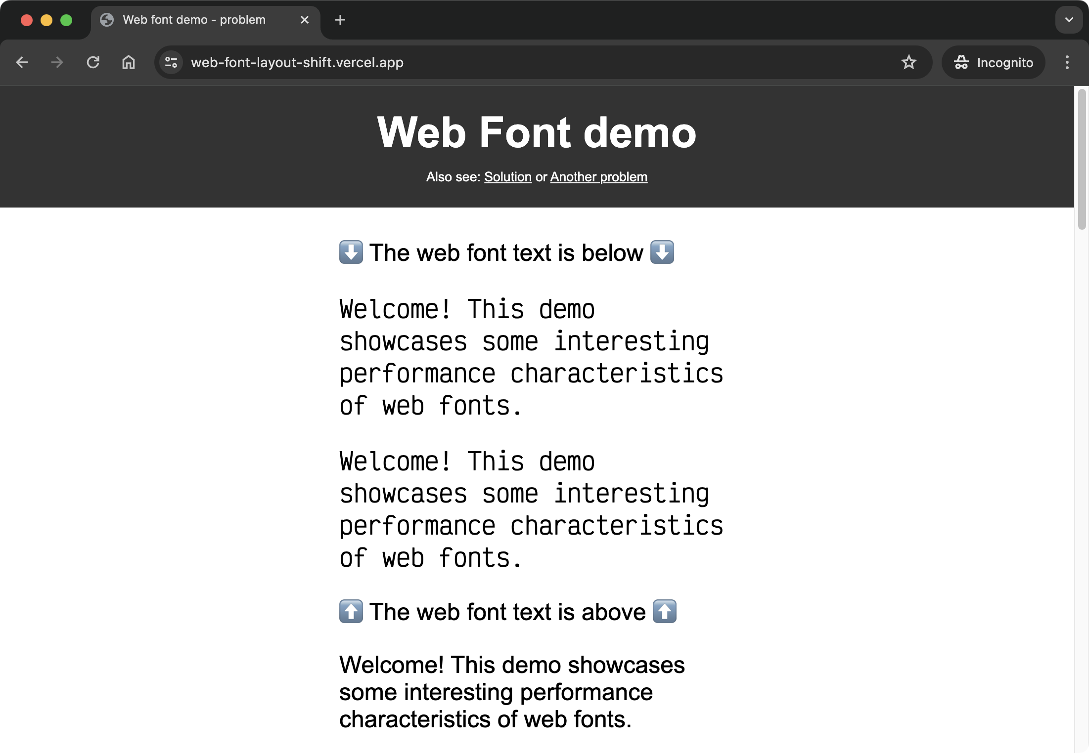
To see how web fonts can cause layout shifts, visit the live example: Web Font Layout Shift Example
The example page uses a custom web font for the main text, and the CSS code specifies a system fallback font.
The CSS code looks like this:
.web-font {
  font-family: "Victor Mono", "Comic Sans MS";
  font-optical-sizing: auto;
  font-weight: 400;
  font-style: normal;
}

@font-face {
  font-family: "Victor Mono";
  font-display: block;
  src: url("victor-mono.woff2") format("woff2");
}
Not only is "Comic Sans MS" a poor fallback for "Victor Mono", but the font-display: block property in CSS causes a flash of invisible text (FOIT) when the web font takes a while to load.
Why can layout shifts happen despite font-display: block?
Earlier in this post, we said this:
When a web font is slow to load, the browser may display a fallback font initially, then swap to the web font once it's ready.
You might be wondering, if font-display: block is used such that the fallback font text doesn't actually appear, then how can there be a layout shift?
The answer is that the browser still reserves space for the web font text - the space needed is not a random guess from the browser however! The reserved space is based on the font metrics of the fallback font. So the fallback font is used to reserve space for the web font text, even if it's invisible to the user!
Why Fix Layout Shifts?
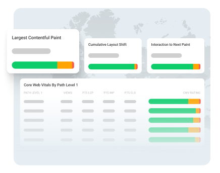
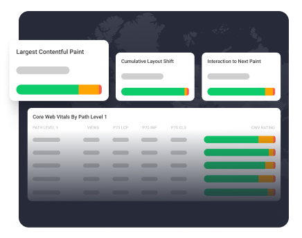
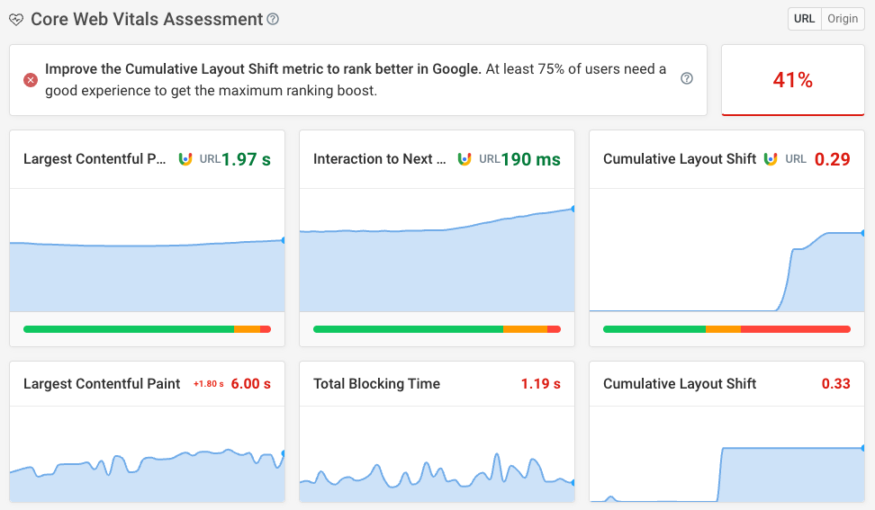
Cumulative Layout Shift (CLS) is a key metric in Google's Core Web Vitals, which measure the real-world user experience of a page. Sites with poor CLS scores may be ranked lower in search results.
But beyond SEO, fixing layout shifts is important for providing a good user experience. Unexpected movement of page content can be jarring for the user and lead to accidental clicks or other usability issues.
In our website speed test result for the example page, the text using a web font is also the Largest Contentful Paint (LCP) element.
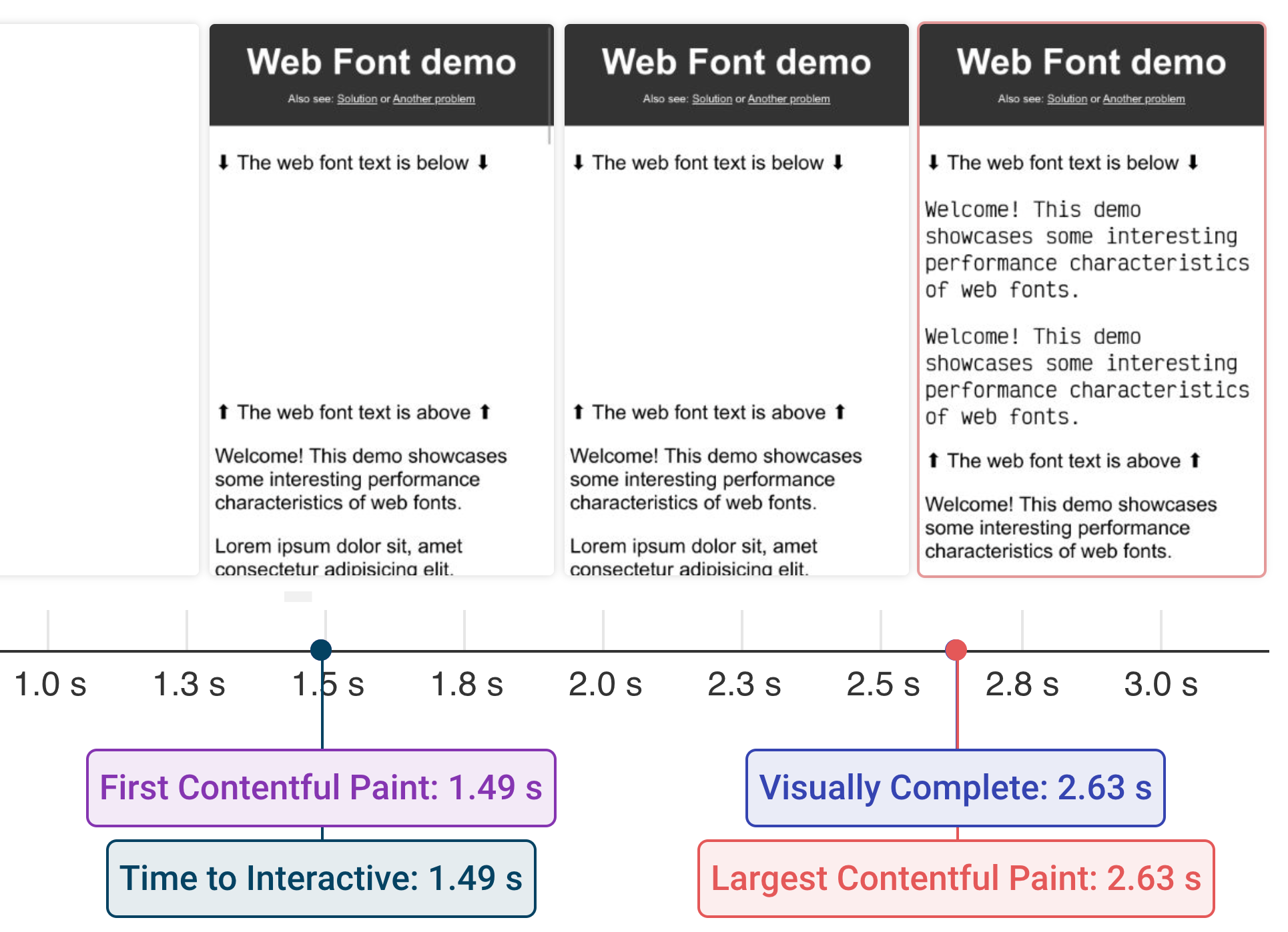
Slow loading of this LCP element not only causes a layout shift, but also results in a poor LCP score. Fixing the font loading issue improves both metrics.
Test your own website for layout shift with our website speed test.
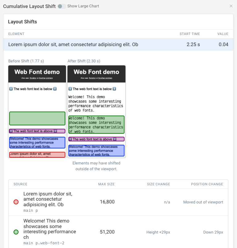
After running a page speed test, you can look at individual shifts on the page to see how much each shift contributed to your overall CLS scores and what elements were affected.
Identifying the Problem Font
To fix the layout shift, we first need to identify which font is causing the issue. In our example, inspecting the main page text in the Elements panel of Chrome DevTools shows that it uses the "Victor Mono" web font, with "Comic Sans MS" as a fallback.
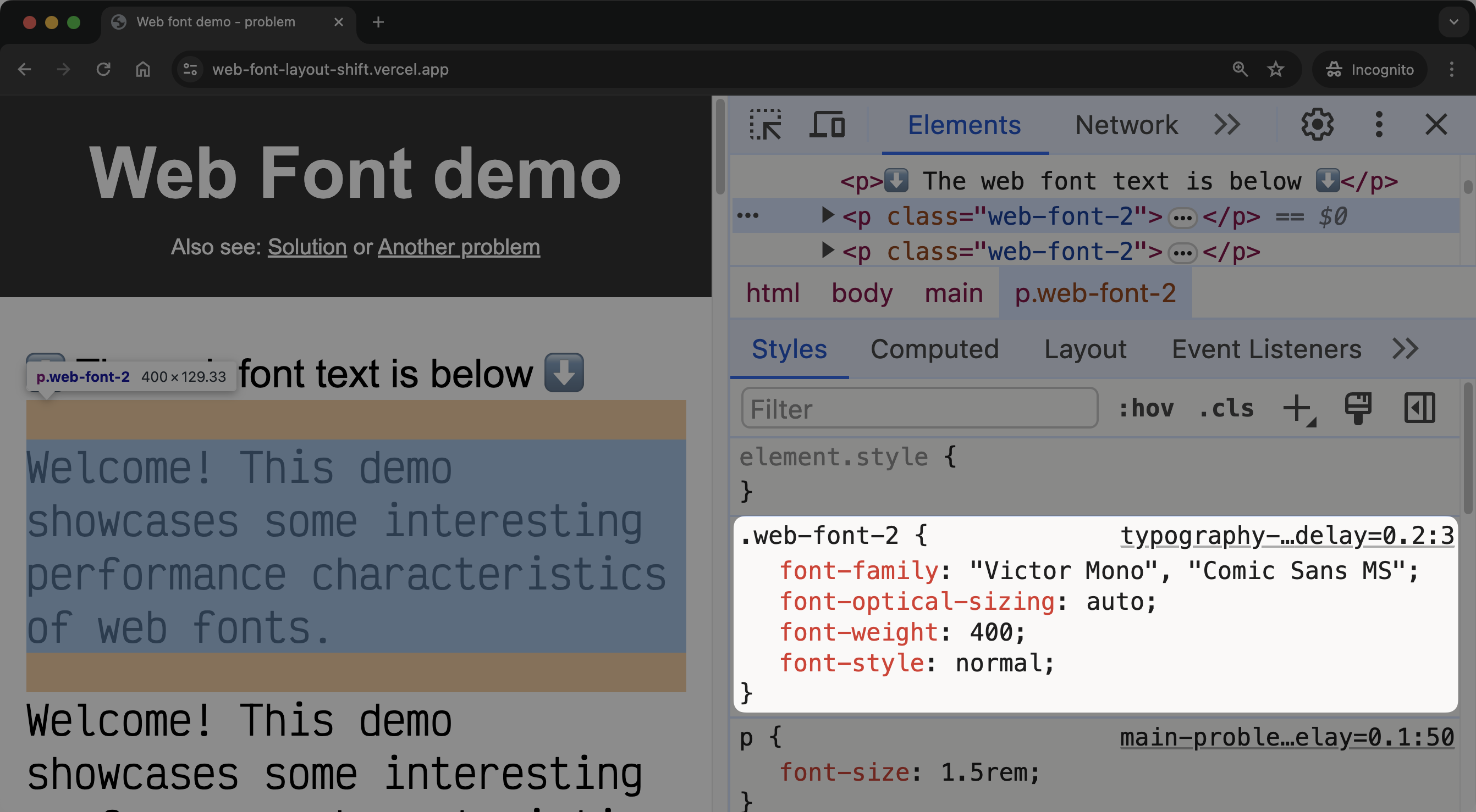
Looking at the font face declaration for "Victor Mono", we see it uses the font-display: block declaration. This means the text will be invisible until the font loads.
@font-face {
  font-family: "Victor Mono";
  src: url("victor-mono.woff2") format("woff2");
  font-display: block;
}
While this avoids a flash of unstyled text (FOUT), it causes a flash of invisible text (FOIT) and delays the main page text from becoming visible.
Using font-display: swap
In this example, the first step is to remove the flash of invisible text by indicating to the browser that it should display the fallback font while the web font is downloading.
To do this, we change font-display: block to font-display: swap in the font face declaration. This tells the browser to display the fallback font immediately, then swap to the web font once the web font loads.
@font-face {
  font-family: "Victor Mono";
  src: url("victor-mono.woff2") format("woff2");
  font-display: swap;
}
If it aligns with your brand vision and identity, you can use font-display: optional instead. This indicates that the web font is not critical to the page. In certain cases, when using font-display: optional, the browser may choose to not use the web font at all.
With font-display: swap, the main page text - which is also the LCP element, is visible immediately using the fallback font. When the "Victor Mono" font loads, it's swapped in.
This is a good compromise between displaying text quickly and using the desired web font. The swap is less jarring than a FOIT, and the main page text is visible immediately, improving LCP.
Putting in fixes like this can help improve your Core Web Vitals scores and provide a better user experience; however, testing this on just your local machine is not enough to validate that your changes are having a noticeable impact on your users.
This is where a monitoring service like DebugBear can help you keep track of your progress and help you understand how your users are experiencing your site.
Monitor Page Speed & Core Web Vitals
DebugBear monitoring includes:
- In-depth Page Speed Reports
- Automated Recommendations
- Real User Analytics Data
Choosing a Better Fallback Font
One way to reduce the layout shift is to choose a fallback font that better matches the size and metrics of the web font.
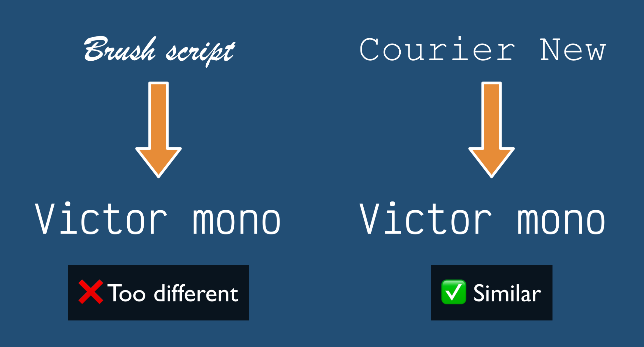
In the example page, "Comic Sans MS", or even Brush Script as shown in the previous image, are both poor fallback fonts for "Victor Mono", causing a large shift when the web font loads.
By changing the fallback font so it better matches the web font, we can reduce the size of the layout shift when the web font loads.
"Victor Mono" is a monospaced font, so the first step is to choose a monospaced system font as the fallback. "Courier New" is a good choice:
.web-font {
  /* `monospace` is a generic monospaced font family */
  font-family: "Victor Mono", "Courier New", monospace;
}
Adjusting Font Metrics
Even with a good fallback font and font-display: swap, there may still be small layout shifts when the web font loads due to differences in font metrics.
To further reduce such layout shifts, we can use font face descriptors to make the fallback font better match the web font.
This could involve using the size-adjust, ascent-override, and descent-override properties in a separate @font-face rule for the fallback font.
First, we need to get the metric values for the web font:
-
Navigate to Capsize and select the "Victor Mono" font or upload the font file.
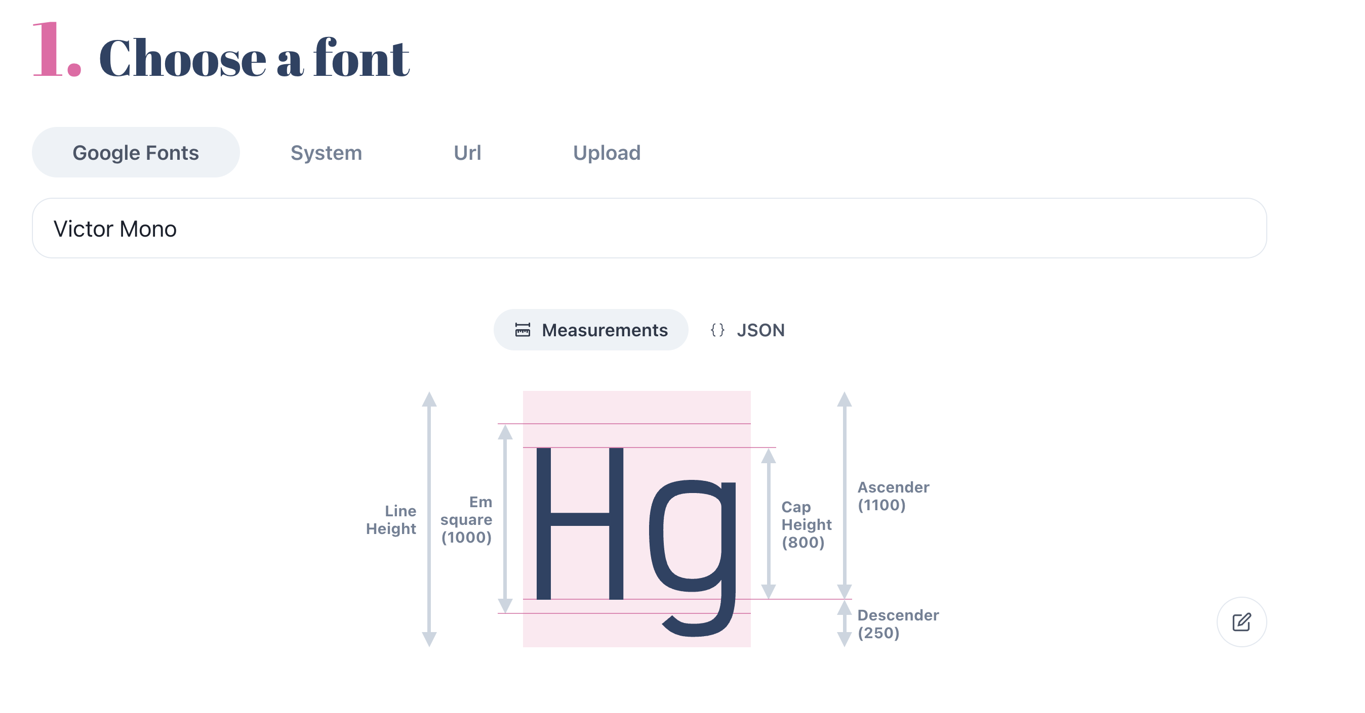
-
Pay particular attention to the "Ascender", "Descender" and "Em Square" values.
-
Create a
@font-facerule for the fallback font, using thesize-adjust,ascent-override, anddescent-overrideproperties.
@import url("/victor-mono.css");

@font-face {
  font-family: "My fallback font";
  /* Courier New closely matches Victor Mono */
  src: local("Courier New");

  /* The fixes! */
  /* formula = 1100 / 10 = 110% */
  ascent-override: 110%;

  /* formula = 250 / 10 = 25% */
  descent-override: 25%;
}

.web-font {
  font-family: "Victor Mono", "My fallback font";
}
With these adjustments, the fallback font should be a very close match to the web font, minimizing any layout shift when the swap occurs.
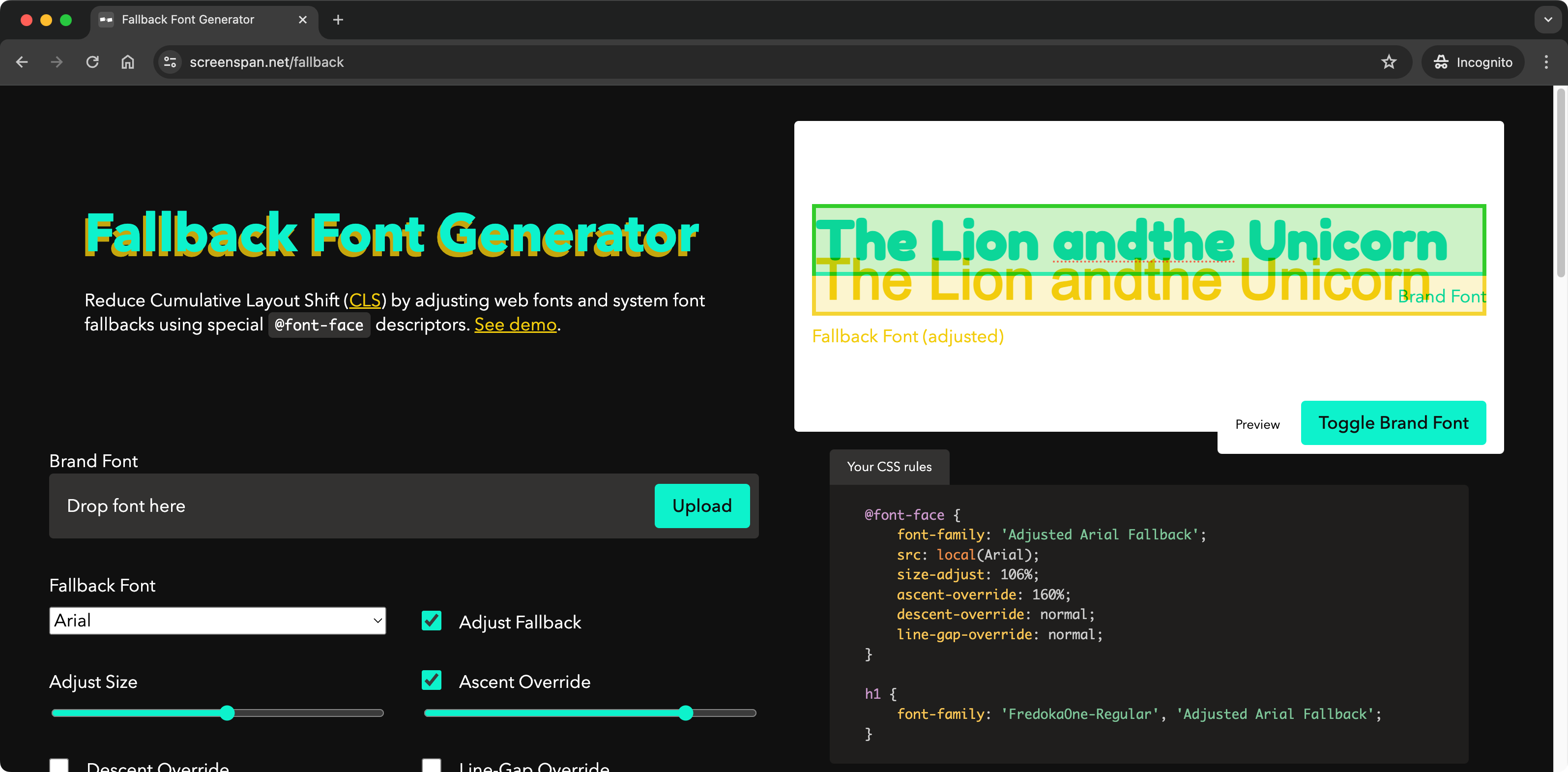
Fallback font generator
You can also use a tool like Fallback Font Generator to tweak the fallback font through a visual interface.
Exercise for the reader
While the above steps can help reduce layout shifts caused by web fonts, the request waterfall shown in the speed test of the demo page highlights an issue of sequential request chains:
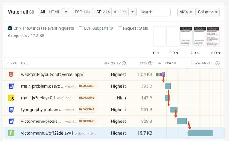
Your task is to think about how you'd improve the font loading performance by optimizing the request chains. For example, do the CSS files need to use @import or can they be inlined?
Conclusion
Layout shifts caused by web fonts can be an issue for user experience and Core Web Vitals scores. By choosing a good fallback font, using font-display: swap, and using font face descriptors, you can minimize such layout shifts and provide a better experience for your users.
Monitor CLS on your website
If you're working on improving Cumulative Layout Shift and other Core Web Vitals, a website monitoring service like DebugBear can help you keep track of your progress and identify new optimizations.
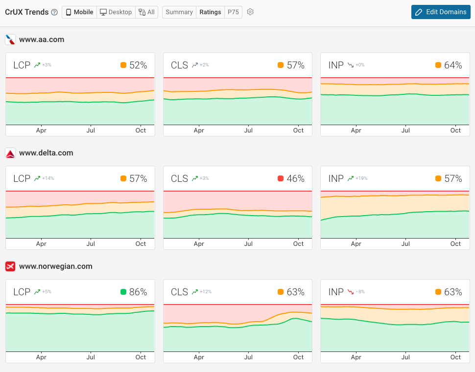
DebugBear combines scheduled synthetic tests, Google CrUX data, and real user monitoring. Here's an example of CrUX data, with a 28-day delay, reported alongside daily lab-based tests.
With DebugBear you can also benchmark your performance against others in your industry. Having better web vitals than your competition can help you rank higher in Google.
Monitor Page Speed & Core Web Vitals
DebugBear monitoring includes:
- In-depth Page Speed Reports
- Automated Recommendations
- Real User Analytics Data