
Google’s Chrome User Experience Report (CrUX) is a dataset of real user metrics that assess the overall performance and user-friendliness of a website. In addition to other key indicators, it includes the three Core Web Vitals that Google uses in its search ranking algorithm.
Understanding the Google CrUX report can help you improve your SEO rankings and page load times. You can also use it to compare your website to those of your competitors.
What is Google’s CrUX Report?
Google’s Chrome User Experience Report, or the CrUX Report for short, was first released in 2017. It’s a publicly available collection of web performance data you can access in different formats using various reporting and analytics tools.
The most important thing to know about the CrUX Report is that Google collects the metrics from real Chrome users while they’re surfing the internet. The result of this data collection method is called ‘field data’ as opposed to ‘lab data’ which is collected in controlled test environments.
But, is it legit to collect data on random internet users who are probably unaware of being tracked? According to Google, the answer is yes, as they get each user’s consent before starting to monitor their internet usage.
Who does Google collect CrUX data from?
Google solely collects CrUX data from internet users who:
- use the Chrome web browser (though Google does not collect metrics in Chrome on iOS)
- are logged into their Google account and have opted into browsing history syncing, but without setting up a Sync passphrase (which would make public data collection impossible)
- have enabled usage statistics reporting in their settings
Plus, Google only reports data on websites and pages that meet a minimum traffic threshold and also limits what data can be queried.
To add a further layer to privacy, Google solely reports anonymized aggregate metrics. While Google publishes a list of websites it has data for, individual page URLs are not revealed. So the browsing history or other internet habits of particular users won’t be included in the CrUX Report.
Despite these requirements, Google still collects CrUX data currently for more than 16 million websites, including subdomains.
Is Google collecting CrUX data on me?
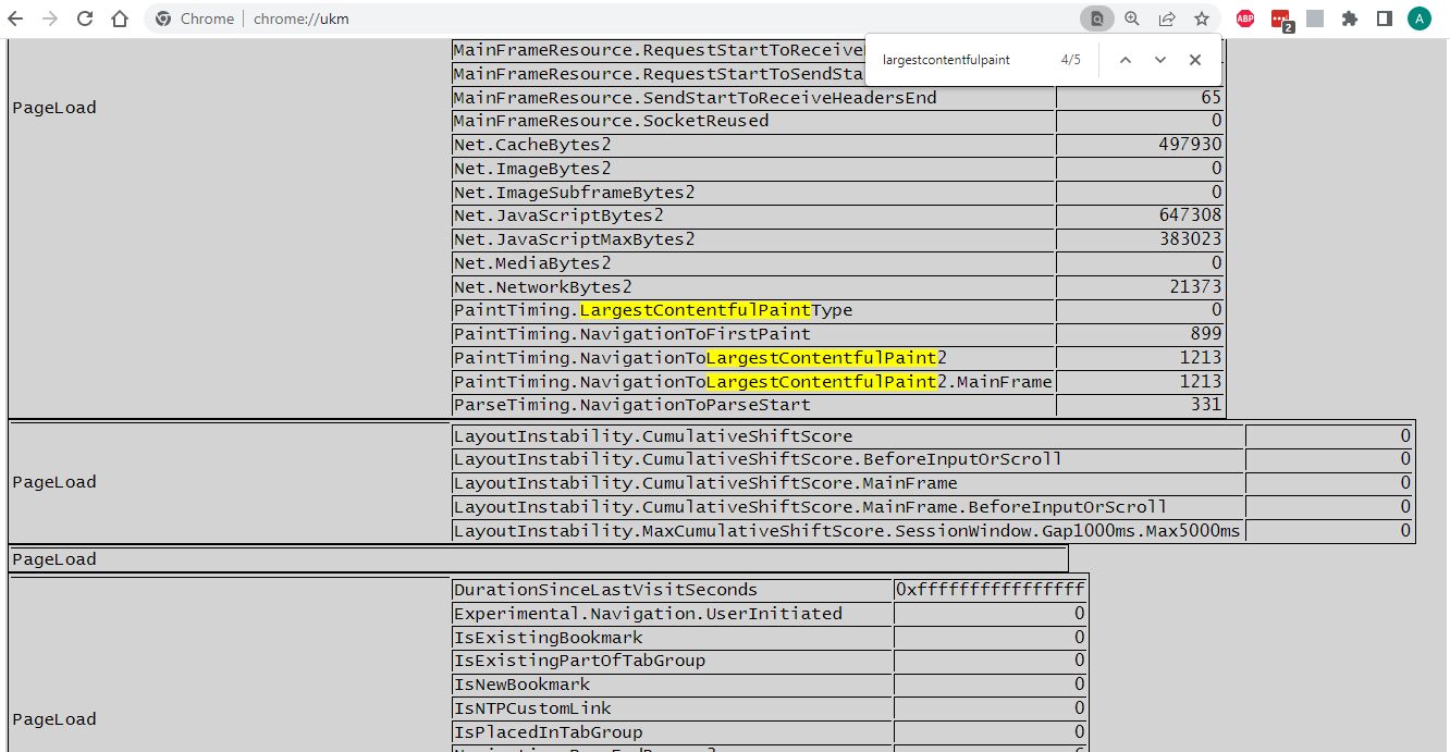
If you’re interested in whether your own Chrome browser sends data to the CrUX Report about your internet usage, simply type chrome://ukm into your address bar and check out if UKM metric collection is enabled for you.

UKM stands for URL-Keyed Metrics, which is a larger set of field metrics that Chromium-based web browsers, such as Chrome, can collect. Metrics included in the CrUX Report are defined in the UKM API which you can check out in detail in the Chromium docs.
On your UKM admin page in Chrome, you’ll see a list of the websites you’ve visited while the admin page was open. You can also see all the data collected on you on each website. Here’s an example of the UKM metrics Chrome collected on me while visiting the Mozilla Developer Network:
Metrics included in the Google CrUX Report
Google’s Chrome User Experience Report includes a range of real user metrics:
- Core Web Vitals
- Other Web Vitals
- Detailed sub-metrics for LCP elements
- Additional data
- BigQuery-only metrics
Almost all of these metrics are time-based values that measure the time difference between two browser events. The only exceptions are Cumulative Layout Shift, which is a unitless score, and Notification Permissions, which is a set of named values.
Now, let’s briefly see the metrics, one by one.
Core Web Vitals
The three Core Web Vitals are part of Google’s page experience signals and search ranking algorithm — globally, since August 2021.
They are as follows:
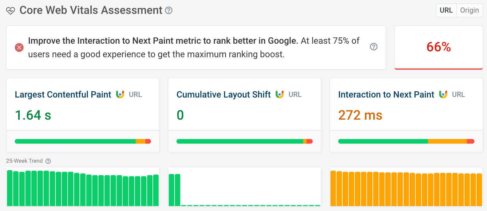
- Largest Contentful Paint (LCP): the time difference between when the page starts loading and when the browser renders the largest content element within the viewport to the screen
- Cumulative Layout Shift (CLS): the amount of unexpected movement of the page content after it was rendered to the screen
- Interaction to Next Paint (INP): a measure of how quickly a website responds to user interactions like clicks or key presses.
Monitor Page Speed & Core Web Vitals
DebugBear monitoring includes:
- In-depth Page Speed Reports
- Automated Recommendations
- Real User Analytics Data
Other Web Vitals
In addition to Core Web Vitals, there are other Web Vitals that are not part of Google’s search ranking algorithm but that you can use to gain more insight into a website’s performance and find out the reasons behind low Core Web Vitals scores.
The CrUX Report contains all the non-Core Web Vitals that can be measured in the field:
- First Contentful Paint (FCP): the time difference between when the page starts loading and when the browser renders the first content element to the screen
- Time to First Byte (TTFB): the time difference between when the page starts loading and when it receives the first byte of content from the server
Detailed metrics for LCP elements
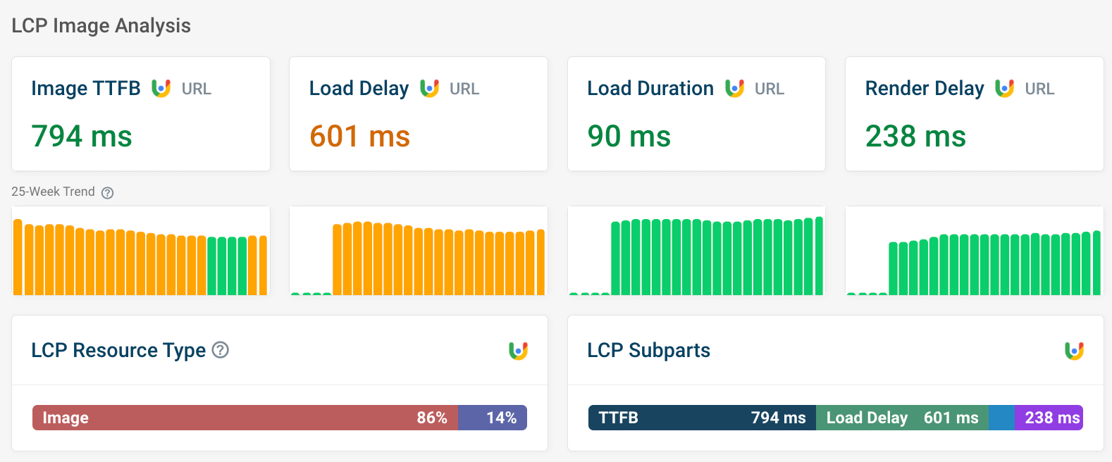
These metrics help you understand which piece of content is considered the 'largest contentful' element, and, if it's an image, how the different subparts affect loading speed. They are:
-
LCP resource type: how often the LCP element is an image or text.
-
LCP subparts: if the LCP element is an image, CrUX monitors the time taken for each step in the rendering process, including:
- Time to First Byte: time to start loading the HTML document from the website server
- Resource Load Delay: time for the browser to discover the LCP image
- Resource Load Duration: time for the browser to download the LCP image
- Render Delay: time for the browser to display the LCP image or other LCP element
You can find all these metrics in DebugBear, too – try it out on any URL using our free website speed test.
Additional data
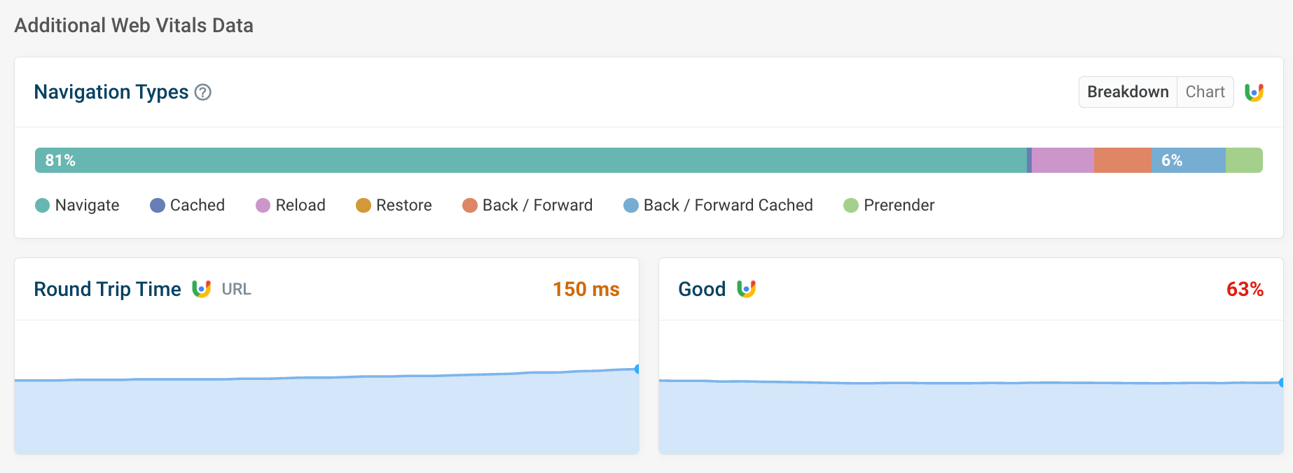
- Navigation types: these help you understand how users most commonly get to the page. Users loading the page via their browser's back button, for example, tend to experience near-instant page loading.
- Round trip time: how long it takes for a message to travel from the user to the server and back again
- Good: the percentage of visitors who have a 'Good' experience for all three metrics. Numbers lower than 75% can negatively impact your position in search results – see below.
Big-Query only metrics
There are also four field-measurable metrics in the CrUX Report that are not part of the Web Vitals initiative:
- First Paint: the time difference between the page request and when the browser renders the first pixel of content to the screen
- DOMContentLoaded: the time difference between the page request and when the browser has completely loaded and parsed the pure HTML page, without waiting for dependencies (stylesheets, images, scripts, etc.)
- onload: the time difference between the page request and when the browser has completely loaded and parsed the entire HTML page with all of its dependencies
- Notification Permissions: the user’s reaction to website notifications, with four available values: accept, deny, dismiss, ignore
CrUX metric performance
Google doesn’t only define the metrics but also evaluates them by assigning them with three qualitative scores: ‘good’, ‘needs improvement’, and ‘poor’.
For example, here are the status definitions of the three Core Web Vitals:
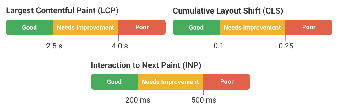
For SEO rankings, Google recommends that the 75th percentile (p75) of page loads for each CrUX metric should be in the ‘good’ range. This means that, for example, at least 75% of user experiences should have an LCP of 2.5 seconds or less.
Data segmentation options
Even though the CrUX Report gives you some options to segment your data, these options are pretty basic. Moreover, not all options are available from all reporting tools and for all the metrics.
Origin-level vs URL-level data
In theory, you can retrieve CrUX data from both domains (origins) and individual pages (URLs). Origin-level data includes the aggregated data of all the pages hosted on the same domain.
However, not all URLs will have public CrUX data. For example, if a page only gets three views a month, it won't have URL-level data, but another page on the same domain with 1000 views will have it.
Google doesn’t publish the exact thresholds from when data becomes available. We find that URL-level data tends to become available once a page reaches around 1,000 monthly views on a given device type. But this will depend on how many of your users share analytics data with Google.
In addition, not all CrUX reporting tools support URL-level data extraction. To get page-level insight into your or your competitors’ CrUX metrics, you’ll need a reporting tool that also supports data extraction from standalone URLs, such as PageSpeed Insights, the CrUX API, or DebugBear.
As I mentioned above, even with those tools, you can only extract URL-level data for pages that meet a minimum traffic threshold. PageSpeed Insights, for example, falls back to origin level for URLs where page-level data is not available.
Google also reports a wider range of metrics for origin-level data than it does for URL-level data.
Is there URL-level data for noindex pages?
Only publicly discoverable pages have URL-level data.
Noindex pages are excluded from search engines, so they won't have URL-level data.
Pages with HTTP status codes other than 200 also don't have URL-level data.
However, these pages will still be included in the origin-level data.
Dimensions
Google’s Chrome User Experience Report provides three dimensions by which you can segment the data. However, not all CrUX reporting tools support all the dimensions.
The three dimensions are as follows:
- Device type (phone, tablet, desktop)
- Network connection (4G, 3G, 2G, slow-2G, offline)
- Country (identified by their ISO 3166-1 alpha-2 code)
CrUX reporting and monitoring tools
Now, let’s see the best tools for tracking, analyzing, and monitoring data collected by the Chrome User Experience Report.
PageSpeed Insights (PSI)
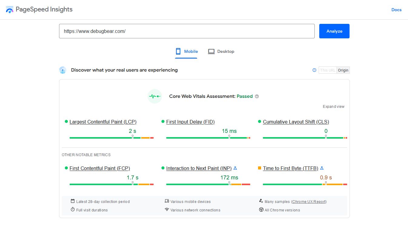
PageSpeed Insights is Google’s first-party tool that allows you to measure Core Web Vitals. It shows both field data collected on real users from the CrUX Report and lab data from Google’s Lighthouse tool. You can access PageSpeed Insights either using a free web app or programmatically via its API.
The PSI web app is the easiest and quickest way to check out the Web Vitals of any website. After running an audit, you’ll find the CrUX metrics at the top of the page. PSI shows the Core and other Web Vitals at both URL- and origin-level, for both desktop and mobile devices (however, not for tablets).
The downside of both the web app and the PageSpeed Insights API is that historical data is not available — you can only see the aggregated average of the previous 28 days.
Google Search Console
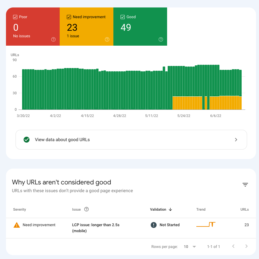
As Core Web Vitals are part of Google’s search ranking algorithm, Google Search Console gives you access to CrUX data related to your own website(s). It only shows the three Core Web Vitals from the CrUX Report — however, it groups the data in a unique way.
Search Console organizes the URLs with the same performance issues into URL groups to make debugging easier. It also provides you with a list of the affected URLs so that you can check them out individually with PageSpeed Insights or another tool.
CrUX Dashboard
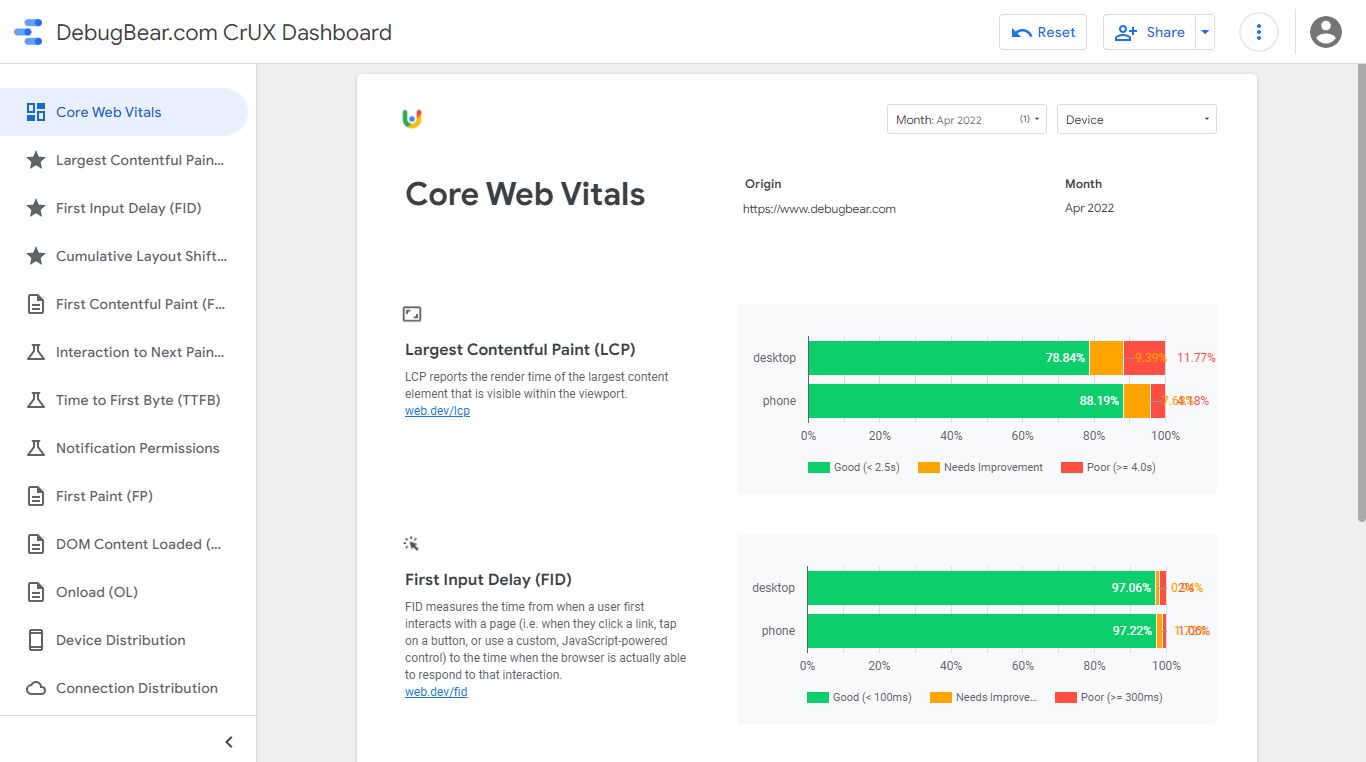
The CrUX Dashboard is another free CrUX reporting tool by Google. It has been built with the Google Data Studio platform to make it easy to set up and use without any programming knowledge.
It pulls data from Google’s CrUX BigQuery project (more on that below) and also lets you retrieve historical data for any website with available CrUX data. You can access all the metrics collected by the CrUX Report and segment the data by device type (desktop, mobile, tablet) and connection type (4G, 3G, 2G, slow-2G, offline).
However, as opposed to some other CrUX reporting tools, CrUX Dashboard doesn’t give you access to the 28-day rolling average of aggregated data. Instead, it only releases datasets once a month: on the second Tuesday of each month. It also only gives you access to origin-level data, which might be a problem if you want to see metrics at the URL level.
For example, here’s a screenshot of DebugBear’s CrUX Dashboard (with default settings) — to see how it works, check out our interactive Data Studio demo, too.
Google BigQuery
BigQuery is Google’s paid-for serverless data analytics platform running on the Google Cloud Platform. You can use it to run SQL queries on CRUX data (see some SQL examples or the BigQuery docs).
Similar to CrUX Dashboard, BigQuery allows you to extract historical data, but the metrics are only available at origin level and the data is only updated once a month (on the second Tuesday of each month). However, BigQuery gives you more segmentation options than CrUX Dashboard as you can also segment the data by country — in addition to device and connection type.
Be careful when running queries on large BigQuery datasets. You can easily spend hundreds of dollars on a few queries!
To see a quick example of how it works, here’s a SQL query that generates a histogram of DebugBear’s LCP data collected in April 2022:
#standardSQL
SELECT
	bin.start,
	SUM(bin.density) AS density
FROM
	`chrome-ux-report.all.202204`,
	UNNEST(largest_contentful_paint.histogram.bin) AS bin
WHERE
	origin = 'https://www.debugbear.com'
GROUP BY
	bin.start
ORDER BY
	bin.start
This is what BigQuery’s interface and SQL workspace look like:
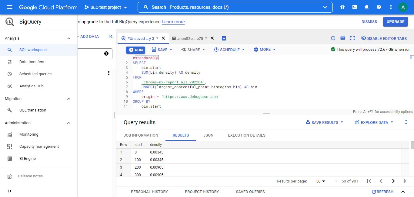
Once the query is processed, you can access the results in SQL and JSON formats or open it with Google Sheets or Data Studio. For example, I exported it to Google Sheets and created a basic line chart that shows the detailed distribution of the data:
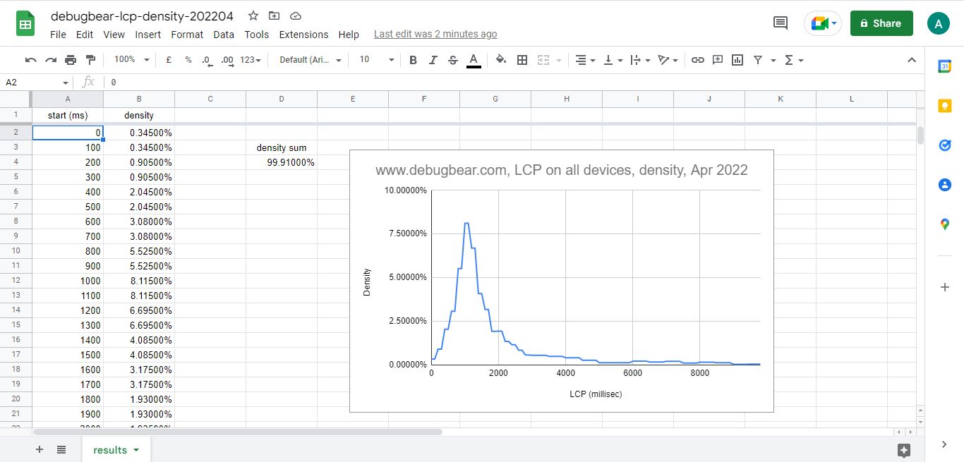
As you see, you can get very granular data and create any kind of custom table or chart with BigQuery, but you need fairly good SQL knowledge to use it.
CrUX API
The CrUX API gives you programmatic access to the Google Chrome User Experience Report — however, not to everything.
You can extract both URL- and origin-level data, retrieve all the CrUX metrics, and segment the data by device type.
But historical data and segmentation by network connection type and country are not available from the API. On any day, you can only request the aggregated average of the previous 28 days.
You can make requests to the CrUX API from the command line or use a programming language such as JavaScript. To get started with the API, you need to create a free API key in your Google Cloud Console.
Here’s a quick example of how to use the CrUX API. The goal is to see DebugBear.com’s detailed Cumulative Layout Shift data for desktop. The following code uses the cURL command line tool to retrieve the data in JSON format and save it into the newly created cls-results.json file:
curl https://chromeuxreport.googleapis.com/v1/records:queryRecord?key=API_KEY --header "Content-Type: application/json" --data "{'formFactor': 'desktop', 'metrics': 'cumulative_layout_shift', 'origin':'https://www.debugbear.com' }" -o cls-results.json
The resulting JSON file includes both the histogram of the three metric statuses (good, needs improvement, poor) and the 75th percentile (p75) value.
As you can see below, 89.82% of DebugBear.com’s desktop page loads resulted in a good CLS score, 7.04% got a mediocre one, and 3.14% scored poorly. Plus, the CLS score for the 75th percentile of desktop page loads was less or equal to 0.01, which is a pretty good result (the threshold for ‘good’ is 0.10).
{
  "record": {
    "key": {
      "formFactor": "DESKTOP",
      "origin": "https://www.debugbear.com"
    },
    "metrics": {
      "cumulative_layout_shift": {
        "histogram": [
          {
            "start": "0.00",
            "end": "0.10",
            "density": 0.89816653042158123
          },
          {
            "start": "0.10",
            "end": "0.25",
            "density": 0.0704192455914983
          },
          {
            "start": "0.25",
            "density": 0.031414223986920495
          }
        ],
        "percentiles": {
          "p75": "0.01"
        }
      }
    }
  }
}
Chrome UX Report Compare Tool
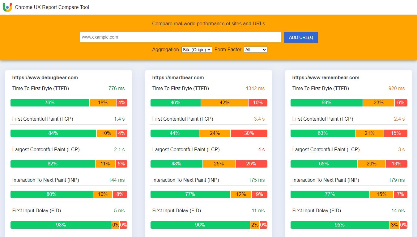
If you want to compare the CrUX data of different websites, you can also use Google’s lesser-known Chrome UX Report Compare Tool, which is based on the CrUX API, too.
It shows the six Web Vitals of each website side by side, supports both origin- and page-level data, and includes tablets in the device-based segmentation.
However, similar to the CrUX API, it doesn’t give you access to historical data; you can only see the 28-day rolling average of each metric.
DebugBear
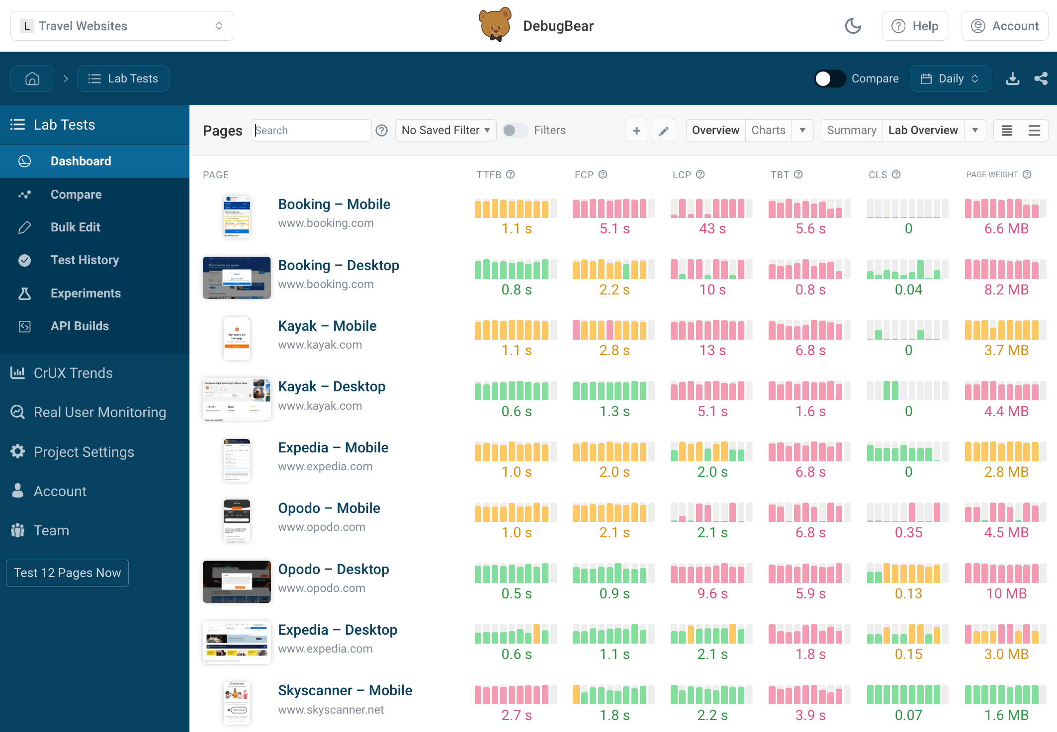
DebugBear is our own web performance monitoring and debugging tool, which lets you view lab and field data side by side. Lab data is collected on our own servers running from 30+ test locations around the world, while field data is pulled from the CrUX API.
This approach provides you with a unique way to monitor Core Web Vitals and other performance metrics for both your own and your competitors’ websites.
You can also see details for each Core Web Vitals metric, including the relevant code, page elements, timelines, and performance recommendations.
The request waterfall visualization helps you identify slow resources and other bottlenecks that are affecting your page speed.
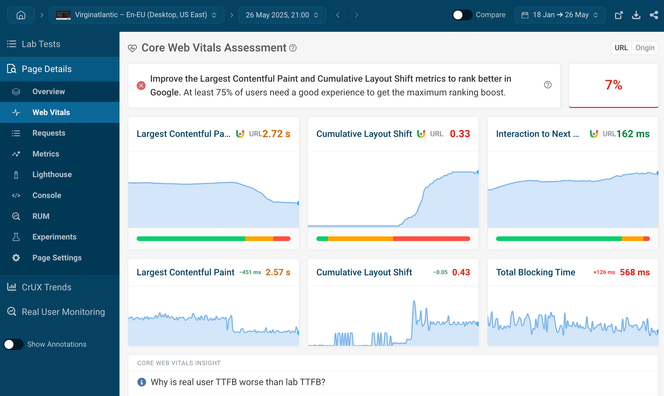
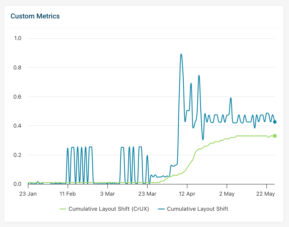
Unlike PageSpeed Insights and the CrUX API, DebugBear gives you access to historical data.
On the screenshot below, for example, you can see how an increase in the CLS score immediately showed up in the lab data, then gradually started showing up in Google’s field data.
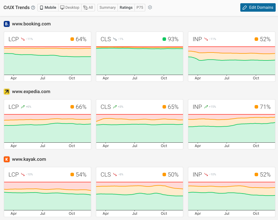
Finally, the CrUX trends dashboard lets you benchmark your website against your competitors.
This can tell you how visitor experience on your website compares to other companies in your industry, and whether optimizing your Core Web Vitals could help you improve your search rankings.
To see how we monitor Core Web Vitals and other web performance data, check out our interactive demo — no signup is necessary.
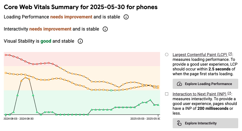
CrUX Vis
CrUX Vis is a newer tool that Google built to surface Chrome UX Report data specifically. In addition to your current web vitals scores you can also see historical data, as well as more detail on the different LCP subparts.
CrUX data versus real user monitoring (RUM)
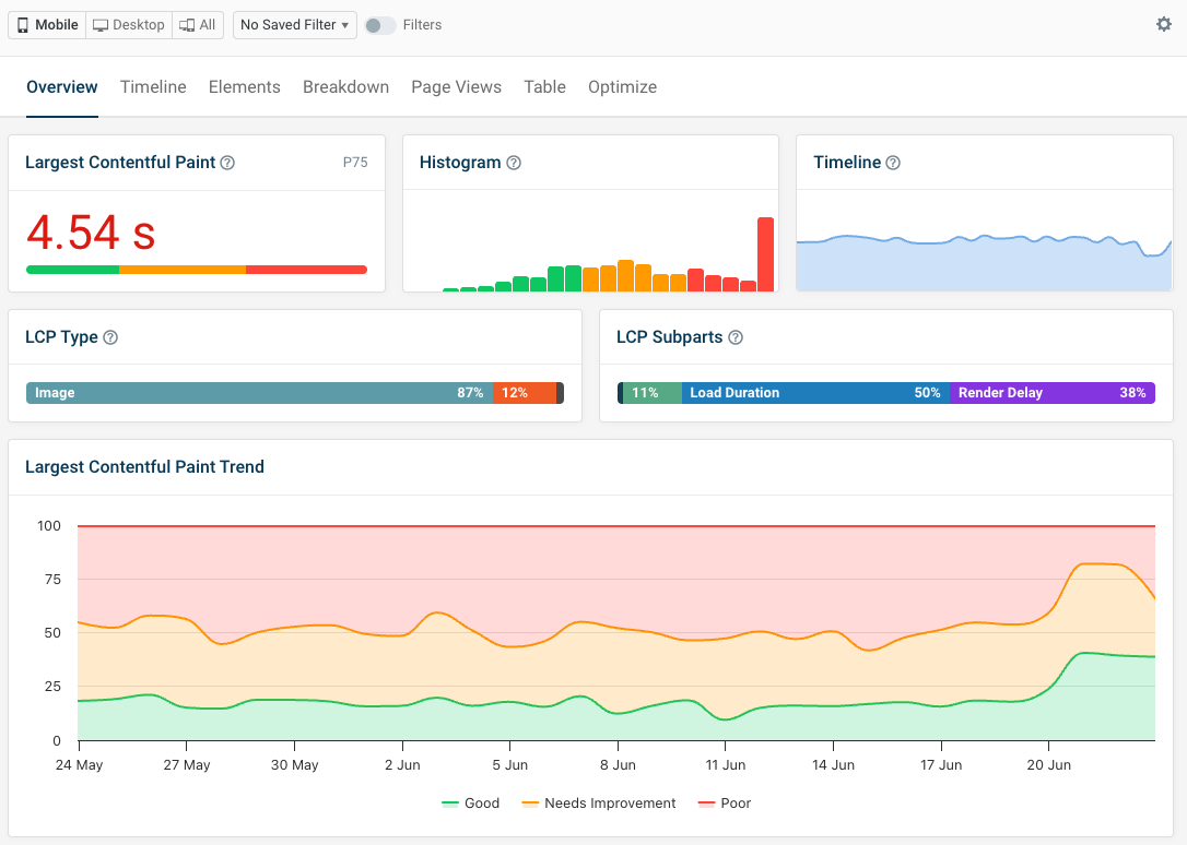
You'll sometimes see differences between the values reported by CrUX and those reported by real user monitoring tools. This can happen for a few reasons:
- CrUX and RUM data include a different set of visits
- CrUX data treats iframes as part of the page, while they are isolated for RUM data
- CrUX data is often aggregated over a different time period
While the CrUX data ultimately impacts rankings, real user monitoring can provide you with in-depth diagnostic data to help you fix performance issues.
Limitations of Google’s CrUX Report
Even though the Chrome User Experience Report is an informative and comprehensive tool, it also has some drawbacks you need to be aware of.
So, before wrapping up, let’s briefly consider some of those limitations:
- Google only returns anonymized aggregate data. On a low-traffic site, you can easily bump into the “chrome ux report data not found” or “no data” message.
- You only get data from a subset of website visitors. Visitors who aren’t logged into Chrome or use another browser, such as Safari or Firefox, won’t show up in your metrics.
- Origin-level data can change if some pages have been moved to a different domain.
- Chrome extensions used by website visitors can impact performance and the resulting metrics.
- New browser releases can lead to changes in the data (see how).
- Different device sizes can change some of the results — for instance, the largest bit of content within the viewport can be a different element, which makes it hard to debug poor LCP scores.
- Population differences might change the results, too — for example, when in a particular country, people typically have higher/lower-end devices and access to faster/slower network connections, which does have an effect on user experience metrics.
Wrapping up
In this article, we looked into the CrUX Report in detail, including the data collection method, the collected metrics, segmentation and other options, and the best CrUX reporting tools.
Google’s Chrome User Experience Report can give you more insight into the performance of your and your competitors’ websites and help you improve your search engine rankings, debug your performance issues, and provide a better experience to your users.
In addition to our interactive demo, DebugBear also comes with a 14-day trial where you can get access to the detailed CrUX data of any website of your interest, among many useful features. You can sign up here (no credit card required) or check out how our customers use DebugBear to monitor their websites and improve their Web Vitals and other web performance metrics.
Monitor Page Speed & Core Web Vitals
DebugBear monitoring includes:
- In-depth Page Speed Reports
- Automated Recommendations
- Real User Analytics Data