Web performance metrics always vary somewhat between tests. This variability will be lower for simple static sites, and higher for complex dynamic content that changes every time the page is loaded.
One way to reduce variability in recorded metrics is to run each test several times and only save the average result.
This article will look at three different websites and investigate how much running tests 1, 3, 5, or 7 times reduces variability.
We'll also take a look at how to select the average result.
Methodology
Three pages were included in the test:
- the CircleCI homepage
- a Wikipedia article
- a New York Times article
The performance of each page was tested 150 times over the course of one week. Tests were repeated between 1 and 7 times.
Performance metrics were collected using Lighthouse with an emulated mobile device, packet-level network throttling, and DevTools CPU throttling. Note that Lighthouse uses simulated throttling by default, which generally reduces variability between test runs compared to other methods.
Determining the average result
Lighthouse CI determines the median run by looking at the First Contentful Paint (FCP) and Time to Interactive (TTI) metrics.
The median value is determined for both metrics and the test results are scored based on how far away from the median they are.
const distanceFcp = medianFcp - firstContentfulPaint;
const distanceInteractive = medianInteractive - interactive;
return distanceFcp * distanceFcp + distanceInteractive * distanceInteractive;
Baseline variability
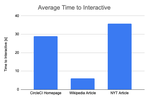
First, let's take a look at the absolute Time To Interactive values. We can see that the Wikipedia page becomes idle much more quickly than the other two pages.
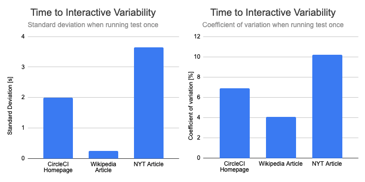
Accordingly, the absolute standard deviation of is much lower for the Wikipedia article, with a value of 0.25s compared to over 2s for the other two pages.
To make it easier to compare the impact of running the tests several times, we'll mostly look at the coefficient of variation from now on. This takes the different absolute values into account.
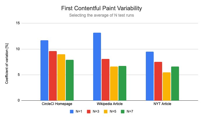
Impact on variability
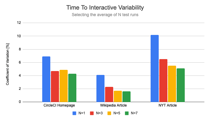
Now that we've established a baseline, let's look at how much repeating the test reduces variability.
Most of the variability reduction is achieved just by repeating the test 3 times. This makes sure that one-off flukes are thrown out. This reduced the coefficient of variation by 37% on average. Running the tests 7 times cuts variability in half.
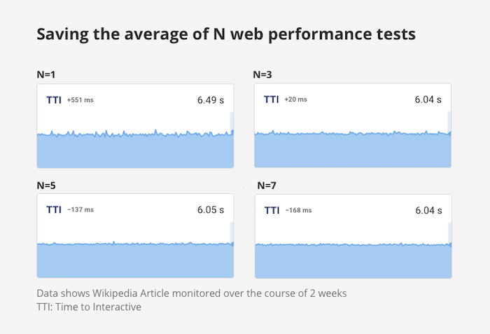
What does this look like in practice when you look at the monitoring results over time? The charts become much more smooth as the number of test runs is increased.
However, the variability reduction for the First Contentful Paint is noticeably lower. Here, running the test 3 times reduces the coefficient of variation by 26%, running it 7 times reduces it by 37%.
We'll look into why this improvement is smaller later on in this article.
Does repeating tests prevent outliers?
Instead of looking at the standard deviation, let's look at the overall range of the values. For example, for one test run the CircleCI Time To Interactive ranges from 26s to 34s, so the size of the range is 8s.
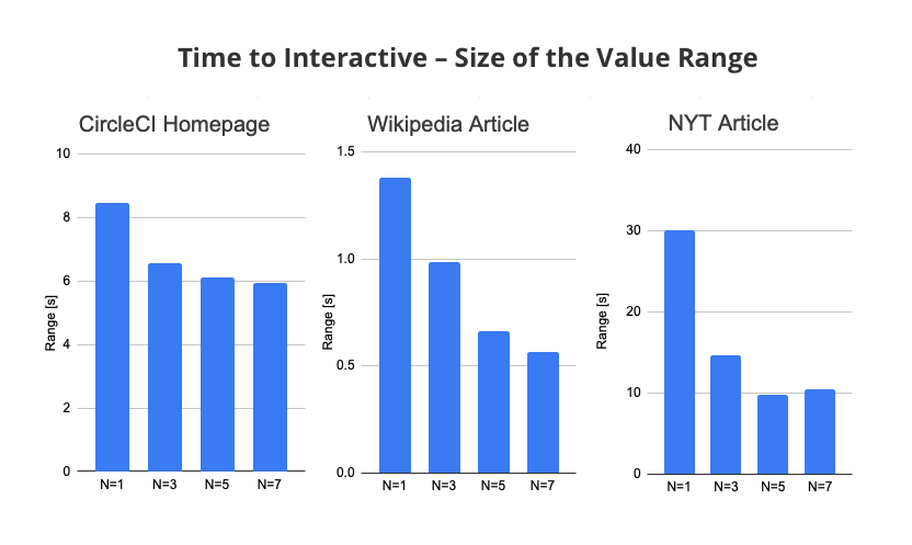
On average, running the tests 3 times instead of once reduced the Time To Interactive range by 34%. With 7 test runs this increased to 51%.
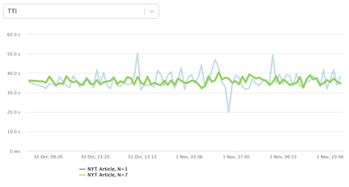
This chart shows an example of this. The green line shows the Time to Interactive when running the test 7 times, overlayed on top of the less stable blue line when the test is only run once.
How to select the average test run
One thing I noticed is that even when repeating the test several times, the FCP would still show occasional outliers.
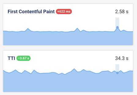
This chart shows the results of all 7 test runs. While the results clearly cluster around an FCP of 1.9s, the run with an FCP of 2.6s was selected instead.

To understand what's going on, let's review the distance formula and apply it to each test run.
distanceFcp * distanceFcp + distanceInteractive * distanceInteractive
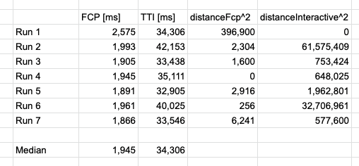
The range between the smallest and largest FCP values is just 0.8s. Compare that to the 10s range of the TTI metric.
As a result, for pages that take a while to become idle, TTI variation dominates the result selection process. And the TTI of Run 1 is actually the median value, so its distanceInteractive is 0. So it ends up getting selected as the average result despite being an outlier in terms of FCP.
You can tweak the selection algorithm based on the metrics whose variability you want to reduce. For example, you could weight the FCP differently, or throw out outliers for each metric.