
Improve image delivery is one of Lighthouse's new performance insights. It identifies oversized images on a web page that could be reduced in size without noticeable quality loss.
The improve image delivery insight also provides image-specific web performance recommendations that can help you improve your page speed.
The 'Improve Image Delivery' Performance Insight in Brief
Lighthouse's new performance insights are still in an experimental stage; according to Google's plans, they'll replace performance audits later in 2025.
Currently, you can access performance insights in three places:
- In the Lighthouse tab in Chrome DevTools
- In the Performance tab in Chrome DevTools (after running the profiler)
- In PageSpeed Insights (PSI)
You can switch between performance audits and insights using a toggle.
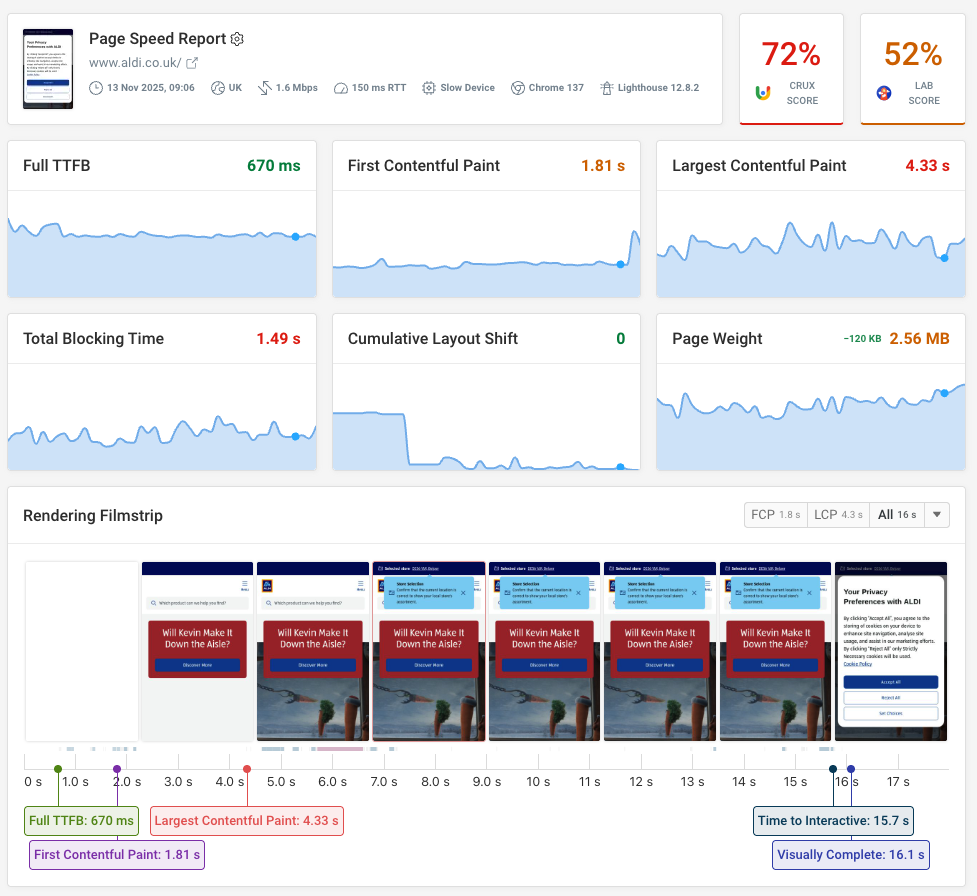
The screenshot below shows the Improve image delivery insight for Booking.com's homepage in Chrome DevTools' Lighthouse tab:
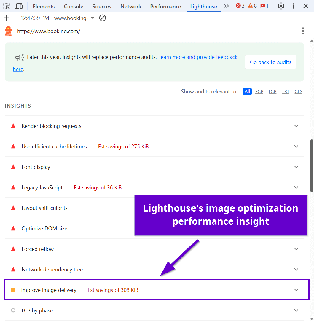
Improve image delivery displays a list of images that could be optimized on the page, along with the estimated savings in kilobytes and detailed web performance recommendations for each image. Lighthouse explains why image optimization matters:
Reducing the download time of images can improve the perceived load time of the page and LCP. Learn more about optimizing image size
Review specific image resources
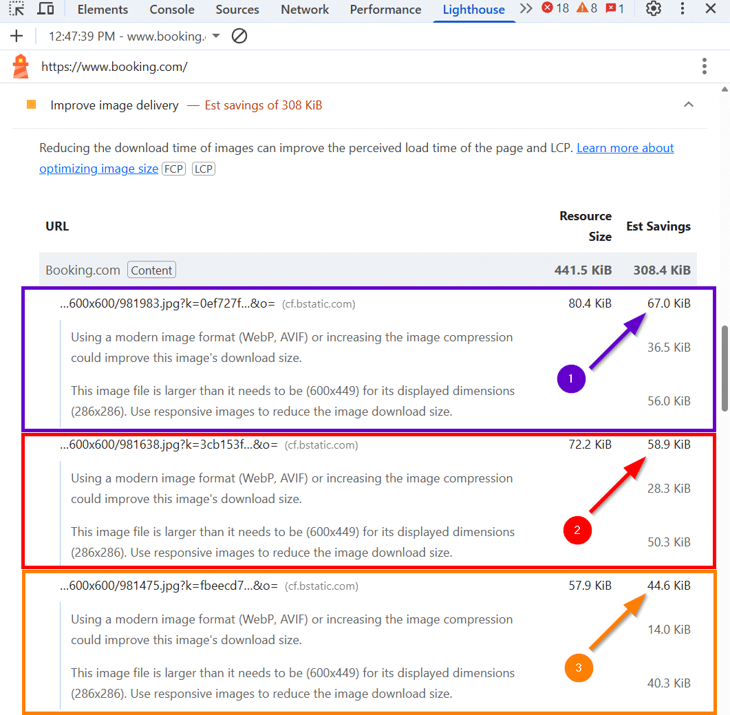
Lighthouse also orders the optimizable images by potential byte savings, putting images with the highest estimated savings at the top of the list:
The Improve image delivery performance insight excludes CSS background images and SVGs from the analysis, along with images that haven't been rendered on the page (e.g., preloaded but unused images).
How Does Reducing the Download Time of Images Improve Web Performance?
To improve image delivery, you need to reduce the download time of your images.
If it takes less time for the browser to download images:
- the overall page load will be faster
- the perceived page load will be faster, too, since the appearance of larger content elements, such as images, directly impacts users' perception of how quickly a page loads
This directly improves web performance metrics that depend on rendering speed, namely First Contentful Paint (FCP) and Largest Contentful Paint (LCP).
How to Reduce the Download Time of Images
Image download time depends on the following factors:
| Factor | Can you improve it? | Does the Improve image delivery insight evaluate it? |
|---|---|---|
| The user's device and network conditions | No | No |
| Server response time | Yes (see here) | No |
| Network latency | Yes (use a CDN) | No |
| Image caching | Yes (see here) | No |
| Scheduling of images | Yes (fetchpriority, preloading, etc.) | No |
| Total network payload | Yes (see here) | Partially (only image payload) |
| Image file size (a.k.a. byte weight) | Yes (see below) | Yes |
While you can reduce the download time of images in multiple ways, Lighthouse's Improve image delivery performance insight focuses on the byte weight of image files that were rendered within the analysis timeframe.
Other factors that impact image download time are covered by Lighthouse's other performance insights — since they are also essential for web performance, it's important to pay attention to them, too.
4 Ways to Improve Image Delivery
Now, let's see how you can reduce the file size of your images. The four techniques below address the four main notification types you can get for the Improve image delivery Lighthouse performance insight.
Lighthouse only flags images where potential byte savings are more than:
- 4 KB by default
- 12 KB for images added with responsive syntax (the
srcsetattribute or the<picture>element)
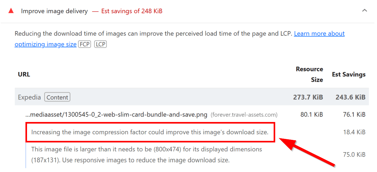
1. Increase the Image Compression Factor
Increasing the image compression factor means that you compress your images at an efficient quality level, which can significantly reduce their sizes. The goal is to find the compression ratio where the file size is as small as possible while the visual difference compared to the original image is not or barely noticeable.
Lighthouse shows the 'Increasing the image compression factor could improve this image's download size' notification for images that use a byte-per-pixel ratio higher than 0.1667 (calculated as 2 * 1/12), as these images can be further compressed without noticeable quality loss.
In the above formula:
- 2 represents 2 bytes per pixel, which is the typical size of image data before compression
- 1/12 represents the expected compression ratio for the AVIF format
Here's how the notification shows up in Lighthouse for Expedia's homepage:
To increase the compression factor of your images, you can use an online image optimization tool such as the Squoosh app by the Chrome team or command line converters such as cwebp for WebP and avif-cli for AVIF.
Alternatively, you can use an image CDN, such as IMGIX or Cloudinary, that allows you to change the compression level through quality parameters (use the q parameter for IMGIX and q or q_auto for Cloudinary). With these quality parameters, you can define how much detail is preserved from the original image.
For general web usage, set the quality parameter to 70-80, which keeps images sharp and file sizes lightweight.
A higher quality parameter means lower compression (e.g., a quality level of 80 preserves more detail than 70).
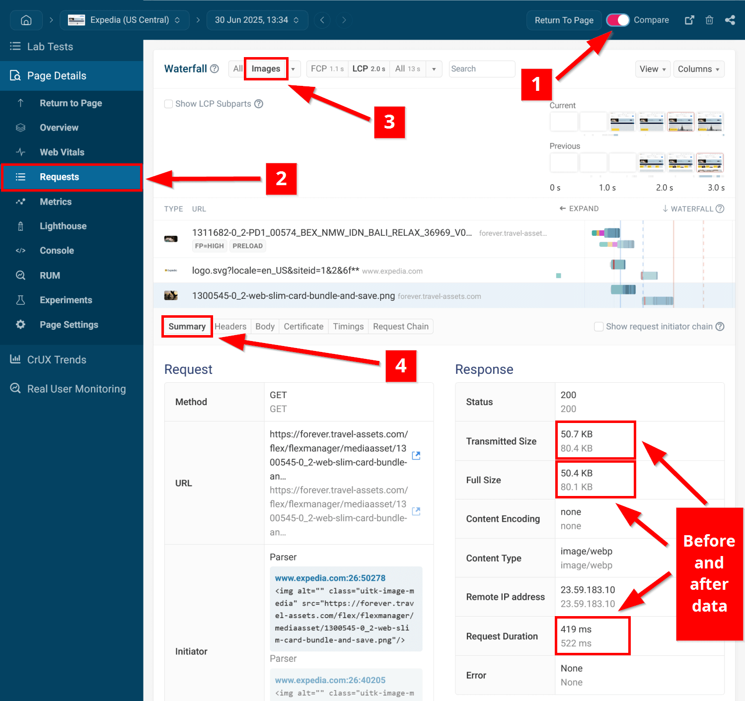
After compressing the images that received the 'Increasing the image compression factor' notification, you can measure the impact using DebugBear's compare feature.
To do so, open your dashboard (a fully functional free trial is available if you don't have an account) and follow these steps:
- Click the Compare toggle in the top bar and select the two test runs you want to compare.
- Click the Requests menu in the left sidebar to view the side-by-side request waterfalls.
- Filter for image files by selecting the Images option from the first dropdown at the top of the page.
- Locate an image file you compressed and click on it to view the details.
- In the Summary tab, you'll see the before-and-after metrics, including file size, request duration, and other performance data.
2. Use a Modern Image Format (WebP, AVIF)
These days, all modern browsers support the two most advanced next-generation image formats:
- WebP (see current browser support for WebP)
- AVIF (see current browser support for AVIF)
As these image formats use more efficient compression algorithms, converting your JPG, PNG, and other images to WebP or AVIF can significantly reduce their sizes.
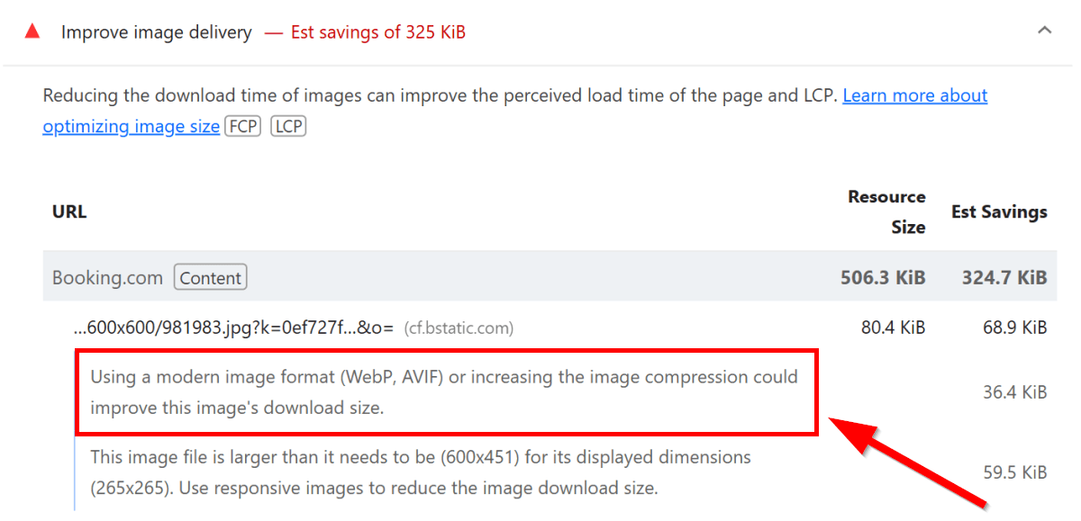
The full text of this Lighthouse notification is 'Using a modern image format (WebP, AVIF) or increasing the image compression could improve this image's download size' — this is what it looks like for Booking.com's homepage:
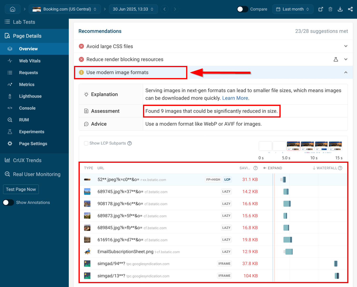
You can view all images that received the 'Use a modern image format' notification in a tidy list view in DebugBear. After running a lab test, click the Overview menu and scroll down to the Recommendations section.
Here, find the Use modern image formats recommendation, which will display the number of flagged images along with the potential savings, performance labels, and request waterfall for each image:
For the image conversion, you can use one of the image optimization tools mentioned in the previous section.
In case you need to provide a fallback for legacy browsers, you can define more than one source file using the <source> and <picture> HTML elements in the following way:
<picture>
  <source srcset="images/image.avif" type="image/avif" />

  <source srcset="images/image.webp" type="image/webp" />

  <img src="images/image.jpg" alt="Image" width="1280" height="960" />
</picture>
3. Use Video Formats Instead of GIFs for animated content
For larger animations, you should aim to use video formats, such as MP4 or WebM, rather than GIFs, as they are much smaller in size.
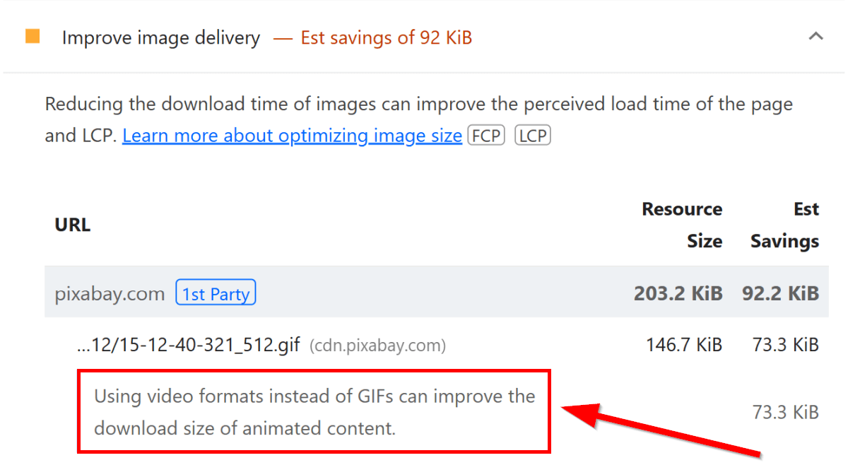
The Improve image delivery performance insight shows the 'Using video formats instead of GIFs can improve the download size of animated content' notification for GIF images that are larger than 100 KB.
In the screenshot below, you can see an example from a Lighthouse report run on a product page of Pixabay.com:
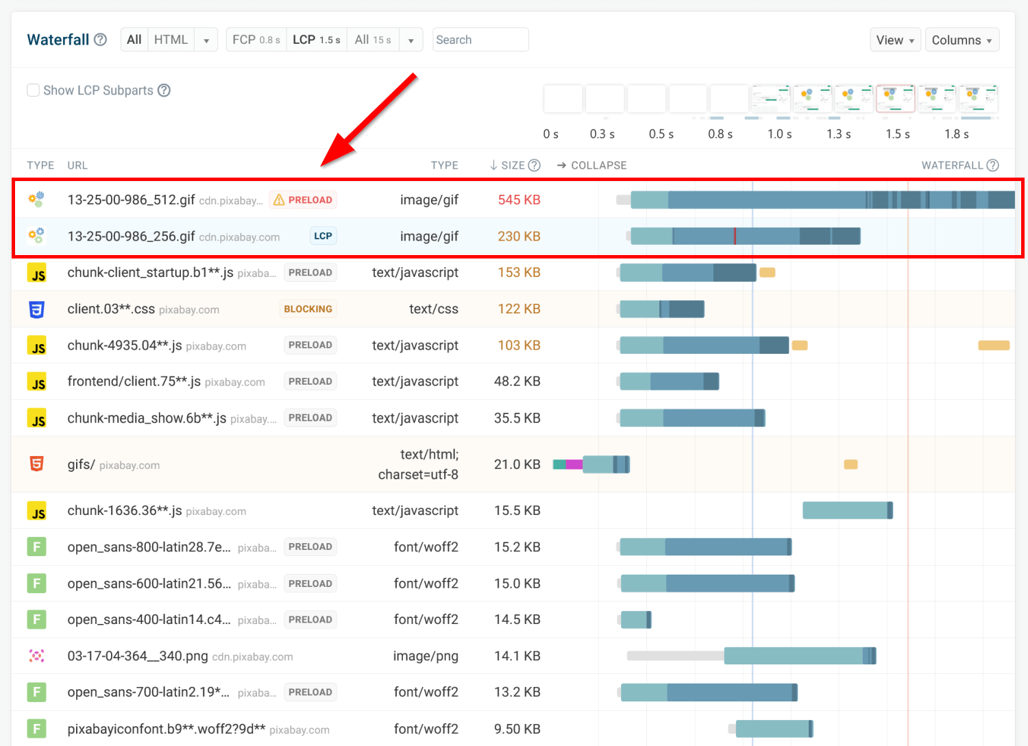
The request waterfall from DebugBear's Requests menu illustrates the performance cost of GIF files and why converting them to video formats matters.
As you can see in the screenshot below, GIFs are both the largest resources and have the longest load times compared to all other file types on the page, including:
- HTML, CSS, and JavaScript files
- font files
- other image formats
You can convert your GIFs to video formats using:
- a web app such as EZGIF or CloudConvert
- the FFmpeg command line tool
- Adobe Photoshop (from the File > Export > Render Video menu)
You can further optimize your videos for web performance by:
- adding a poster image
- preloading the poster image with
fetchpriority="high"(for videos above the fold) - preloading the video's metadata, such as duration, dimensions, first frame, etc. (since this is a lightweight preload, you can also add it for videos below the fold)
- adding the
widthandheightdimensions to avoid unexpected layout shifts
Here's a code example of how you can add animated content as fast-loading video:
<!DOCTYPE html>
<html lang="en">
  <head>
    <!-- other code -->
    <link
      rel="preload"
      as="image"
      fetchpriority="high"
      href="posterimage.avif"
    />
    <!-- other code -->
  </head>

  <body>
    <!-- other code -->
    <video
      controls
      poster="posterimage.avif"
      width="560"
      height="315"
      preload="metadata"
    >
      <source src="animation.webm" type="video/webm" />

      <source src="animation.mp4" type="video/mp4" />

      Sorry, your browser doesn't support embedded videos.
    </video>
    <!-- other code -->
  </body>
</html>
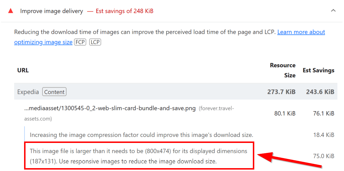
4. Use Responsive Images to Reduce the Image Download Size
You can also improve image delivery by using responsive images, which means providing more than one source file for an <img> tag so that the user's browser can select the one that best fits the present conditions.
There are three types of responsiveness (width-based, resolution-based, type-based); the Use responsive images notification addresses width-based differences between various devices.
Lighthouse shows this notification when:
- an image's display size is smaller than its intrinsic size, as these images are larger than necessary
- potential byte savings exceed 4 KB by default, or 12 KB for images that already use responsive syntax (as I mentioned above, this condition applies to all notification types of Improve image delivery)
The full text of the notification is 'This image file is larger than it needs to be for its displayed dimensions. Use responsive images to reduce the image download size' — here's an example from Expedia's homepage:
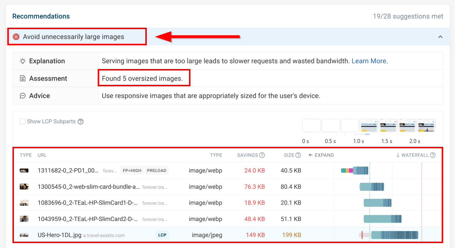
To analyze your oversized images, you can use DebugBear's Avoid unnecessarily large images recommendation on the Overview page.
It uses the same formula as Lighthouse to identify images that could benefit from a responsive syntax. You can sort the flagged images by potential savings and file size and see the individual request waterfalls.
If you click any of the images, you can also view an in-depth performance summary, detailed timings, and the full request chain:
You can implement width-based responsive images by adding alternative source files to the srcset attribute of the <img> tag (the sizes attribute defines the width of the space the image will occupy on the page):
<img
  src="image-lg.jpg"
  srcset="image-md.jpg 600w, image-lg.jpg 900w, image-xl.jpg 1200w"
  sizes="80vw"
  alt="Image"
/>
If the alternative source files have different dimensions (e.g., you want to show a portrait image on mobile devices and a landscape image on desktop), you can use the <picture> and <source> HTML elements along with the srcset and media attributes as follows:
<picture>
  <source
    srcset="landscape-image.jpg"
    media="(min-width: 800px)"
    width="800"
    height="600"
  />

  <img src="portrait-image.jpg" alt="Image" width="450" height="800" />
</picture>
Improving image delivery in Next.js
For Next.js apps, Lighthouse includes a platform-specific recommendation to use the built-in Next.js Image component instead of native HTML <img> tags:
Use the next/image component instead of
<img>to automatically optimize image format.
The <Image> component can automatically compress your images and generate responsive image versions for several sizes.
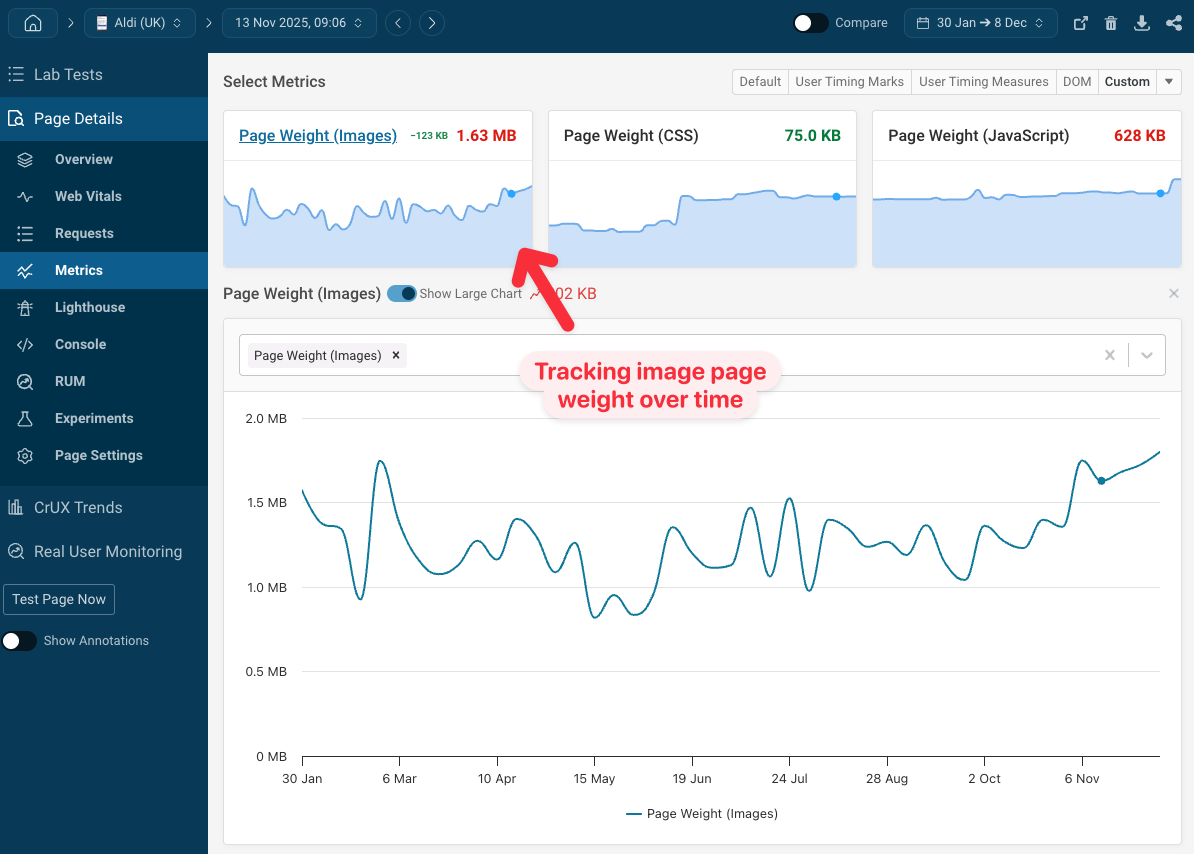
Start Monitoring Image Weight on Your Website
To improve image performance and pass Lighthouse's Improve image delivery insight, set up web performance monitoring on your key pages with DebugBear.
You can use the Metrics tab to see day-to-day changes in image weight on your monitored pages, alongside many other important web performance metrics:
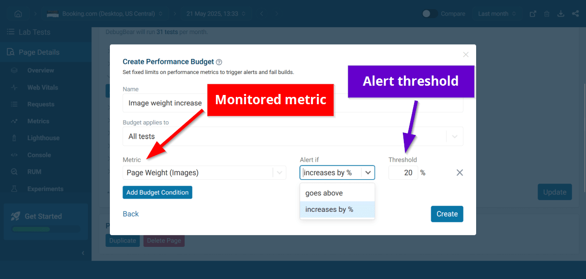
You can also configure performance budgets that alert you when image weight on your key pages exceeds a pre-defined threshold:
To start improving image delivery on your website, sign up for a free 14-day trial with access to the full web performance monitoring functionality.
Keep track of page speed and identify high-impact optimizations. Try out changes using experiments, without deploying code on a live website.
Monitor Page Speed & Core Web Vitals
DebugBear monitoring includes:
- In-depth Page Speed Reports
- Automated Recommendations
- Real User Analytics Data