Real-user metrics are aggregated across many different website visitors using different devices. In contrast, to run a lab test you need to select a single test device. That's the case both when testing locally in Chrome DevTools and when using a dedicated performance tool.
Discrepancies between lab and field data are incredibly common. This can be confusing: what data should you believe, and what are the best device and network settings to use when running tests?
The device configuration you should use depends on what your goals are. This guide explores different options and explains their pros and cons.
What device settings impact performance metrics?
Here are the five test device characteristics with the biggest impact on your site speed metrics:
- Network Latency – how long does a network round trip between browser and server take?
- Network Bandwidth – how much data can be transferred per second?
- CPU Throttling – is the processor slowed down to simulate a mobile device?
- Test Location – where in the world is the test run from?
- Screen size – are you testing the mobile site or the desktop site?
Other device factors can also impact performance, for example what browser extensions are installed or what image formats are supported by the browser.
In addition to device configuration, past page interactions also impact metrics. For example, pages may load more slowly for logged-in users or they may load faster because some page resources are already cached from a previous visit.
This article will focus on network latency and bandwidth settings, and then take a quick look at CPU speed, test location, and viewport size.
Field vs lab data on PageSpeed Insights
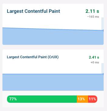
Google's PageSpeed Insights (PSI) often shows far worse metrics for lab data than for field data.
In this example, only 75% of real users experience an FCP under 1.9 seconds, but Google's lab data puts it at 2.8 seconds.
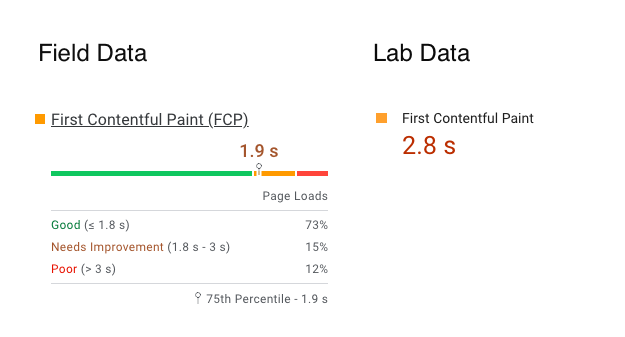
Why? Because PageSpeed Insights simulates a slow mobile device on a slow connection. PSI is built on top of Lighthouse, which aims to simulate the Moto G4 phone that Motorola released in 2016. The network configuration matches the bottom 15% of 4G experiences.
Why simulate a low-end device and network connection?
There are three reasons to test in low-end conditions: making sure your website works for everyone, making it easier to interpret the result of performance tests, and to be able to see metric changes more clearly.
Building websites that are fast for everyone
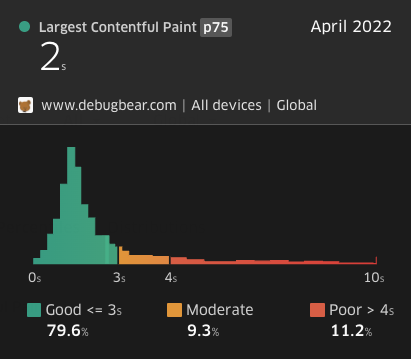
Google's Core Web Vitals focus on the 75th percentile of experiences. If your website is slow for 20% of users this has no impact on your web vitals rankings. But this could still represent hundreds or thousands of people who have a poor experience with your business.
Website load times often have a long tail. For example, for most visitors of the DebugBear website pages load within 2 seconds. But a very small number of users waits over 10 seconds for the main page content to appear.
Making test results easier to interpret
Websites consist of many different resources and it's often hard to tell which resource is really holding back rendering.
Slowing down the page load lets you see your website render bit by bit, with requests finishing one at a time. This way you can better understand the dependencies between different resources, which in turn enables you to optimize your pages more effectively.
You can also see the potential performance impact of each resource more clearly. For example, consider these two request waterfalls, one collected on a fast connection and the other on a slow connection.
With the high-bandwidth connection you barely notice the effect that download size has on how long it takes to fetch the resource. With the slower connection you can clearly see that it takes longer to load large files.
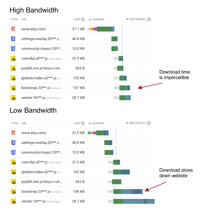
The slow waterfall chart also shows how Chrome allocates bandwidth between different requests. The areas shaded dark blue show when data is received for a request. While the first large file is being downloaded the other two resources basically sit idle until bandwidth becomes available again.
Seeing metric changes more clearly
Even when running two tests in the same conditions, metrics always vary somewhat between each test result.
If your LCP score increases from 1.1 seconds to 1.3 seconds it can be hard to tell if this is due to a change on your website or just random noise. But when testing in worse conditions the change will be more pronounced, let's say from 3.8 seconds to 4.5 seconds.
With bigger numbers you can more easily see when a site speed regression occurred.
Why run tests on a fast device and connection?
While some users will always have a poor page experience, usually the majority of users will use a reasonably new device on a reasonably fast connection. Optimizing for the slowest 5% of users only helps a small number of people.
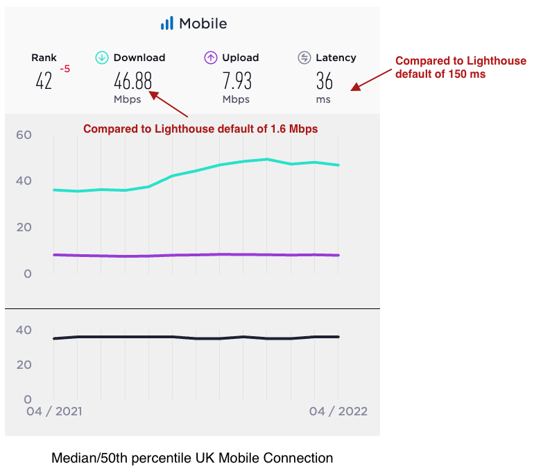
From an SEO perspective, Google looks at the slowest 25% of experiences and usually reports metrics at the 75th percentile. The metrics that Lighthouse reports by default are usually far off from what typical users experience, even toward the slow end.
For example, while Lighthouse uses a bandwidth of 1.6 Mbps, SpeedTest reports a median mobile bandwidth of 47 Mbps in the UK. And that's before considering that many people use their phones while on Wi-Fi.
Running tests on a fast connection will result in metrics that more closely match what your real users experience.
What device configuration should I use?
For performance optimization
A slow device configuration usually makes it easier to identify potential improvements as well as observing the impact of an optimization.
The Lighthouse defaults work well for this, and these metrics will also match what you see on PageSpeed Insights. (Or at least they'll broadly match.)
To estimate real user metrics
To estimate real user metrics a faster configuration is better.
Real user experiences are too diverse to be reflected with only one or two device configurations. Don't expect lab data to match Google's web vitals data exactly.
At DebugBear we run faster mobile tests with a bandwidth setting of 12 Mbps and a latency of 70 milliseconds. This usually gets you into the ballpark of mobile data from the Chrome User Experience Report (CrUX).
You can also look for typical network speeds in your country and use those. However, note that usually these are median figures, rather than the 75th percentile values reported by Google.
Ideally you would know what devices users typically use to access your website, and under what network conditions.
Estimating realistic bandwidth and latency settings with the Lighthouse simulator
If you see an LCP value of 2.1 seconds in Google's field data, what device settings might give you a similar result in the lab?
You can use our Lighthouse simulator tool to estimate this. It runs Lighthouse with 100 different speed settings and then shows the metrics reported for each one.
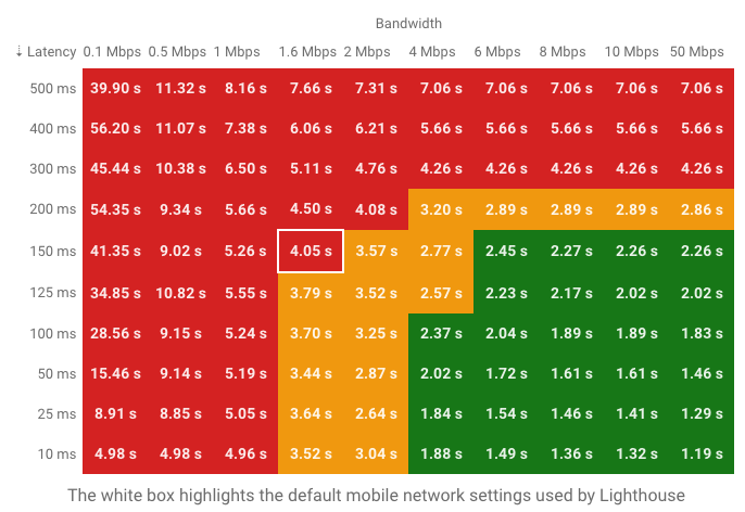
We can see that a bandwidth of 8 Mbps and a latency of 125 milliseconds would result in an LCP of 2.2 milliseconds. Alternatively, 4 Mbps of bandwidth and 50 milliseconds of latency would result in an LCP of 2.0 seconds. Both settings would be potential candidates for your device configuration.
While these settings are worth a try, note that they are based on the potentially inaccurate metric simulation that also powers PageSpeed Insights.
Selecting a screen size
Screen size and resolution can impact performance in a variety of ways. Your LCP metric might be worse on a high-resolution mobile screen as the browser will load higher-resolution images. Or the LCP element might be different on mobile, as the usual LCP element is positioned outside the mobile viewport.
However, typically a 50px difference in viewport width isn't going to make a big difference, and running tests using the default desktop and mobile screen sizes used by Lighthouse is usually good enough.
If you see unexpected metric discrepancies between lab and field data it can be worth trying out different device sizes in Chrome DevTools to see if that can explain the differences.
Selecting a test location
To get started, pick the test location that's closest to your users. Optimizing your data here will help the majority of your users, and also benefit the rest.
If your user base has a wide geographic distribution it's worth adding another test location that's far away from where your servers are located.
Your selected test location will have a bigger impact on metrics when using a low network latency setting. If you run tests with a high network latency like 150 milliseconds then you won't see a huge difference between tests run from Paris versus Helsinki, as that round trip only adds another 40 milliseconds.
CPU speed
The CPU speed matters most for client-side apps without server-side rendering. If you are testing a static page this setting generally isn't very important.
I like to use a throttling factor of 2x for mobile and 1x (no throttling) on desktop. For reference, the default mobile setting used by PageSpeed Insights is 4x.
Conclusion
Testing with a low-end device is a good way to identify potential performance optimizations.
It's difficult to get lab metrics to match Core Web Vitals field data, but picking settings that are a bit worse than what's typical for your users usually gets you close enough.