Working With Percentiles: What Do p50, p75, And p90 Mean?
Percentiles are a statistical measurement to help you interpret data. In a page speed context, some users will have fast experiences and some will wait a long time for your page to load. Percentiles allow you to break down how long different numbers of people are waiting.
What are percentiles?
In statistics, percentiles show how a value compares to other values in a data set. They tell you the value at specific points in a distribution, indicating where a certain percentage of observations fall.
In a web performance context, percentiles show how a visitor experience compares to other experiences on the same website.
Example: the 75th percentile (p75)
If the 75th percentile (p75) of the Largest Contentful Paint metric is 2.29 seconds, then that means that 75% of users wait less than 2.29 seconds for the main page content, and 25% wait longer than that.
This annotated histogram explains how this works in more detail. Each bar in the histogram indicates how many visitors had a load time in the range indicated on the x axis. For example, about 100 visitors waited less than 0.3 seconds for the LCP.
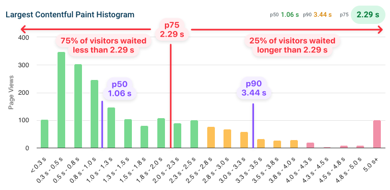
However, even if the page loads in about 2.3 seconds for 75% of users, that still means that 25% of users may be waiting much longer. This may be a problem, so you'll also want to look at higher percentiles like the 90th percentile (p90). In this case, the p90 is 3.44 seconds, which means that 10% of visitors wait at least 3.44 seconds for the page to render.
Google uses the 75th percentile for reporting Core Web Vitals data. These visitor experiences impact your search rankings.
What does p90 mean in statistics?
The p90 (90th percentile) means that 90% of values in a data set fall below this value, and 10% fall above it. When monitoring website performance, a p90 of 3 seconds means 90% of users experienced load times faster than 3 seconds, while 10% waited longer. The p90 is commonly used to identify performance issues affecting the slower portion of your users without being skewed by extreme outliers.
p99 and other percentiles
Looking at even higher percentiles can start being impacted heavily by small individual outliers. For example, the p99, which looks at the slowest 1% of experiences. You may be able to identify edge cases where your website loads very slowly, but it could also be affected by users with a very slow connection or by reporting errors.
What percentile does Google report for Core Web Vitals data?
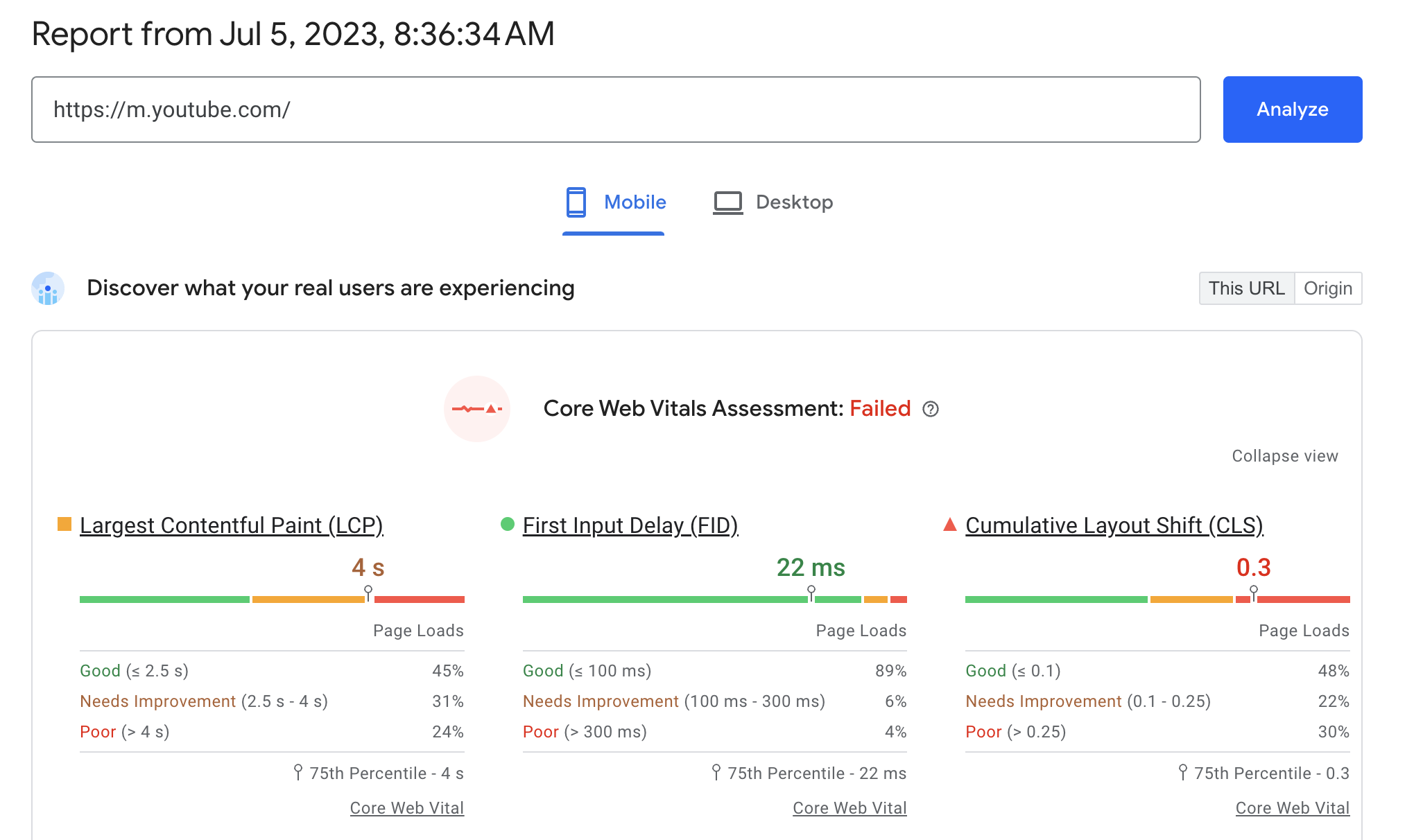
Google focuses on the 75th percentile when reporting Core Web Vitals metrics. The PageSpeed Insights report below shows a p75 Largest Contentful Paint of 4 seconds, which means that 25% of users waited more than 4 seconds for the main page content.
You can also use the free website speed test by DebugBear to see a history of your p75 Core Web Vitals metrics over the last 40 weeks.
Google focuses on the 75th percentile for two reasons:
- Ensuring that a majority of page experiences are good
- Preventing the metric from being impacted by outliers
What are the advantages of using percentiles?
Unlike other metrics like the mean value, percentiles are resistant to outliers. If most users on your site wait 2 seconds for the page to load, but one user waited 100 seconds, then looking at the mean value would suggest that your website is really slow. But the percentiles ignore all data above the percentile value. If the p75 is 2 seconds, then whether other users wait 3 seconds or 10 seconds doesn't impact the metric value.
What are the disadvantages of using percentiles?
The flip side of being resistant to outliers is that some user experiences are ignored when calculating the percentile. If you only look at the 75th percentile you might think your website works well for users, but up to 25% of visitors might still have a poor experience.
To avoid this, look at more than one percentile value. For example, you can check the p90 or p95 values in addition to the p75.
How to look at Core Web Vitals percentiles other than the 75th percentile
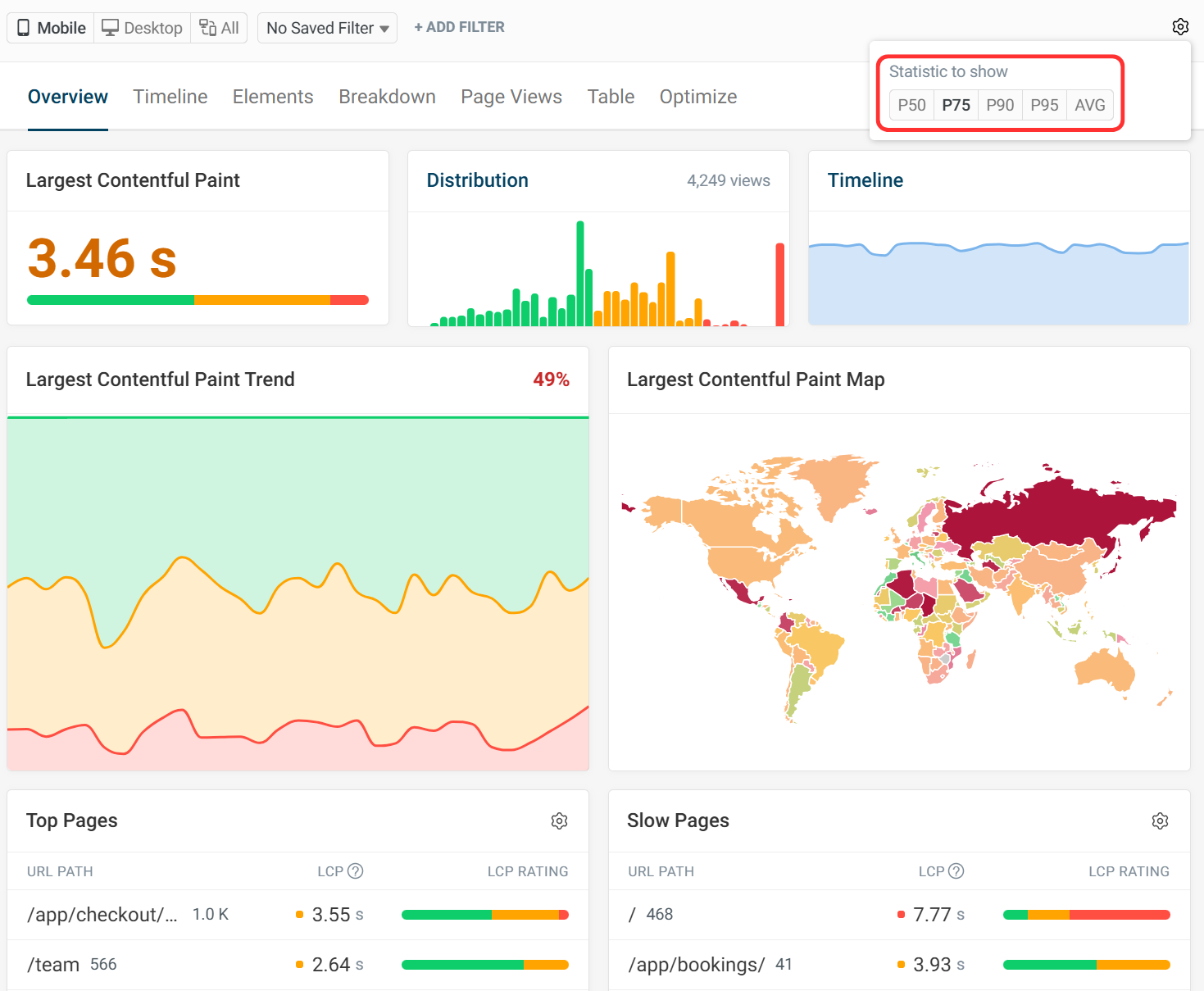
DebugBear RUM tracks how fast your website is for real users and lets you select what statistical aggregation method to use.
The following options are available:
- P50: The average user experience (slower for 50% of users and faster for 50%)
- P75: 75th percentile, matches Google CrUX data
- P90: 90th percentile, helps analyze slower visitor experiences specifically
- P95: 95th percentile, the slowest 5% of experiences, may contain many outliers
- AVG: The arithmetic mean for the metric
To change your selection, click on the Gear icon and then select the aggregation method you want to use.
What percentile is the median value?
The median is the same as the 50th percentile value. Half of user experiences will be better than the median and half will be worse.
The 25% percentile is also called the lower quartile and the 75% percentile is called the upper quartile.
What does the average value mean and is it the same as the 50th percentile?
The average is a general term for a number that represents a typical value for a data set. For example, the median and the mean are both average values for a set of data.
When an average is reported you need to check the context to see what type of average is reported. When reporting data, specify what type of average is shown.
If the median is reported instead of the arithmetic mean then it's the same as the 50th percentile.
How do Google's rating percentages relate to percentiles?
Core Web Vitals tools like PageSpeed Insights or the DebugBear Website Speed Test not only show the 75th percentile value but also a rating breakdown into Good, Ok, and Poor experiences.
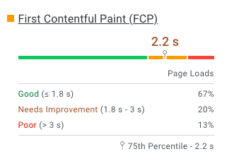
In this example, 67% of users have a good FCP experience with a rendering time below 1.8 seconds. That means the 67th percentile FCP is 1.8 seconds, or slightly better than the 75th percentile value of 2.2 seconds.
We also see that the fastest of the slowest 13% of experiences have an FCP of 3 seconds, so the 87th percentile FCP is 3 seconds.
What does the 98th percentile mean for the INP metric?
The Interaction to Next Paint (INP) metric measures the 98th percentile of interaction delays for a single visit. In practice, that means the longest input delay is reported for visits with less than 50 user interactions.
However, what if a user clicks on your page 200 times with a delay of 2 milliseconds and then there is another click with a 500-millisecond delay? In that case, the outlier doesn't impact your INP score as the 4 worst experiences will be ignored when calculating the 98th percentile.
While the INP for each single visit is calculated by looking at the 98th percentile, the overall Google Core Web Vitals data then reports the 75th percentile of these collected values across a large number of visits.
Monitor different Core Web Vitals percentiles
You can use real-user monitoring in DebugBear to keep track of page experience and look at different percentiles.
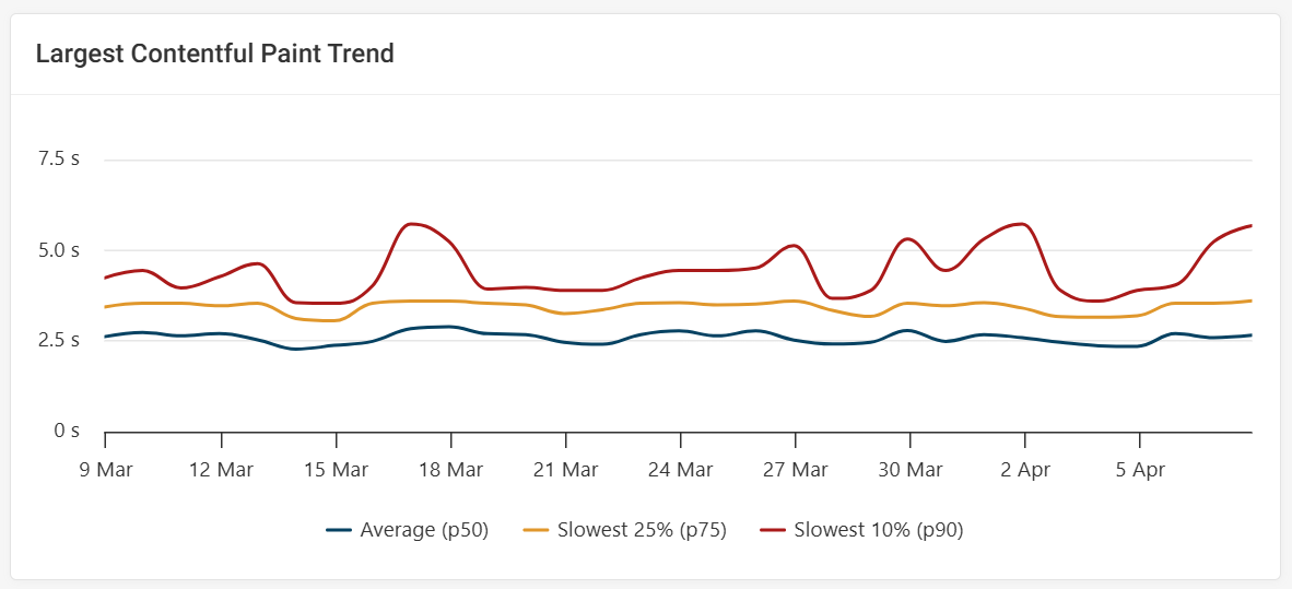
For example, the "Largest Contentful Paint Trends" chart shows the p50, p75, and p90.
Monitor Page Speed & Core Web Vitals
DebugBear monitoring includes:
- In-depth Page Speed Reports
- Automated Recommendations
- Real User Analytics Data