I recently looked at the speed of the Waitrose homepage and was surprised by its massive uncompressed HTML document size: 3.5 MB.
This article takes a look at how images make the document so big and asks if this reduces site speed.
Image URLs in the srcset attribute
Traditional img tags only take one src image URL that's used regardless of the size of the device. That means either images will look pixelated on large high-res screens, or a lot of unnecessary bandwidth will be consumed on small devices.
<img src="img-800px.png" />
The srcset and sizes attributes fix this problem. Developers can use srcset to provide multiple URLs that serve the same image at different sizes – or sometimes a different image that uses the available space more effectively. sizes is used to tell the browser how large the image is supposed to be at different screen sizes.
The browser then decides what image to load based on the rendered size and screen resolution.
<img
  srcset="img-400.png 400w, img-800.png 800w, img-1600.png 1600w"
  sizes="(max-width: 600px) 400px, 800px"
/>
Using lots of srcset URLs
Now let's take a look at the HTML of the Waitrose homepage.
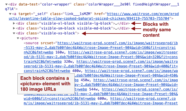
This section of the page looks pretty simple, but it's built with half a megabyte of HTML code.

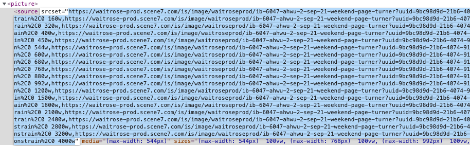
The website is responsive and uses the picture tag and srcset attribute to serve different images at different screen sizes. Each <picture> tag in this section contains 180 possible image URLs.
On top of that, the website uses Bootstrap classes like visible-xs to show different DOM elements depending on screen size. Each of the three blocks contains mostly similar content, and the browser ends up loading one image out of 540 possible URLs.
Does it affect download speed?
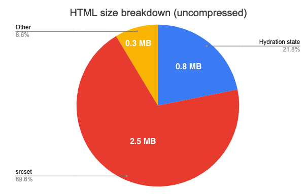
Picture elements account for most of the HTML code, but there's also a 900KB __PRELOADED_STATE__ global to initialize the React app.
While extra image URLs add a lot of code, the URLs are very repetitive. So they should be easy to compress when transferring over the network.
Without compression, the srcset attributes make up 70% of the total page size of 3.5 MB.
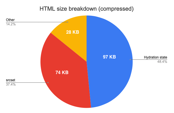
After gzipping the file, srcset only contributes 37% to an overall size of ~200 KB.
I actually expected compression to help a bit more!
Okay, so let's assume the responsive image code actually added 74 KB of download size. That's meaningful, but only 1.4% of the total page download weight (5.1 MB). On a slowish 10 Mbit connection downloading 74 KB would take around 60 ms.
And the whole point of including responsive images is to prevent spending bandwidth downloading images that are too high-res. So increasing document size can save data later on.
However, HTML size has a larger performance impact than other on-page resources. While images are low-priority and can be loaded later on, HTML is high priority and competes for bandwidth with other render-blocking resources like CSS files.
Generally I wouldn't say the extra download size is a big concern. However, for this particular website the duplication seems excessive and there's likely low-hanging fruit to pick.
Does it affect overall site speed?
While response compression reduces the impact of large duplicated content, the browser still needs to decompress and process the large HTML response. For example, this would result in more time spent parsing HTML.
How long does it take to parse 2.5 MB of HTML?
I ran a test adding 10 MB of picture tags to a page and it increased parse time by around 300ms. Let's say 1 MB of uncompressed HTML means an extra 30ms of parse time.
Then 2.5 MB of HTML takes about 75 ms to parse. On a mobile device that's 4x slower this might be closer to 300 ms.
Parsing the extra HTML will have an impact that's just about noticeable, but not massive.
What's the overall performance impact?
My very rough guess is that the extra HTML slows down the initial render by 90 to 360 ms, depending on CPU speed and network connection. While this is not a major problem, it's enough to consider optimizing.
The results suggest that HTML parse time has a much larger impact than the additional download time.
How to fix this?
The root cause of this issue is likely that multiple layers of abstraction are stacked on top of each other. Each srcset attribute only specifies around 18 URLs. But many picture tags contain multiple source tags for different screen sizes. And these bits of code are then duplicated for different screen sizes again.
Developers and authors are not aware of this multiplicative effect, as they only interact with one layer of abstraction at a time. The most impactful solution would therefore be to review the architecture and find ways to reduce duplication. Maybe classes like visible-xs can be avoided entirely in favor of single responsive HTML blocks.
Alternatively, reduce the number of image URLs per picture:
- You might not need both a 600px wide image and a 680px one
- A
visible-xsblock is only shown on screens narrower than 544px, and doesn't need a 4000px wide image - A
sourceelement with amedia="(max-width: 544px)"attribute also doesn't need a 4000px wide image - While in a
visible-xlblock, there's no need to include asourcetag with amedia="(max-width: 544px)"attribute
The srcset attribute can reduce bandwidth by loading images at an appropriate size.
— DebugBear (@DebugBear) September 8, 2021
But if you provide too many possible URLs that can blow up the size of your HTML document and hurt performance.https://t.co/nn0WUDA16A