
'Responsive images' is an umbrella term for a number of image optimization techniques that allow web designers and front-end developers to reduce page weight, improve site speed, and enhance user experience.
As image weight impacts your Largest Contentful Paint score, one of Google's Core Web Vitals metrics included in its search algorithm, you can also improve your SEO rankings by using responsive images.
Since images are a key aspect of web performance, in this article, we'll look into responsive images in detail, including their pros and cons, a handful of code examples, a couple of recommendations, and a bit of theory related to the subject.
What Are Responsive Images?
The term 'responsive images' is somewhat misleading, as an image can't be responsive on its own. Responsive images are a collection of image files a user agent (e.g. a web browser) can choose from. It's like a competition of images — you provide a set of images for one image location on a web page, and the browser of each user picks and downloads the one that best fits its needs.
Responsive images are one aspect of responsive web design. A website can respond to device properties and technical capabilities by displaying slightly different content.
Browsers include features to make it easier to implement responsive images. They can identify the best-fitting image from a list of available image options and selection criteria such as:
- the viewport's width, height, aspect ratio, etc.
- screen resolution
- orientation (portrait or landscape)
- media type (e.g. screen, print, etc.)
- supported file formats (a.k.a. MIME types)
- and others
For instance, the following code example lists three alternative image sources which are different in file format so that the browser of each user can choose the best match:
<picture>
  <source srcset="image.avif" type="image/avif" />
  <source srcset="image.webp" type="image/webp" />
  <img src="image.jpg" alt="Image" width="1200" height="800" />
</picture>
The selection process roughly happens as follows:
- You upload all the images to your server.
- You add the responsive image syntax to your HTML, CSS, or (sometimes) JavaScript file(s).
- The user enters your URL into their browser's address bar.
- The browser sends an HTTP request to your server to download the HTML document.
- The browser parses the code and decides which image is the best match.
- The browser sends a request to your server for the image it wants to download.
- Your server responds with the requested image.
Note that in some cases, this process can be more complex. For example, if the responsive image syntax is included in the CSS file (e.g. you provide multiple sources for a background image), the browser has to request, download, and process the CSS file before the image.
Run A Free Page Speed Test
Test Your Website:
- Automated Recommendations
- Detailed Request Waterfall
- Web Vitals Assessment
Background: Hardware vs Software Pixels
The distinction between hardware and software pixels is a key concept in digital image optimization. Understanding the difference between the two is also important when implementing responsive images on the web, as you can target both programmatically — we'll see code examples for both in the next sections.
Since the appearance of high-density screens, such as Apple's Retina display, the term 'pixel' has been split into two distinct types:
- Hardware pixel (also known as screen pixel):
- one dot of light on a screen
- the total number of hardware pixels defines the screen resolution
- Software pixel (also known as CSS pixel):
- 1/96th of an inch, as defined in the CSS specifications
- the total number of software pixels defines the viewport size
- can consist of a different number of hardware pixels
There are two metrics related to hardware vs software pixels you'll frequently encounter when working with responsive images:
- Pixel Density (Pixels Per Inch or PPI) is the number of hardware pixels per inch on a screen (e.g. high-density displays have more hardware pixels per inch).
- Device Pixel Ratio (DPR) is the ratio of the hardware and software pixels.
 Credit: Understanding the Device Pixel Ratio by Tom Roth
Knowing when you target software vs hardware pixels programmatically is important because not getting it right can lead to performance issues.
For instance, a smartphone can have a higher screen resolution (more hardware pixels) than a larger monitor but a lower viewport size (fewer software pixels). If you only optimize your responsive images for pixel density (hardware pixels), it can happen that you load a heavy image on a small screen without any tangible design benefits (i.e. users won't see any difference).
Here's a comparison table of the DPR values of some popular devices — you can find more devices here:
| DPR (Device Pixel Ratio) | How many hardware pixels does one software pixel contain? | Device examples |
|---|---|---|
| 1 dppx | 1 | iPhone 3, Microsoft Surface, |
| 2 dppx | 4 | iPhone 4-8, iPad, iPad Air, MacBook Pro |
| 3 dppx | 9 | iPhone X-11-12, Samsung Galaxy S4-S5 |
| 4 dppx | 16 | LG G3-G6, Samsung Galaxy S6-S7 |
The dppx (dots per pixel) unit is used in both CSS and JavaScript; it's equal to the number of hardware pixels (dots) that make up one software pixel along one direction (the horizontal and vertical values are always the same as pixels are squares).
Preparing Responsive Images
Before starting to write responsive image code, you'll need to create a number of versions of each image (e.g. they might differ in size, format, orientation, etc.) and upload them to your server.
There are many image optimization tools you can use, but the most universal one is the free Squoosh app, which supports next-generation image formats, such as WebP and AVIF, and lets you resize the images using different color palettes, methods, and compression tools.
You can also automate the process of image optimization by using the auto-resizing features of content delivery networks such as Cloudflare or imgix.
Once your image files are prepared, it's also recommended that you organize them into a logical folder structure with descriptive file names.
HTML Syntax for Responsive Images
HTML allows you to implement responsive images by defining alternative sources for an image element so that the browser can choose the best-matching one.
You'll always list responsive images with the srcset (source set) attribute, but there are a couple of different ways to use it.
First, we'll look into the basic, non-responsive image syntax, then we'll move on to using the srcset attribute to implement responsive images in HTML.
To follow through the code examples below, you can:
- clone this repo from GitHub
- test the live demos on different devices and viewports
The <img> Element with a Single Image Source (not responsive)
The <img> element lets you display images on an HTML page. It has two required attributes:
- the
srcattribute defines the path to the image file - the
altattribute lets you add a text alternative for screen readers and other non-visual user agents such as search engines
Here's a simple example:
<img src="images/lake.jpg" alt="Lake" />
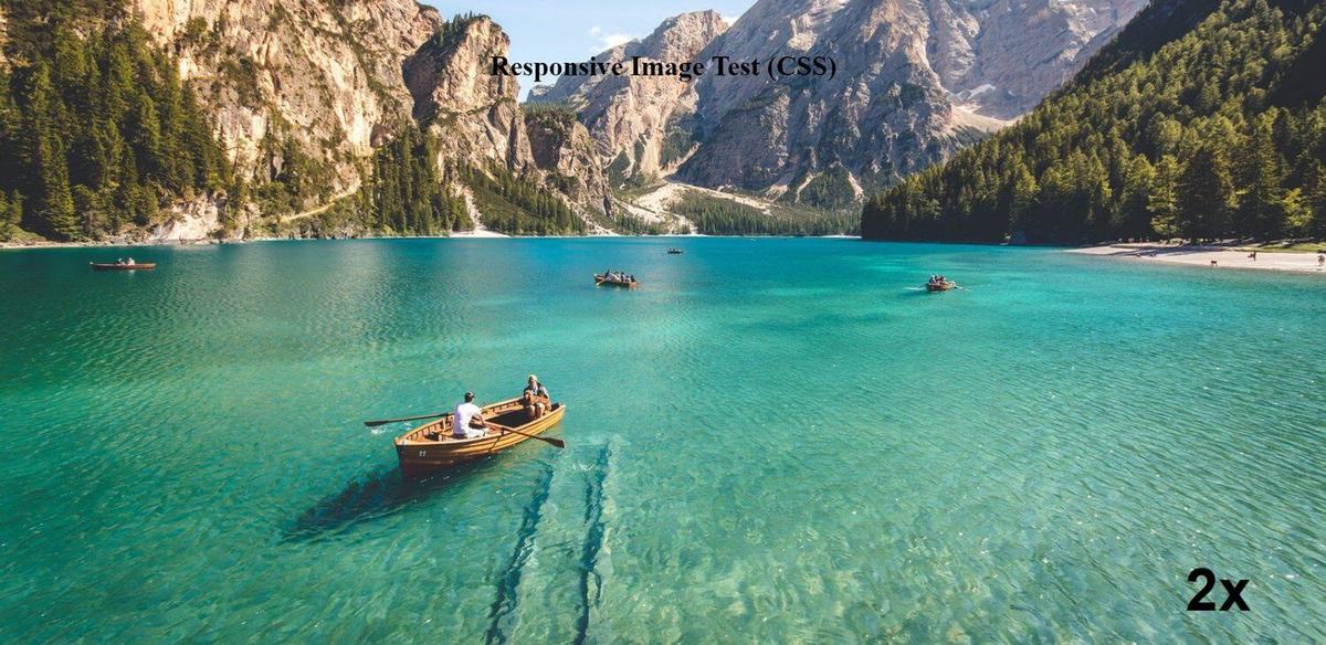
While the semantic <figure> and <figcaption> tags are not required to serve responsive images, they can help with accessibility, and figcaption also improves searchability:
<figure>
  <img src="images/lake.jpg" alt="Lake" />
  <figcaption>Lake, mountains, boats</figcaption>
</figure>
Here's what it looks like on the frontend:
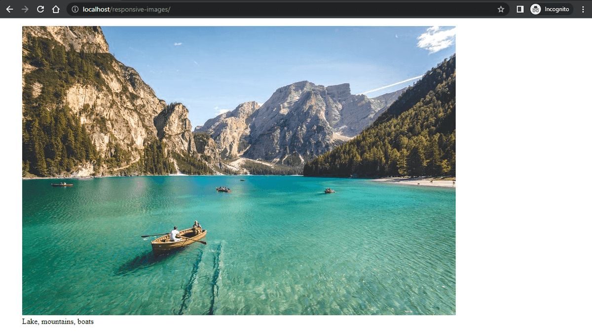 Credit: The photo used in the code examples is authored by Pietro de Grandi (Unsplash)
Sizing Hints
Sizing hints are the optional width and height attributes of the <img> element.
They inform the browser about the size of an image so that it can pre-calculate the layout before the image is loaded:
<img src="images/lake.jpg" alt="Lake" width="900" height="600" />
Sizing hints can improve CLS (Cumulative Layout Shift) scores as they reduce the amount of unexpected layout shifts.
The srcset Attribute
The srcset attribute allows you to define a source set of responsive images so that the browser of each user can choose the best match.
When implementing responsive images in HTML, you can use srcset within two HTML tags:
<img>– this is the basic use case; it lets you add the same graphics in different sizes.<source>– this is the advanced use case; it lets you add image sources that are different either in graphics or format (or both).
First, let's see the basic use case.
Basic Use Case: srcset within the <img> Element
When used within the <img> element, the srcset attribute is optional. You can use it to add the same image in different sizes to support various devices, viewports, and other media conditions.
There are two ways to define the srcset attribute within the <img> tag:
- with x-descriptors, which target pixel density (hardware pixels)
- with w-descriptors, which primarily target viewport width (software pixels), but also take pixel density into consideration
Note that you can't use x- and w-descriptors in the same srcset attribute, as both will be ignored by the browser:
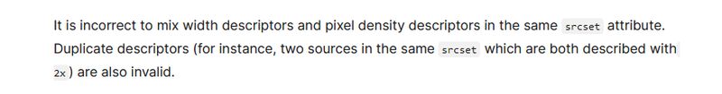 Image source: MDN Web Docs
X-descriptors
X-descriptors allow you to serve responsive images for devices with various device pixel ratios (DPR). They make it possible to support high-resolution screens in HTML. They are sometimes also referred to as pixel density descriptors ('x' refers to 'piXel').
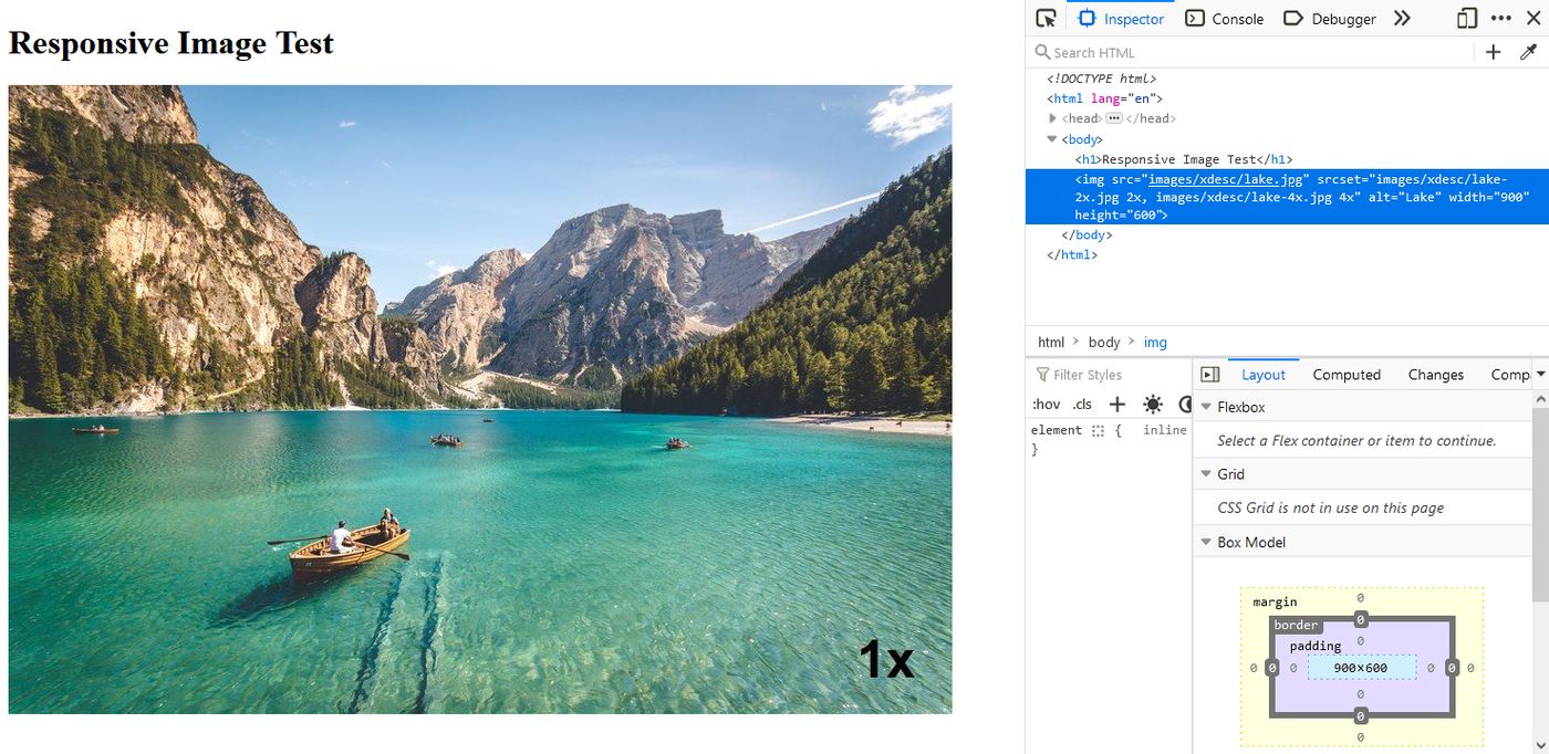
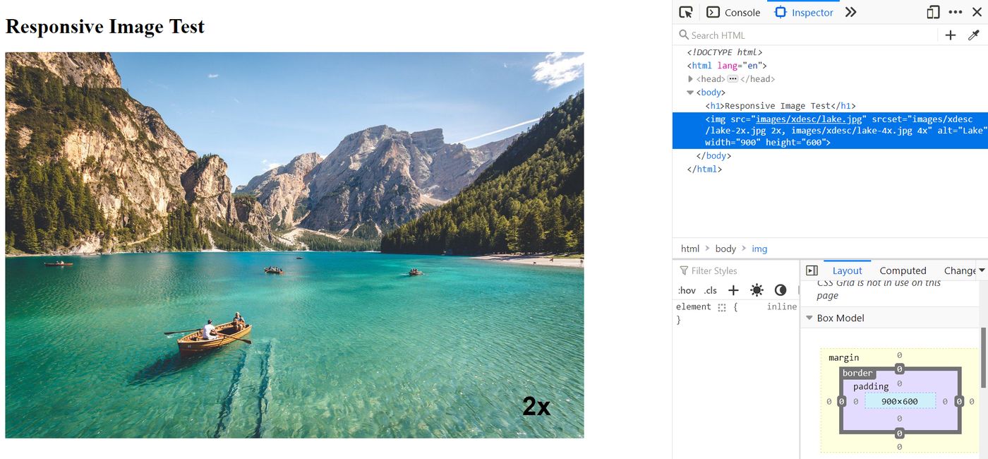
The following code example defines three image source files (1x, 2x, and 4x) for devices with DPRs of 1, 2, and 4:
<!-- Shorthand notation -->
<img
  src="images/xdesc/lake.jpg"
  srcset="images/xdesc/lake-2x.jpg 2x, images/xdesc/lake-4x.jpg 4x"
  alt="Lake"
  width="900"
  height="600"
/>
In this example, the browser will use lake.jpg as the 1x image source, as no 1x descriptor is specified in the srcset attribute. Essentially, it's the shorthand for the following code snippet where the 1x source is added to srcset and the src attribute defines the default image and the fallback for browsers that don't support srcset:
<!-- Longhand notation -->
<img
  src="images/xdesc/lake.jpg"
  srcset="
    images/xdesc/lake.jpg    1x,
    images/xdesc/lake-2x.jpg 2x,
    images/xdesc/lake-4x.jpg 4x
  "
  alt="Lake"
  width="900"
  height="600"
/>
To implement this example, you need to prepare the source files in the following sizes:
| Width (px) | Height (px) | |
|---|---|---|
| lake.jpg | 900 | 600 |
| lake-2x.jpg | 1800 | 1200 |
| lake-4x.jpg | 3600 | 2400 |
Despite having different sizes, each image version will appear in the same dimension (900x600) on the screen, but the 2x and 4x images will look sharper.
Below, you can see the test results of the above code example.
On our 1x display, the browser rendered the smallest image (900x600) in the dimensions defined by the sizing hints (900x600):
Then, on our 2x display, the browser rendered the medium-sized image (1800x1200) in the same dimensions as above (900x600 — see the '2x' annotation in the bottom right corner of the image (added to the image manually to facilitate testing):
W-descriptors and the sizes Attribute
W-descriptors describe the width of the source images ('w' refers to 'Width') and primarily target software pixels.
However, when browsers evaluate width descriptors, they also take DPR into consideration. See this article by Chris Coyier for further explanation (it's an older post, but it still applies).
If you use the srcset attribute with w-descriptors, you must use it together with the sizes attribute (otherwise it won't work).
The sizes attribute defines the width of the image location on the screen where the image will be rendered. It's required because the browser can only pick the best match if it knows in advance how much space the image will take up. Its value can be specified in font-relative (e.g. em, rem, ex) and absolute (e.g. px, pt) CSS length units or by using the vw (viewport width) unit, but not as a percentage (%) of the container size.
Let's see an example:
<img
  src="images/wdesc/lake-lg.jpg"
  srcset="
    images/wdesc/lake-sm.jpg  300w,
    images/wdesc/lake-md.jpg  600w,
    images/wdesc/lake-lg.jpg  900w,
    images/wdesc/lake-xl.jpg 1200w
  "
  sizes="60vw"
  alt="Lake"
  style="aspect-ratio: 3 / 2;"
/>
Here, the <img> element:
- defines four image sources
- the w-descriptors describe the width of the source images (e.g.
300wmeans that lake-sm.jpg has a width of 300px) - the
sizesattribute defines that the image will take up 60% of the viewport width (60vw)
By evaluating the srcset and sizes attributes, the browser of each user will request and download the best-fitting image.
For example, on a 1024px viewport of a 1x display, 60vw is 614.4px, so the best match will be lake-lg.jpg (lake-md.jpg is still too small for this viewport width, as the browser has to fill an image location that has a width of 614.4px). On a 2x display, however, the browser will pick lake-xl.jpg for a 1024px viewport as when using w-descriptors, it also takes DPR into consideration, so it has to fill an image location with a width of 1,228.8px.
When using w-descriptors, you'll need to add the default image (lake-lg.jpg) to both the src and srcset attributes (if you don't add it to srcset, the browser will simply omit it) — here, you can't use shorthand like in the case of x-descriptors.
Note that it's not recommended to combine the width and height attributes with w-descriptors, as these attributes have a higher priority than the sizes attribute in the rendering process. As a result, the browser would still select and download the most appropriate image option defined by srcset but render it at the dimensions specified by width and height. This can result in a blurred image or a layout different from the one specified by the sizes attribute.
As a workaround, you can add the aspect-ratio CSS property as an inline style to the <img> element to let the browser know how much space it needs to allocate for the image, to prevent unexpected layout shifts when the image is painted to the screen.
For the code example above, you need to prepare the responsive images in the following dimensions:
| Width (px) | Height (px) | Belonging w-descriptor | |
|---|---|---|---|
| lake-sm.jpg | 300 | 200 | 300w |
| lake-md.jpg | 600 | 400 | 600w |
| lake-lg.jpg | 900 | 600 | 900w |
| lake-xl.jpg | 1200 | 800 | 1200w |
Here's a screencast of the above code. As you can see, smaller and smaller image files appear on the screen as the viewport is shrinking, but the image itself always takes up 60% of the viewport width:
You can also add media conditions to sizes if you want. For example:
<img
  src="images/wdesc/lake-lg.jpg"
  srcset="
    images/wdesc/lake-sm.jpg  300w,
    images/wdesc/lake-md.jpg  600w,
    images/wdesc/lake-lg.jpg  900w,
    images/wdesc/lake-xl.jpg 1200w
  "
  sizes="(max-width: 640px) 100vw,
    (max-width: 960px) 80vw,
    60vw"
  alt="Lake"
  style="aspect-ratio: 3 / 2;"
/>
Here's the breakdown of the values of the sizes attribute:
- on viewports smaller or equal to 640px, the image will take up 100% of the viewport width
- on viewports between 640.00001 and 960 pixels, the image will take up 80% of the viewport width
- on viewports larger than 960 pixels, the image will take up 60% of the viewport width
In the screencast below, you can see that the layout changes at the two breakpoints defined by the media conditions (960 and 640px), and the browser always chooses the best-matching image by evaluating both the available image sources and the layout defined by the sizes attribute:
Advanced Use Case: srcset within the <source> Element
The <source> element makes it possible to list alternative image sources that are different in image content or format.
It can be the child element of one of the following wrapper elements:
<picture>– defines alternative image sources<audio>– defines alternative audio sources<video>– defines alternative video sources
In this article, we'll only discuss when <source> is used within the <picture> element.
The semantic <picture> element serves as a wrapper for a number of <source> elements and an <img> tag which defines the default image file.
There are three ways to define <source> elements inside <picture>:
- with the
mediaattribute - with the
typeattribute - with both the
mediaandtypeattributes
The srcset attribute is required in all three cases.
The <source> Element with the media Attribute
The media attribute allows you to target various media conditions — for example, you can display non-identical graphics on different viewports (also known as the art direction problem).
A typical scenario is when you want to show a more detailed image on large screens:
 Then, you crop it a bit for medium-sized screens:
 Finally, you crop it once more and show a vertical close-up image on small screens:

(However, note that the <picture> tag can hold completely different graphics as well, e.g. you could show a different landscape on mobile).
Here's what the code for the example above looks like — you can add sizing hints to each <source> element to help the browser pre-calculate the layout in each case:
<picture>
  <source
    srcset="images/art-direction/lake-with-mountains.jpg"
    media="(min-width: 1280px)"
    width="1200"
    height="800"
  />
  <source
    srcset="images/art-direction/lake-without-mountains.jpg"
    media="(min-width: 640px) and (max-width: 1279px)"
    width="900"
    height="600"
  />
  <img
    src="images/art-direction/only-a-boat.jpg"
    alt="Lake"
    width="450"
    height="800"
  />
</picture>
In this example, each <source> tag includes just one source image, however the srcset attribute can hold more than one source image (we'll see another code snippet below).
Here's the screencast that shows how the browser picks the best-matching image file:
You can also use x- and w-descriptors within the srcset attributes if you want to. In the example below, I added 2x images for each art direction to support Retina screens:
<picture>
  <source
    srcset="
      images/art-direction/lake-with-mountains.jpg    1x,
      images/art-direction/lake-with-mountains-2x.jpg 2x
    "
    media="(min-width: 1280px)"
    width="1200"
    height="800"
  />

  <source
    srcset="
      images/art-direction/lake-without-mountains.jpg    1x,
      images/art-direction/lake-without-mountains-2x.jpg 2x
    "
    media="(min-width: 640px) and (max-width: 1279px)"
    width="900"
    height="600"
  />

  <img
    src="images/art-direction/only-a-boat.jpg"
    srcset="images/art-direction/only-a-boat-2x.jpg 2x"
    alt="Lake"
    width="450"
    height="800"
  />
</picture>
To provide images for this code, you need to prepare the files in the following sizes:
| Width (px) | Height (px) | |
|---|---|---|
| lake-with-mountains.jpg | 1200 | 800 |
| lake-with-mountains-2x.jpg | 2400 | 1600 |
| lake-without-mountains.jpg | 900 | 600 |
| lake-without-mountains-2x.jpg | 1800 | 1200 |
| only-a-boat.jpg | 450 | 800 |
| only-a-boat-2x.jpg | 900 | 1600 |
Here's a short video about what it looks like on a 2x display (on the 1x display, it's the same as in the previous screencast):
You could also use w-descriptors in the <source> tag, but in this case, you'll target media conditions twice. If this still makes sense in your scenario, note that:
- You need to add the
sizesattribute, otherwise the w-descriptors won't work. - You'll need to remove the
widthandheightattributes, as they don't work together withsizes.
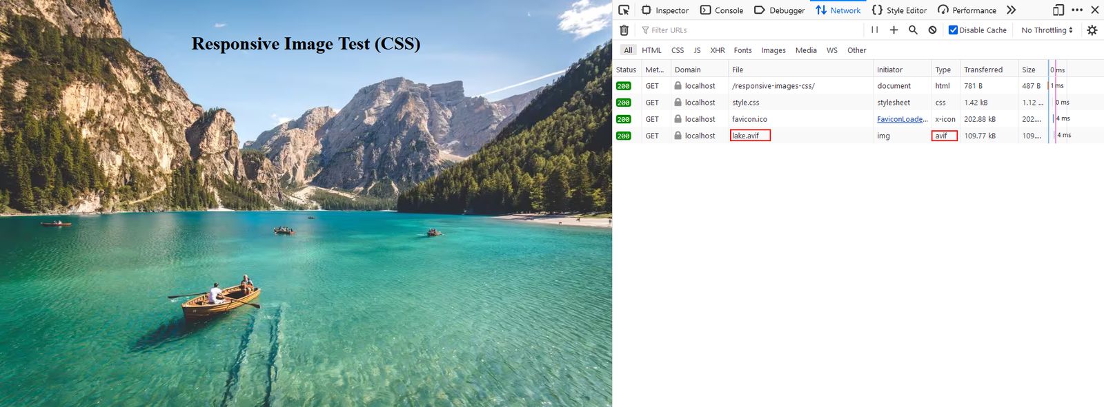
The <source> Element with the type Attribute
You can also use the <source> tag with the type attribute to support different media types (also known as MIME types). MIME types primarily refer to the file format, but in some cases, you can define other parameters as well (e.g. target different codecs for audio and video files).
When speaking of responsive images, the biggest benefit of the type attribute is that you can add alternative image sources in next-generation image formats. This frequently (but not always) comes with some performance gain. To learn more on the subject, check out our article on modern image formats that addresses the performance question in detail.
You can use the Squoosh app by Google Chrome Labs to convert your images to next-gen image formats.
The code example below lists the same image in three different formats: JPG, WebP, and AVIF:
<picture>
  <source srcset="images/mime-types/lake.avif" type="image/avif" />

  <source srcset="images/mime-types/lake.webp" type="image/webp" />

  <img src="images/mime-types/lake.jpg" alt="Lake" width="1200" height="800" />
</picture>
As AVIF is a newer format than WebP, it comes with poorer browser support, but it's usually more lightweight. As a result, it makes sense to add it first so that the browser can start by checking if it supports this file format before moving on to WebP, then JPG.
The <source> Element with Both the media and type Attributes
Finally, you can combine the media and type attributes in the following way to address both media conditions and supported MIME types:
<picture>
  <source
    srcset="images/combined/lake-with-mountains.webp"
    media="(min-width: 1280px)"
    type="image/webp"
    width="1200"
    height="800"
  />

  <source
    srcset="images/combined/lake-with-mountains.jpg"
    media="(min-width: 1280px)"
    type="image/jpeg"
    width="1200"
    height="800"
  />

  <source
    srcset="images/combined/lake-without-mountains.webp"
    media="(min-width: 640px) and (max-width: 1279px)"
    type="image/webp"
    width="900"
    height="600"
  />

  <source
    srcset="images/combined/lake-without-mountains.jpg"
    media="(min-width: 640px) and (max-width: 1279px)"
    type="image/jpeg"
    width="900"
    height="600"
  />

  <source
    srcset="images/combined/only-a-boat.webp"
    type="image/webp"
    width="450"
    height="800"
  />

  <img
    src="images/combined/only-a-boat.jpg"
    alt="Lake"
    width="450"
    height="800"
  />
</picture>
Of course, the responsive image code can be even more complex — for example, you could use x-descriptors in one or all of the srcset attributes above to support high-density displays.
CSS Syntax for Responsive Background Images
While in most cases, you'll add responsive images in HTML, there's an important exception: responsive background images.
Traditionally, you had to use media queries to show different background images on smaller and larger screens. However, nowadays you have access to the image-set() CSS function that makes it possible to target device pixel ratio and supported MIME types.
Let's see how it works.
The image-set() function
The image-set() CSS function allows you to list multiple alternative sources for background images. You can use it from within the background-image property.
As browser support is still somewhat patchy, it's recommended that you also add the -webkit- vendor prefix for older Webkit-based browsers.
There are two use cases of image-set():
- You can use it together with x-descriptors to support high-density screens.
- You can list next-generation images as alternative sources for a background image.
Using image-set() with x-descriptors
The following code example shows how to use x-descriptors with the image-set() function:
body {
  background-repeat: no-repeat;

  /* Fallback */
  background-image: url("images/xdesc/lake.jpg");

  /* Prefixed */
  background-image: -webkit-image-set(
    url("images/xdesc/lake.jpg") 1x,
    url("images/xdesc/lake-2x.jpg") 2x,
    url("images/xdesc/lake-4x.jpg") 4x
  );

  /* Default */
  background-image: image-set(
    url("images/xdesc/lake.jpg") 1x,
    url("images/xdesc/lake-2x.jpg") 2x,
    url("images/xdesc/lake-4x.jpg") 4x
  );
}
The above code snippet adds:
- first, a fallback for very old browsers
- then, the prefixed version for older Webkit-based browsers
- finally, the default syntax that will be used by modern browsers
Like in the case of responsive images added in HTML, the user's browser will only download one image file — the best-matching one.
For example, on our 2x display, the browser downloaded and showed the 2x image:
Using image-set() with next-gen images
You can list next-generation images as alternative background images with the image-set() function in the following way:
body {
  background-repeat: no-repeat;

  /* Fallback */
  background-image: url("images/mime-types/lake.jpg");

  /* Prefixed */
  background-image: -webkit-image-set(
    url("images/mime-types/lake.avif") type("image/avif"),
    url("images/mime-types/lake.webp") type("image/webp"),
    url("images/mime-types/lake.jpg") type("image/jpeg")
  );

  /* Default */
  background-image: image-set(
    url("images/mime-types/lake.avif") type("image/avif"),
    url("images/mime-types/lake.webp") type("image/webp"),
    url("images/mime-types/lake.jpg") type("image/jpeg")
  );
}
The above code example uses the same logic as the previous one: it first adds the fallback, then the prefixed version for older Webkit-based browsers, and finally the default syntax.
In the screenshot below, you can see that Firefox 114.0.2 downloaded the lightweight AVIF file for the background image:
Monitor Page Speed & Core Web Vitals
DebugBear monitoring includes:
- In-depth Page Speed Reports
- Automated Recommendations
- Real User Analytics Data
Preloading Responsive Images
To improve web performance, you can also use preload hints to preload the most important images on the page — for example, to optimize Largest Contentful Paint.
The imagesrcset attribute of the <link> element makes it possible to preload responsive images. You can use it together with responsive images defined in HTML or CSS.
While browser support for imagesrcset is still patchy, e.g. Safari doesn't support it at all, it's still worth considering, as it can:
- speed up page loads in Chromium-based browsers and Firefox
- improve your LCP scores in Google's CrUX report (measured on Chrome users)
Let's see how it works.
Basic Usage of the imagesrcset Attribute
You can use imagesrcset to preload responsive images defined with x-descriptors. You need to add the <link> tag to the <head> section of the HTML page in the following way:
<link
  rel="preload"
  as="image"
  imagesrcset="images/xdesc/lake.jpg 1x,
    images/xdesc/lake-2x.jpg 2x,
    images/xdesc/lake-4x.jpg 4x"
/>
While in most cases, you need to add the href attribute to the <link> tag, this is not the case when it's used with imagesrcset — here's the explanation from the HTML5 specifications:
"Note how we omit the
hrefattribute, as it would only be relevant for browsers that do not supportimagesrcset, and in those cases it would likely cause the incorrect image to be preloaded."
The imagesrcset takes the same value as the srcset attribute of the corresponding <img> tag:
<img
  src="images/xdesc/lake.jpg"
  srcset="
    images/xdesc/lake.jpg    1x,
    images/xdesc/lake-2x.jpg 2x,
    images/xdesc/lake-4x.jpg 4x
  "
  alt="Lake"
  width="900"
  height="600"
/>
You can use the same <link> syntax to preload background images added with the image-set() function and x-descriptors in CSS. In both cases, the browser will only preload the best-fitting image candidate that it will later use on the page.
Combining the imagesrcset and imagesizes attributes
You can also preload responsive images defined with w-descriptors by using imagesizes together with imagesrcset which takes the same value as the sizes attribute of the corresponding <img> element.
The <link> element goes into the <head> section:
<link
  rel="preload"
  as="image"
  imagesrcset="images/lake-sm.jpg 300w,
    images/lake-md.jpg 600w,
    images/lake-lg.jpg 900w,
    images/lake-xl.jpg 1200w"
  imagesizes="(max-width: 640px) 100vw,
    (max-width: 960px) 80vw,
    60vw"
/>
And the corresponding <img> tag goes into the <body> element of the same HTML page:
<img
  src="images/wdesc/lake-lg.jpg"
  srcset="
    images/wdesc/lake-sm.jpg  300w,
    images/wdesc/lake-md.jpg  600w,
    images/wdesc/lake-lg.jpg  900w,
    images/wdesc/lake-xl.jpg 1200w
  "
  sizes="(max-width: 640px) 100vw,
    (max-width: 960px) 80vw,
    60vw"
  alt="Lake"
/>
Combining the imagesrcset and media Attributes
To preload the <picture> element that holds responsive images defined with the media attribute to support different art directions, you can use imagesrcset together with the media attribute.
You need to add a <link> tag for each <source> element in the following way:
<link
  rel="preload"
  as="image"
  imagesrcset="images/art-direction/only-a-boat.jpg"
  media="(max-width: 639px)"
/>

<link
  rel="preload"
  as="image"
  imagesrcset="images/art-direction/lake-without-mountains.jpg"
  media="(min-width: 640px)"
/>

<link
  rel="preload"
  as="image"
  imagesrcset="images/art-direction/lake-with-mountains.jpg"
  media="(min-width: 1280px)"
/>
As you can see, the media attributes of the <link> elements take the same value as the media attributes of the <source> tags.
However, you also need to create a media attribute for the default image defined with the <img> tag. Here, use a value that complements the other media attributes, which is (max-width: 639px) in this example.
<picture>
  <source
    srcset="images/art-direction/lake-with-mountains.jpg"
    media="(min-width: 1280px)"
    width="1200"
    height="800"
  />

  <source
    srcset="images/art-direction/lake-without-mountains.jpg"
    media="(min-width: 640px) and (max-width: 1279px)"
    width="900"
    height="600"
  />

  <img
    src="images/art-direction/only-a-boat.jpg"
    alt="Lake"
    width="450"
    height="800"
  />
</picture>
You Can't Preload Responsive Images Defined with the type Attribute
As the <link> element doesn't support the type attribute, you can't preload responsive image sources that differ in MIME type, e.g. next-generation images.
If you have an important <picture> tag that defines image sources with the type attribute, you can still inform the browser about its high priority by using priority hints.
The Improve Image Delivery audit in Lighthouse
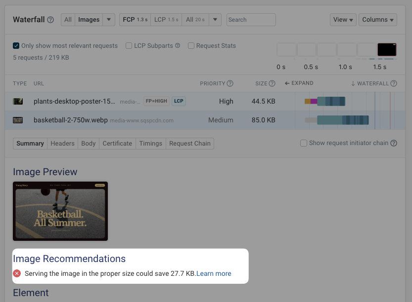
When you use Lighthouse, whether that's through the Chrome DevTools or on PageSpeed Insights, you can view a number of audits and recommendations for your page. One of those audits is the Improve image delivery audit.

This audit detects images that are larger than necessary and recommends resizing them or serving them in a modern format. The audit lists images that benefit from this recommendation, along with the potential size savings in kilobytes.
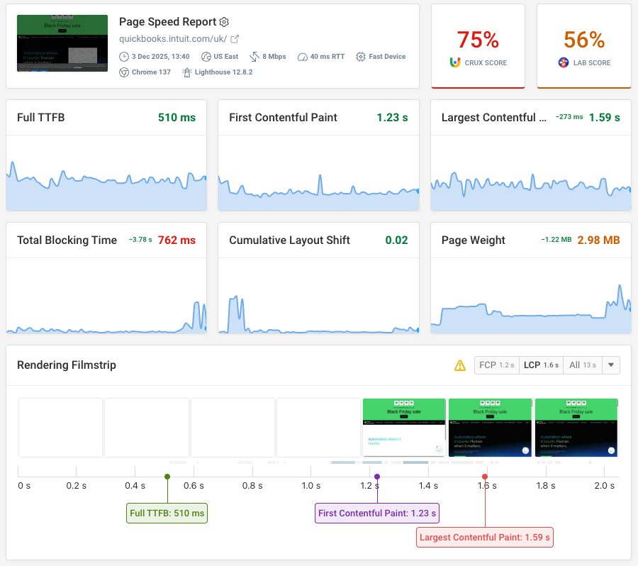
The DebugBear page speed test can also highlight images that are not served at an optimal size:
Pros and Cons of Responsive Images
Responsive images have both advantages and disadvantages. It's important to consider the trade-off between the pros and cons before implementing them on your website.
Advantages of Responsive Images
- Lower total image weight – If the responsive image syntax is well-thought-out and properly tested, the browser will download more lightweight images for some or all of the image locations on the page.
- Better Largest Contentful Paint (LCP) scores – If the images are smaller in size, the largest content element will load faster, which will result in improved Core Web Vitals metrics.
- Better-looking websites – For example, you can provide high-resolution images for Retina displays.
- Extra design options – For example, you can show a close-up photo on small screens and a panorama photo on large screens.
Disadvantages of Responsive Images
- Increased complexity – If you get the responsive image syntax wrong, the browser might load the wrong image, so it can either be unnecessarily large or show up pixelated. Plus, you'll need to provide all the different image versions, which can be a lot of work unless you have an automated image optimization solution.
- Larger HTML/CSS files – If you add lengthy syntax to each image element, your code files may end up heavier, which may increase page load times. We covered this performance issue in detail in this post — however, note that this is an edge case that doesn't happen frequently.
- More storage space is needed – To store several versions of each image, you'll need more server space.
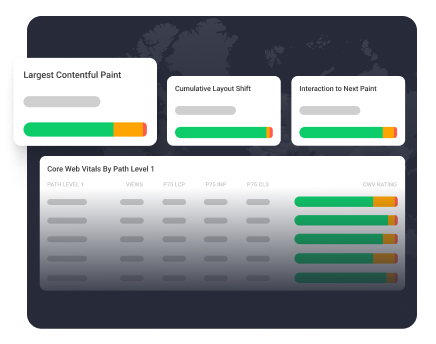
Monitoring Responsive Images with DebugBear
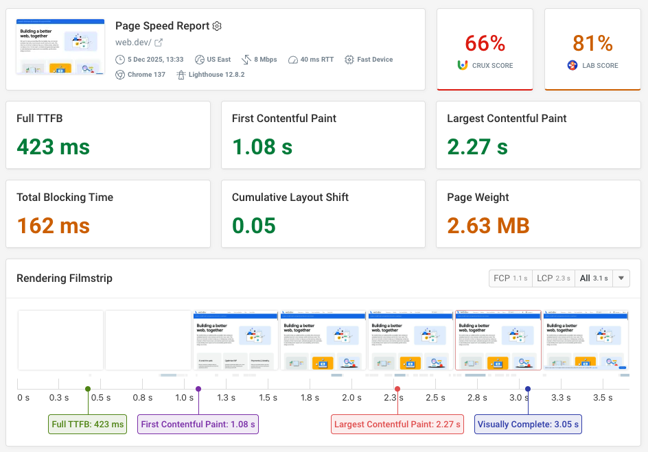
If you want to monitor the performance of responsive images on your website, you can use DebugBear's real user monitoring feature. DebugBear shows you an aggregated view of the slowest type of LCP images on your site, as experienced by your real users:
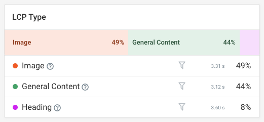
You can also use the Optimize tab for a guided walkthrough of the images that need optimization, including responsive images.
The Optimize tab narrows down individual page views that include slow images so you can quickly dive in and understand what's wrong with the LCP image.
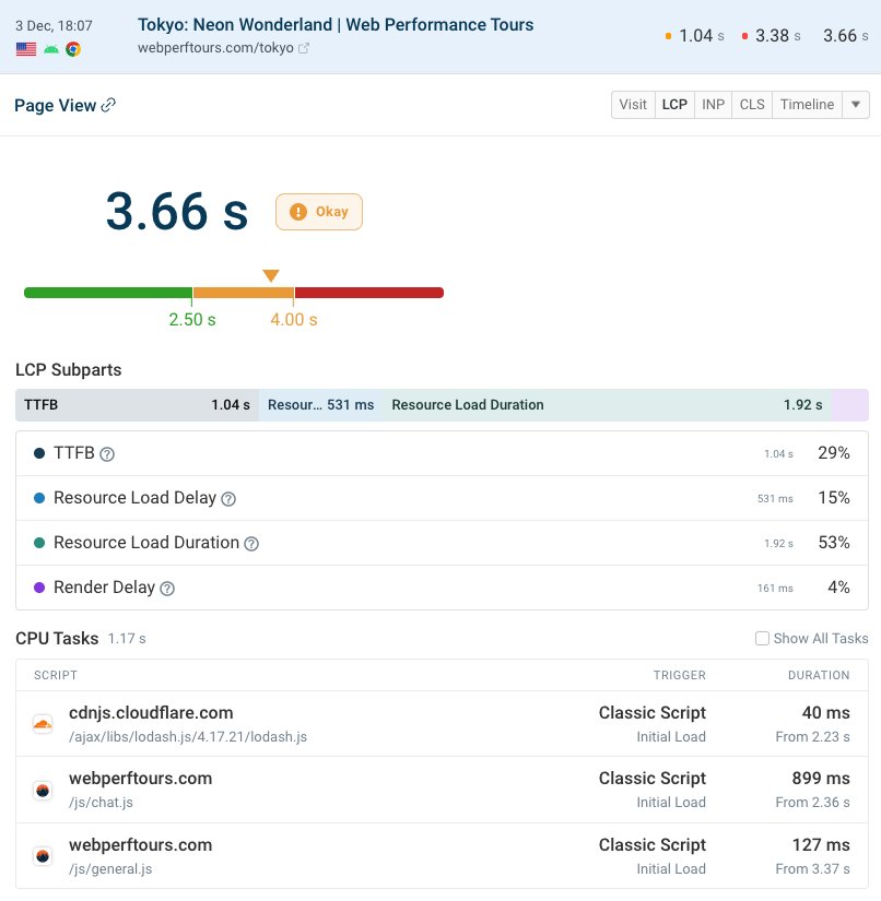
The following screenshot shows a resource that has a high LCP score because it took long to download (i.e., Resource Load Duration is 53%), which suggests that the image is too large and unoptimized:
Wrapping Up
In this article, we looked into how to implement responsive images on the web.
Responsive images can significantly improve web performance, especially on image-heavy websites, but only if you know what you're doing.
If you don't want to implement responsive images manually, you can also use an image CDN such as Cloudinary that automates the entire process of preparing the source images and adding the syntax.
You can also use a performance analysis tool such as DebugBear to measure and monitor image performance so that if there are any issues, you can fix them before they affect your users.
With DebugBear, you can measure performance both on real users and in simulated environments, track Core Web Vitals, test different scenarios, and more.
To get detailed insights about your site's web performance and identify your most pressing issues, sign up for a free 14-day trial that gives you access to the full DebugBear functionality (no credit card required)!
Monitor Page Speed & Core Web Vitals
DebugBear monitoring includes:
- In-depth Page Speed Reports
- Automated Recommendations
- Real User Analytics Data