We have added two new charts to custom dashboards, as well as a DebugBear MCP server.
New Custom Dashboard charts
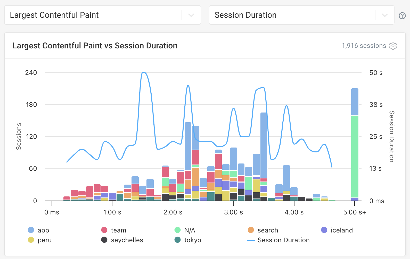
This month we added two new chart options to our custom dashboards feature: histograms and scatter plots.
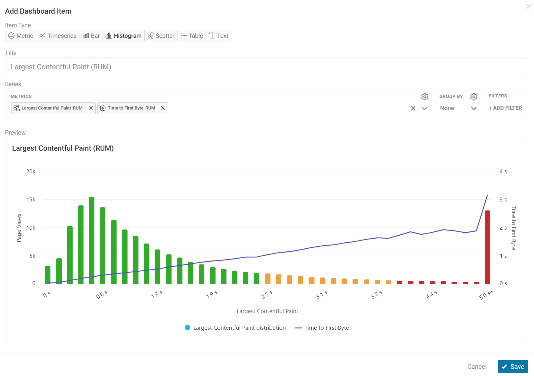
Histogram
Histograms show how a metric is distributed across a dataset, making it easy to identify patterns and outliers.
You can add additional metrics to explore how they relate to the primary metric and uncover potential correlations. For example, in this histogram we can see the TTFB trendline spike for the lowest LCP experiences.
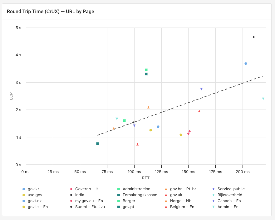
Scatter plot
Scatter charts plot two metrics against each other to reveal relationships and correlations in your data. Each point in the chart represents a data group.
A trendline can be enabled that summarizes the overall relationship between the data points, making it easier to see the direction and strength of the correlation.
Group by options
Histograms on custom dashboards and in RUM suppart a group by option, allowing you to break data down by category. For example, you can group data by domain, device type, or INP script.
DebugBear MCP Server
DebugBear now provides a Model Context Protocol (MCP) server, making it easy to access DebugBear directly through your preferred AI tool.
The MCP server supports the same functionality existing API, allowing you to create projects, configure page monitoring, run performance tests and much more. Enabling the server can make analyzing project data easier, as well as automating bulk changes to save time.
You can use AI tools like Claude, ChatGPT, Gemini, or Cursor to connect to the MCP server.
New Articles
- How Does Indaru Ecometrics Calculate Website Carbon Footprint?: A look at how websites emit carbon and how to estimate this figure with the Indaru plugin.
- What's The Fastest Train Booking Website In Europe?: An analysis of 25 European train booking websites to see which country performs the best across Core Web Vitals.
- WebMCP: Optimize Your Website for AI Agents: A full guide on optimizing your website for AI agents and what the future holds for WebMCP.
- What's The Fastest Post Office Website In Europe?: As Post Offices shift their pricing strategies to offer online discounts, we review how they perform across Core Web Vitals.
Web performance videos
- How to scan your website for performance and quality issues: Learn how to check your entire website for problems with agentic browsing.