
A website can load quickly, pass performance audits, and still feel frustratingly slow on mobile devices.
This is one of the most common problems in modern web development. Teams often optimize their sites under ideal conditions—fast Wi-Fi, powerful hardware, and desktop-first assumptions. Meanwhile, real users browse on mid-range phones, unstable networks, and touch-based interfaces, where even small inefficiencies become painfully obvious.
To understand why this happens, we need to look at raw loading times but also focus on how users actually experience performance on mobile.
Mobile devices present more performance challenges
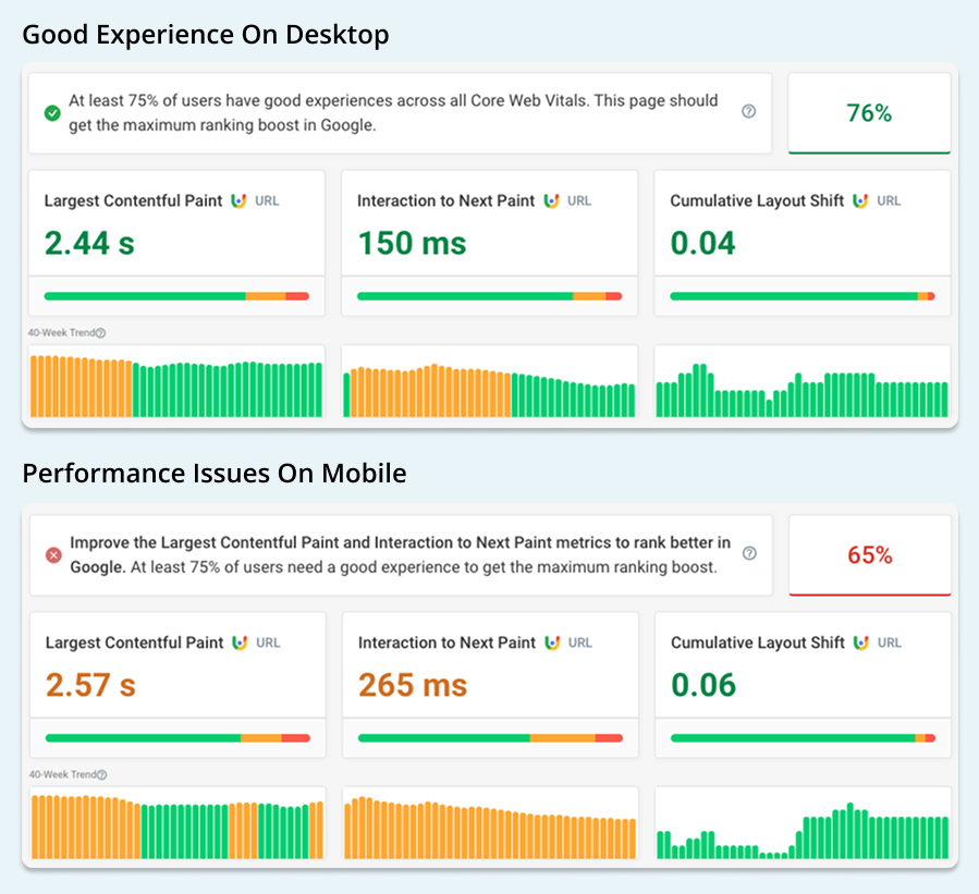
When looking at real visitor data, it's easy to see that mobile visitors have a slower experience than desktop users. We can use data from Google's Chrome User Experience Report to see how experience differs between device types.
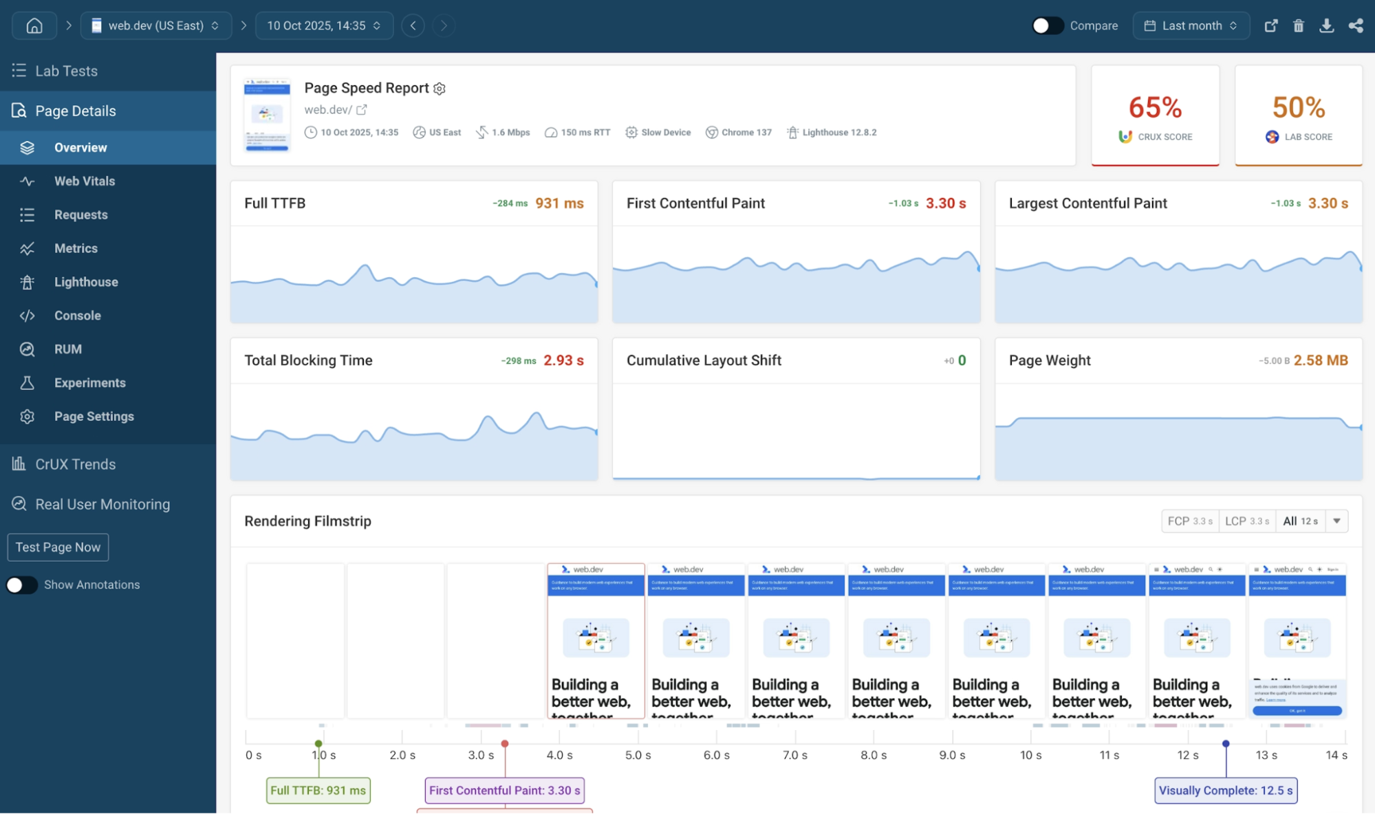
The screenshots below come from the free DebugBear website speed test. The CrUX data shows that the website is passing the Core Web Vitals assessment for desktop users, but is failing it on mobile.
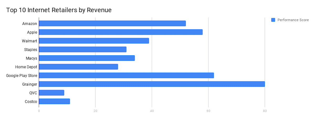
Mobile Lighthouse Performance score for big companies
Let's also look at the Lighthouse performance score. Even big companies such as Amazon, Apple, Walmart or Google Play, can have a poor mobile performance score, as indicated on the chart below.
Does it mean then that we do not need to care about performance at all? No! We should observe it and try to optimize it at all times but also keep in mind that sometimes we won’t be able to improve it further.
Let’s take a look at the comparison between mobile and desktop versions of apple.com:
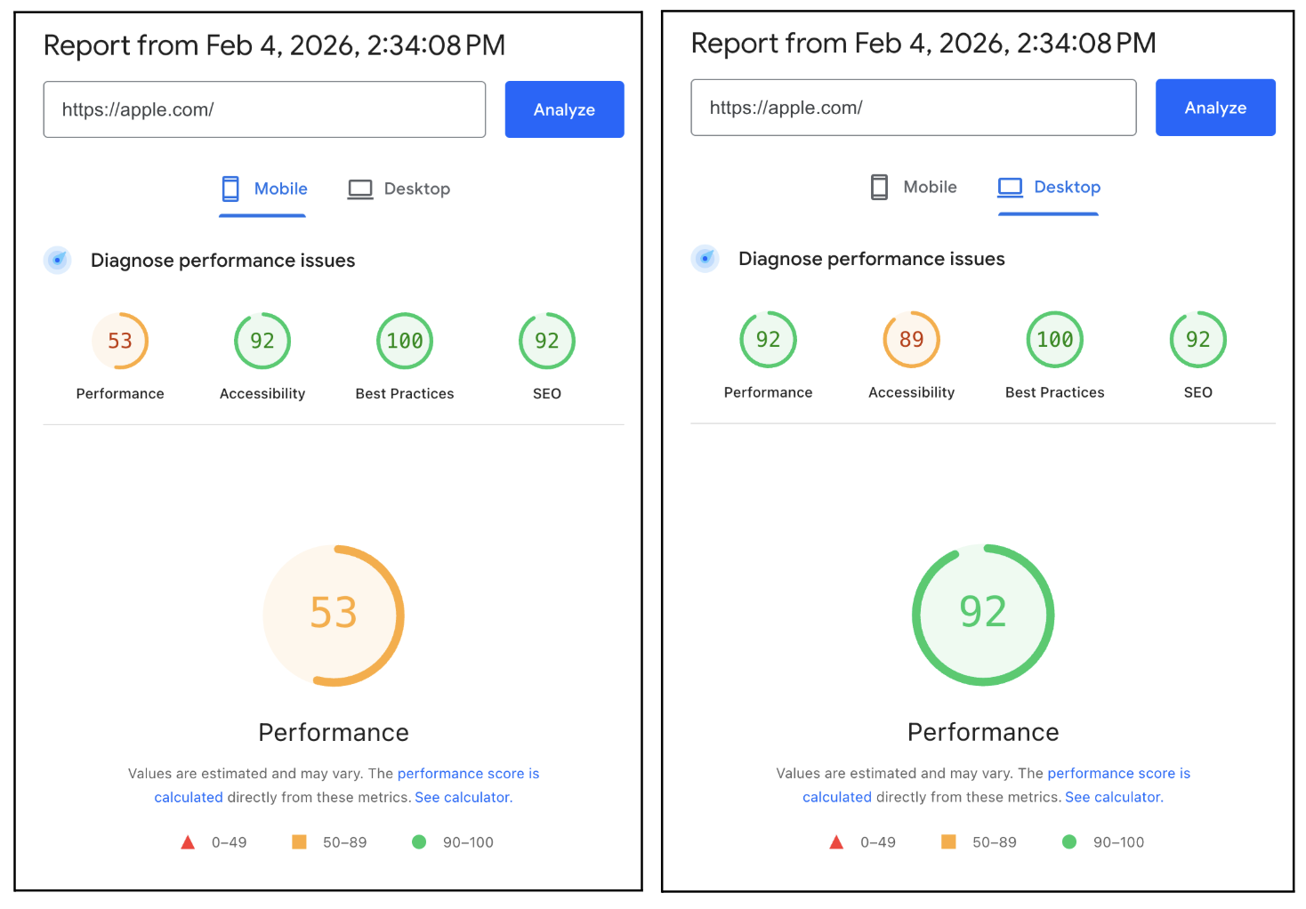
We can clearly see that even though it is the same website, the performance scores differ between the device types.
Even though the Apple.com website might seem slow (due to the low Lighthouse Performance score), if we inspect the Core Web Vitals on PageSpeed Insights we can see that for real mobile users it passes the Core Web Vitals Assessment:
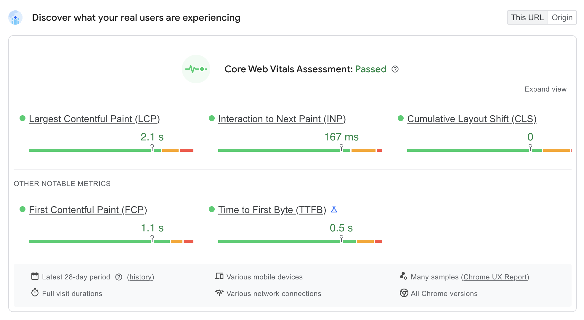
All metrics have a correct (green) value, which means that for real users accessing this website, the experience is that it performs well. Amazon shows the same result, with a mobile Performance score of 56 while Core Web Vitals Assessment is passed.
That is exactly why we need to look at both Lab (Lighthouse) and Field (Core Web Vitals) data to improve the performance of our website. Lighthouse provides detailed insight into specific performance issues, while real user data shows how often visitors are actually impacted.
Combining this knowledge with auditing both mobile and desktop gives us a better understanding of the performance and experience of our website.
What causes performance issues on mobile?
Mobile devices operate under far tighter constraints than desktops. For example, they have:
- Less processing power
- Limited memory
- Slower or less reliable network connections
Even mid-range modern smartphones struggle with tasks that desktops handle effortlessly, such as executing large JavaScript bundles or decoding high-resolution images.
On top of that, mobile interaction relies on touch. When a user taps a button and nothing happens immediately, the site feels broken—even if it’s only delayed by a few hundred milliseconds. These constraints mean that performance issues surface faster and feel more severe on mobile than on desktop.
Performance tools measure when resources finish loading. Users measure when a page becomes useful.
A page may technically be loaded, but still feel slow if:
- The main content appears late
- The layout shifts while loading
- Taps and scrolls don’t respond immediately
This gap between technical speed and perceived speed is especially important on mobile. Optimizing for perceived performance means prioritizing what users see and interact with first—not just minimizing total load time.
How to fix common mobile web performance problems
Heavy Images and Media Assets
Images are one of the most common causes of poor mobile performance.
A frequent mistake is serving the same large image to every device, regardless of screen size.
<img src="/images/hero-2000px.jpg" alt="Hero image" />
On mobile, this forces users to download a large file they don’t need. The result is slower rendering and worse Largest Contentful Paint (LCP).
To solve this, we should deliver optimized and responsive images like this:
<img
  src="/images/hero-800.webp"
  srcset="
    /images/hero-400.webp   400w,
    /images/hero-800.webp   800w,
    /images/hero-1600.webp 1600w
  "
  sizes="(max-width: 768px) 100vw, 50vw"
  loading="lazy"
  alt="Hero image"
/>
By serving appropriately sized images in modern formats and deferring offscreen images, mobile devices download less data and render content faster. This directly improves both perceived speed and Core Web Vitals.
If you're using a JavaScript framework, check out our articles on Next.js image optimization or Nuxt performance to learn about framework-specific techniques.
Excessive JavaScript Execution
JavaScript is one of the biggest reasons a page looks ready but feels unresponsive.
Mobile devices pay a high cost for parsing and executing JavaScript. Large bundles block the main thread, delaying user interactions like scrolling and tapping.
<script src="/vendor.js"></script>
<script src="/analytics.js"></script>
<script src="/animations.js"></script>
<script src="/app.js"></script>
All scripts execute immediately, blocking rendering and input handling. Instead, we should defer scripts that don't need to block other content:
<script src="/vendor.js" defer></script>
<script src="/app.js" defer></script>
<script src="/analytics.js" async></script>
Using defer and async allows the browser to prioritize initial content rendering and user interaction, making the page feel responsive much sooner—especially on mobile.
Of course, beyond shifting when scripts run, it's also worth reducing JavaScript execution time throughout the lifetime of the page.
Content Prioritization and Render Blocking
Another common issue is loading everything at once, regardless of importance.
<link rel="stylesheet" href="/styles.css" />
<link rel="stylesheet" href="/animations.css" />
<link rel="stylesheet" href="/carousel.css" />
All styles block rendering, delaying the first visible content. Instead, we can load critical CSS first:
<style>
  body {
    margin: 0;
    font-family: system-ui;
  }
  .hero {
    padding: 2rem;
  }
</style>

<link rel="stylesheet" href="/styles.css" />
<link
  rel="stylesheet"
  href="/animations.css"
  media="print"
  onload="this.media='all'"
/>
By prioritizing above-the-fold styles, users see meaningful content faster—even if the rest of the page continues loading in the background. You can also use this great project by Daniel Roe called Beasties that will help you inline the critical CSS.
Third-Party Scripts and Their Hidden Cost
Third-party scripts are easy to add but expensive to run, especially on mobile.
<script src="https://chat.example.com/widget.js"></script>
<script src="https://analytics.example.com/track.js"></script>
<script src="https://heatmap.example.com/hm.js"></script>
Each script adds network requests and JavaScript execution, increasing input delay. If possible, we should load them when the browser is idle to not slow down the application for users:
requestIdleCallback(() => {
  const script = document.createElement("script");
  script.src = "https://chat.example.com/widget.js";
  document.body.appendChild(script);
});
Deferring non-essential scripts ensures that critical UI remains responsive on mobile.
Layout Shifts and Visual Stability
Layout shifts are especially disruptive on small screens. The following code has no reserved space for the image:
<img src="/banner.jpg" alt="Banner" />
This causes content to jump when the image loads. Instead, we should set explicit dimensions like the following:
<img src="/banner.jpg" width="1200" height="600" alt="Banner" />
Reserving space upfront prevents layout shifts and improves Cumulative Layout Shift (CLS).
Why Desktop Testing Isn’t Enough
Desktop performance testing often hides real mobile problems. Tests run on fast hardware and stable networks don’t reflect how users actually experience your site.
To get realistic results, test with:
- Mobile throttling in Lighthouse
- CPU and network throttling in DevTools
- Real devices whenever possible
Mobile Web Performance Testing with DebugBear
Use DebugBear to track mobile page speed and Core Web Vitals, run scheduled tests, check Google SEO data, and measure real user visits.
Test on 3G or 4G connections, and run tests on slow mobile CPUs and from locations around the world to see how your website performs globally.
Get custom page speed recommendations that go beyond Google's Lighthouse tool.
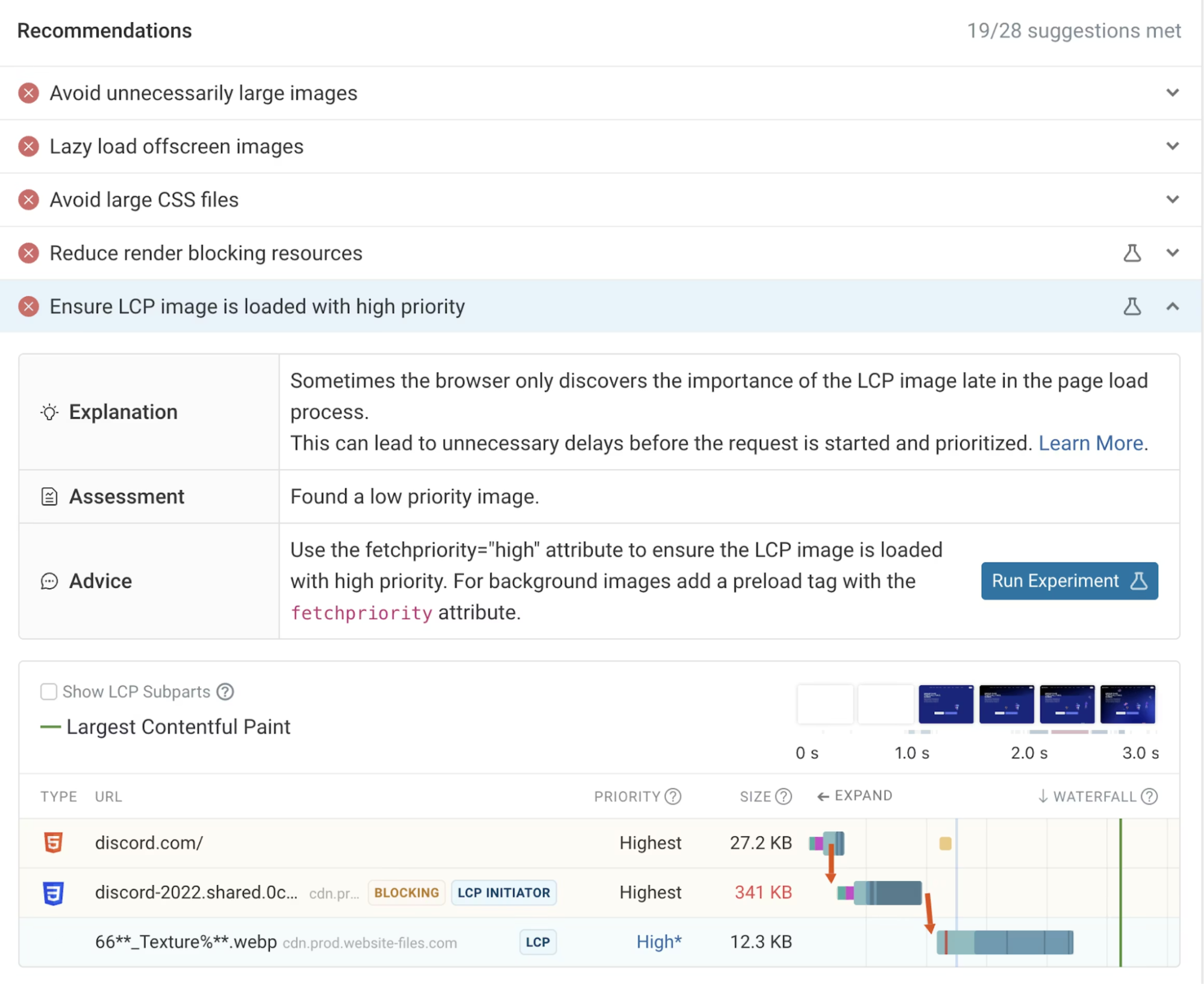
For example, in this screenshot you can see that the browser doesn't correctly detect the LCP image as high-priority from the start. That means it won't load as quickly as it should.
Summary
A website that feels slow on mobile will lose users, no matter how fast it appears on desktop.
Mobile performance issues come from a combination of heavy assets, excessive JavaScript, poor prioritization, and unnecessary work. By addressing these issues at the code level and focusing on perceived speed, you can create experiences that feel fast, stable, and responsive on real devices.
Performance is not just a technical metric. On mobile, it’s a core part of user experience and business success.
Monitor Page Speed & Core Web Vitals
DebugBear monitoring includes:
- In-depth Page Speed Reports
- Automated Recommendations
- Real User Analytics Data