
Most Shopify speed optimization advice focuses on improving Lighthouse scores and Core Web Vitals. While these metrics matter, they don't explain why many stores still feel slow, laggy, or unstable even with decent scores.
The real issue is not the metrics themselves, but the underlying performance bottlenecks: oversized hero sections, uncontrolled app scripts, inefficient asset loading, and poor execution strategy.
In this guide, we'll move beyond surface-level tips and focus on the structural problems that actually slow down Shopify stores — and how to fix them properly.
Above-the-Fold Optimization: Controlling First Impressions��
Above-the-fold content has the biggest impact on how fast your Shopify store feels. This is the first thing customers see when the page loads, and it shapes their perception of speed instantly.
Even if the rest of the page loads quickly, a heavy or poorly optimized hero section can make the entire store feel slow.
The Hero Section Is Usually Your Biggest Performance Cost
A hero section is the large area at the top of a webpage, right below the header or menu. It is the first section visitors see when the page loads and usually includes a main image, headline, and call-to-action.
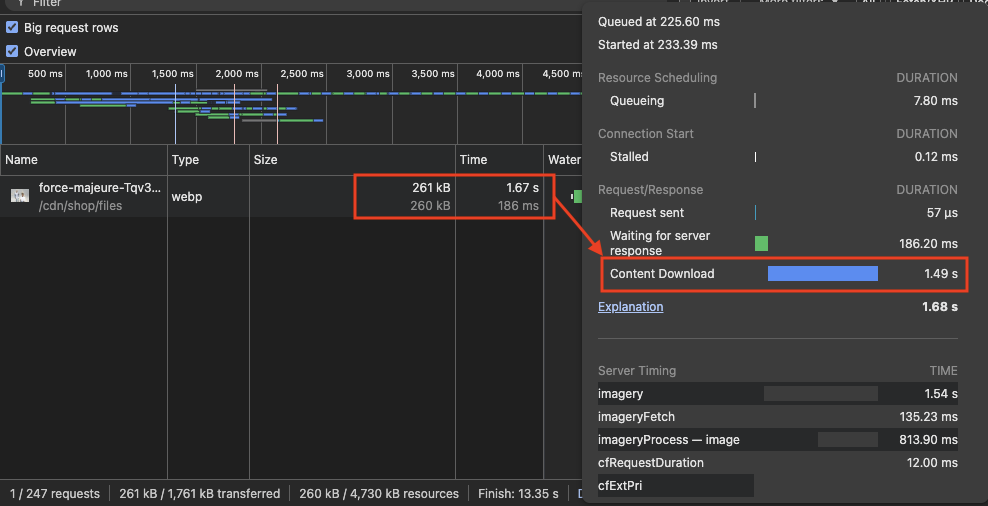
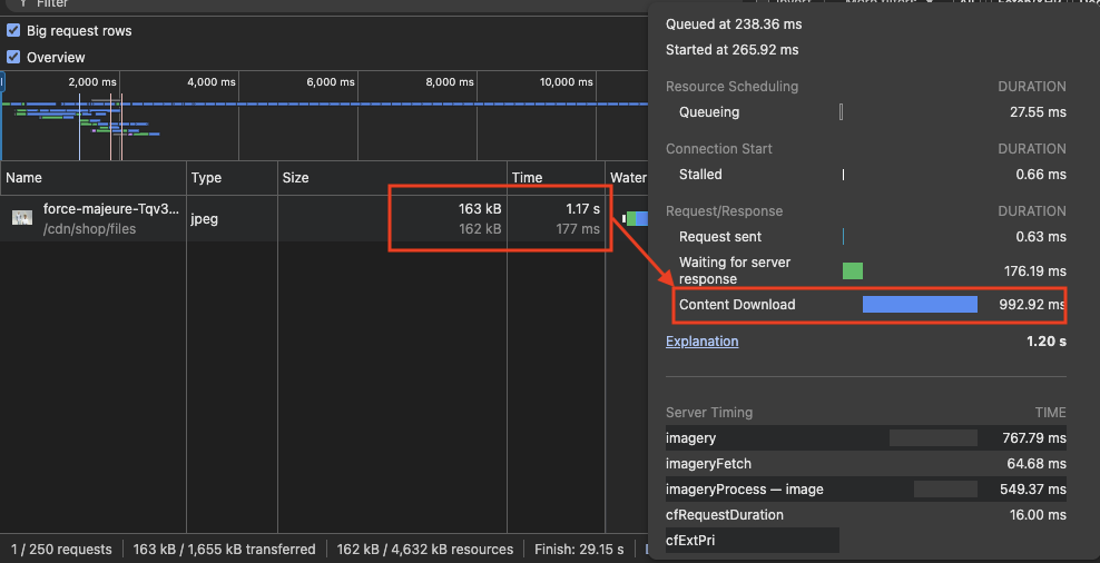
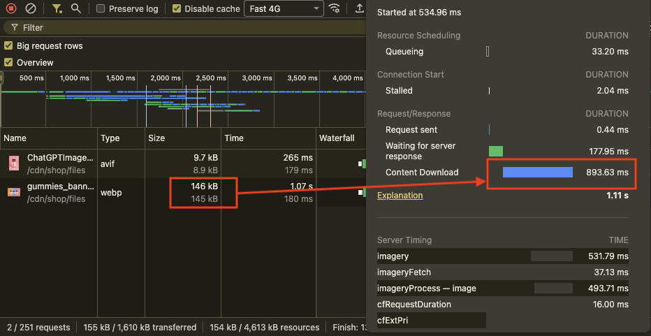
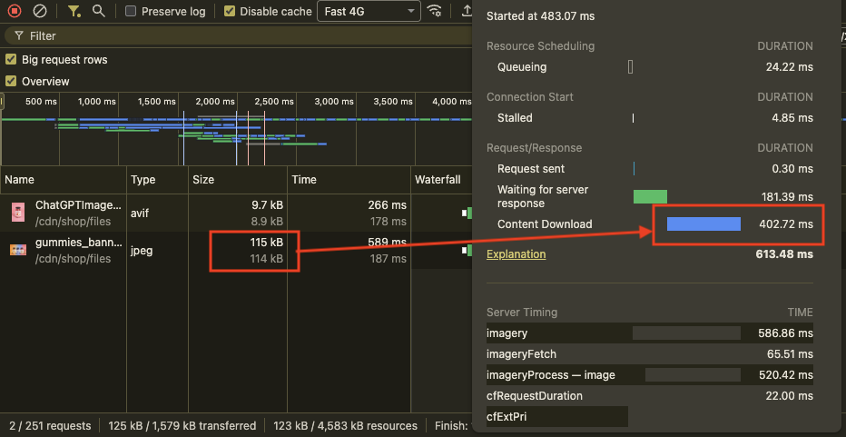
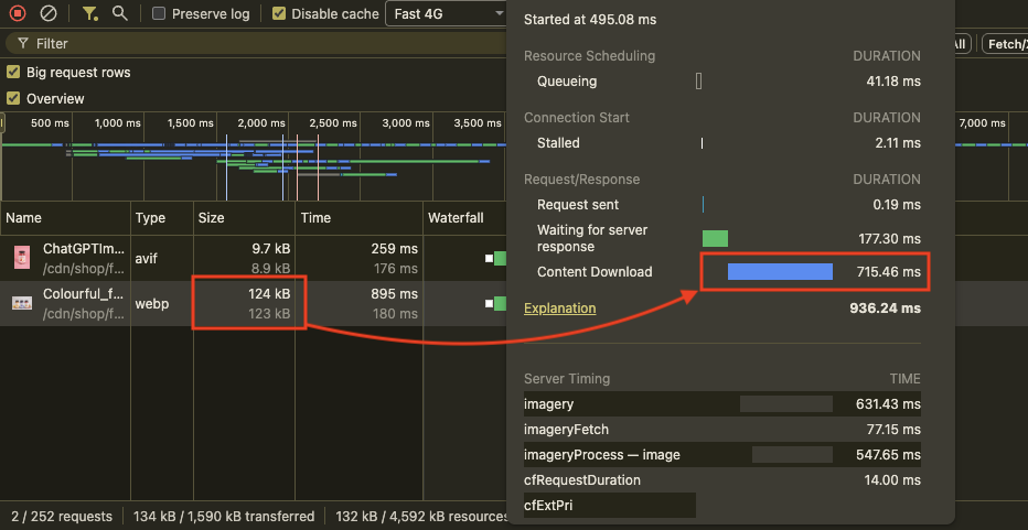
The first step in optimizing the hero section is reducing the hero image size as much as possible without sacrificing visual quality. Many slow Shopify stores use hero images between 300KB and 400KB, and sometimes even over 900KB. This significantly delays initial rendering and affects Largest Contentful Paint (LCP), which measures how quickly the main visible content loads on the screen.
For better performance, aim to keep the hero image under 180KB while maintaining clarity and sharpness.
You can use a tool like Chrome DevTools or DebugBear's free website speed test to check the size of your hero image.
Sliders, Background Videos, and Why They Hurt Performance
Many modern Shopify brands use video as a hero banner to create a stronger visual impact. While this improves storytelling and engagement, it also introduces a performance challenge. Video files are significantly heavier than static images, and when used above the fold, they often become the LCP element, directly affecting load time.
If implemented incorrectly, a hero video can slow down initial rendering. However, with the right loading strategy, it's possible to retain the visual impact of video while minimizing its effect on LCP.
Use a Placeholder Image Before Loading the Video
Video files, no matter how optimized, will always take longer to load than static images. Instead of allowing the hero section to appear blank while the video downloads, use a lightweight placeholder image (poster image) as the initial visible element.
Display the placeholder image immediately when the page loads, then load the video after the main content has rendered. Once the video is ready, you can replace the image seamlessly.
This approach ensures that the browser does not prioritize the heavy video file during initial rendering. As a result, the hero section can load quickly, improving LCP while still preserving the visual impact of video.
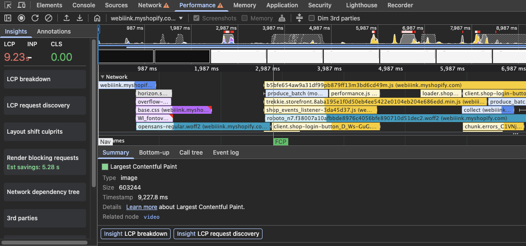
In this example, it takes over 9 seconds for the browser to display the first video frame.
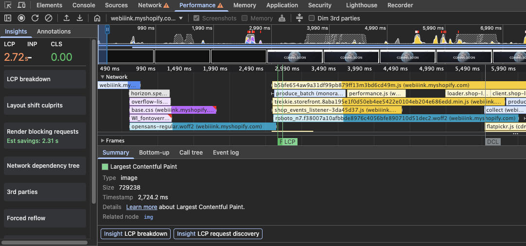
With a poster image the Largest Contentful Paint goes down to just 2.7 seconds.
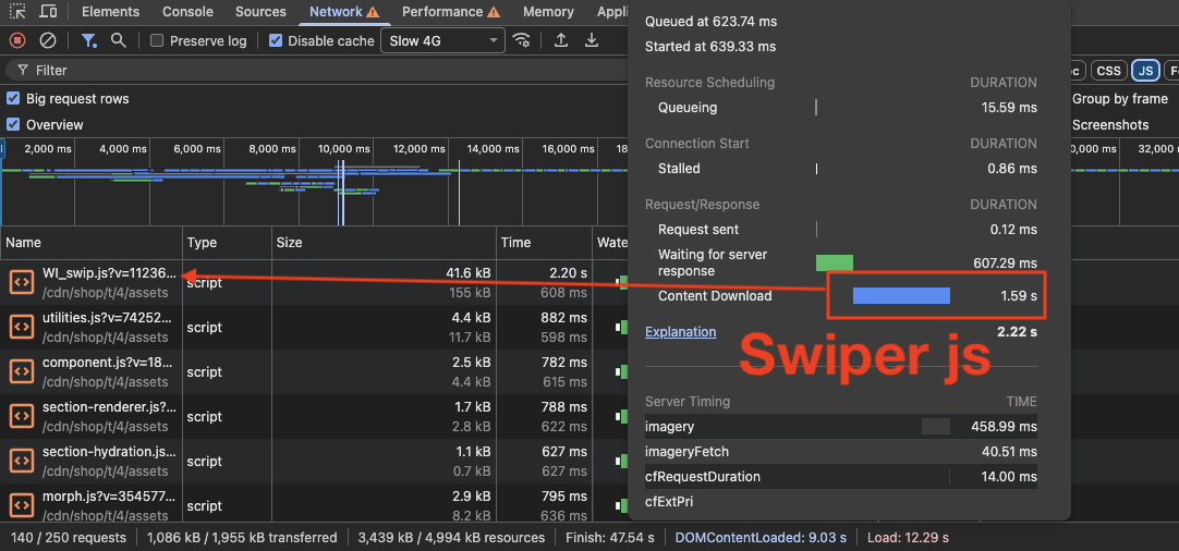
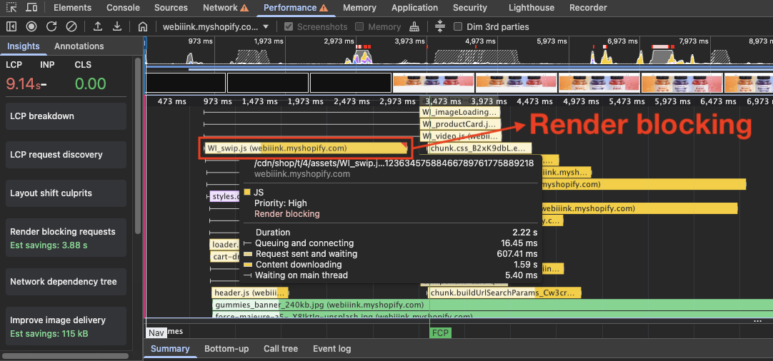
Avoid Heavy Third-Party Carousel Libraries
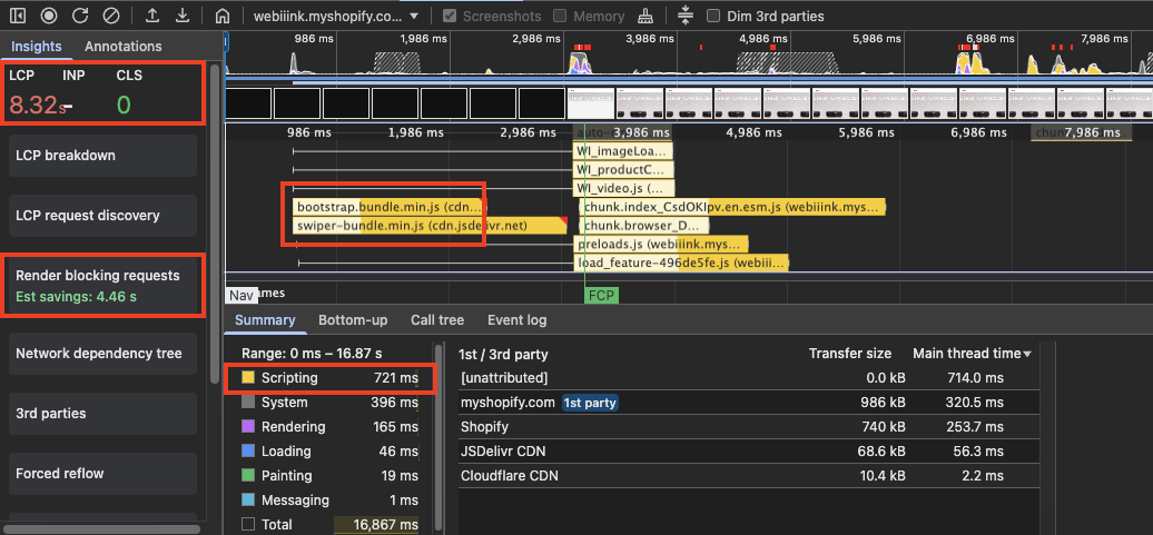
Sliders and carousels are another common element that can significantly hurt performance when used in the hero section. While they may seem visually appealing, they often introduce multiple large images, additional JavaScript, and layout complexity all above the fold.
You'll notice that many high-performing brands avoid hero sliders entirely. A single strong visual is usually more effective and more performant. However, if you must use a slider, it needs to be implemented carefully to minimize its impact on performance.
Many popular carousel libraries like Swiper.js and Splide.js look small in size, around 30KB to 40KB. But when used in the hero section (which often becomes the LCP element), they can worsen performance.
File size is only part of the problem. Execution time is the bigger concern: when a JavaScript library is loaded without proper defer or async, the browser must download it, parse it, and execute it before continuing HTML parsing.
As a result, the hero image may not render until the carousel script has fully loaded and initialized, which negatively impacts LCP. In some cases, the layout can also shift after the script runs, leading to visual instability.
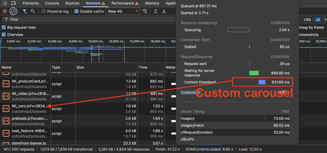
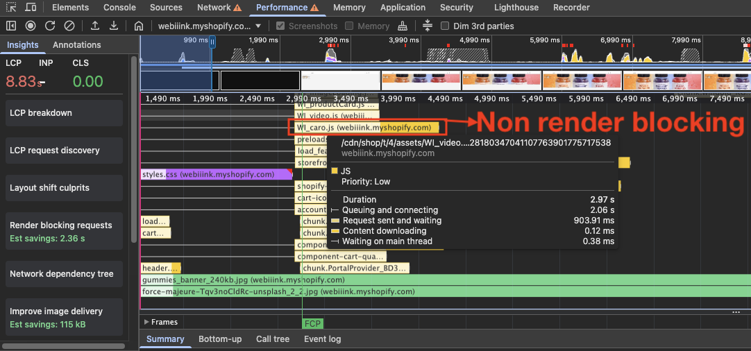
Instead of using heavy third-party libraries, create a lightweight CSS or JavaScript custom carousel. Hero carousels are usually very simple in layout and functionality, so you can develop a very lightweight solution without adding unnecessary complexity.
A custom-built carousel will not cause LCP issues and will maintain a stable layout during the initial load.
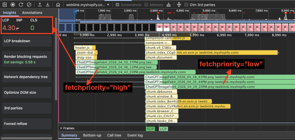
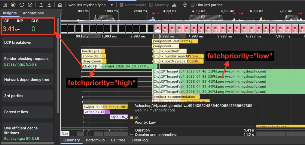
Prioritize the First Slide When Using Multiple Images
When using a carousel in the hero section, there will be multiple images. Because it's a banner image, each image is usually larger, which means the browser has to download all of them at the initial stage. This can make LCP worse.
That's one reason why many big brands avoid using carousels in the hero section. Downloading multiple large images at once increases the initial page weight and negatively affects LCP.
In cases where a carousel banner is necessary, we can optimize it so the performance impact is minimal. One effective way is to use the fetchpriority attribute: set the very first image to high and all the remaining ones to low. This ensures that the browser focuses only on downloading the first image.
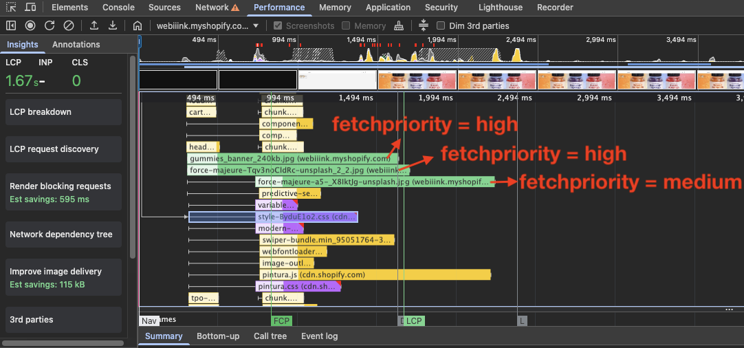
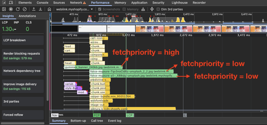
Image Sizing and Compression
Use Shopify's image_url Liquid Filter
If your store is using a free or premium Shopify theme, there's usually nothing to worry about. The issue arises when the site has custom development — which is often the case — and the developer hasn't implemented proper Shopify Liquid code for handling images. In such situations, the website is likely missing out on significant performance gains.
When you use Liquid code like {{ image | image_url: width: 2400 | image_tag: loading: "eager" }}, Shopify creates multiple image variants with different widths, allowing the browser to choose the most appropriate version based on the user's screen size.
If the user is on a 27-inch monitor, the browser will load a 1920px image (around 180 KB). But if the user is on an 18-inch screen, it will load a 1200px image, which is much smaller in size (around 140 KB or even less), improving performance and reducing unnecessary data usage.
Although the device DPR (Device Pixel Ratio) also matters, for simplicity we'll consider only screen width.
Screen width 1024 pixels
Screen width 767 pixels
Compress Images Without Sacrificing Quality
Many Shopify websites make the mistake of not compressing their images. In a typical Shopify store, proper image compression can reduce file size by 40% to 70%.
For example, if an uncompressed hero banner is 500KB, after compression it can be reduced to 250KB or even 150KB. That's a significant reduction in size, especially for above-the-fold content.
Since the hero banner often becomes the LCP element, reducing its size can directly improve loading performance and perceived speed.
Image compression is not a magic solution — it has its drawbacks. It reduces image quality by making details blurry and causing color banding. That's why we need to be careful when applying compression. Heavy compression can significantly reduce visual clarity.
For industries like fashion, luxury, cosmetics, and jewelry, image sharpness is directly linked to perceived product value. If the image looks dull or over-compressed, it can negatively impact conversion rates.
Normal image
Compressed image
Reduce File Size by Simplifying Colors
Reducing the number of colors in an image is another way to lower the file size without relying on heavy compression. Images are made up of pixel data, and the more color variation an image contains, the more information the file has to store.
When an image uses fewer colors — such as a clean background with minimal variation — the file size naturally becomes smaller. This allows you to maintain sharpness without significantly increasing image weight.
By simplifying backgrounds and reducing unnecessary color complexity, you can achieve smaller file sizes while preserving visual quality.
Image with a colorful background
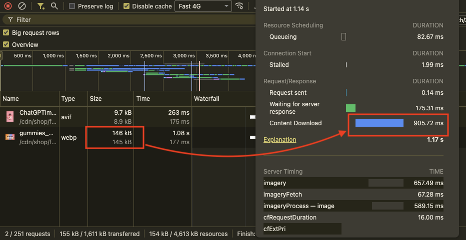
Image with blended background
JavaScript and App Bloat: The Silent Performance Killer
JavaScript is one of the most important parts of any modern website, but it can also be one of the biggest reasons a website slows down. This is especially true for Shopify stores, where the problem can become worse because of Shopify apps.
Most Shopify apps are built using JavaScript, and each app adds its own scripts to the website. If these scripts are not used carefully or properly managed, they can significantly slow down the store and affect overall performance.
JavaScript Libraries Add Hidden Cost
A JavaScript library is a pre-written set of code that developers can use to add functionality to a website. This allows developers to implement features without building complex functions from scratch.
For example, instead of creating a carousel from the ground up, developers can use libraries like Swiper.js or Splide.js.
JavaScript libraries make development easier and faster, but every library also adds more code to the website that the browser must download, parse, and execute.
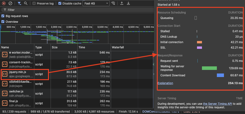
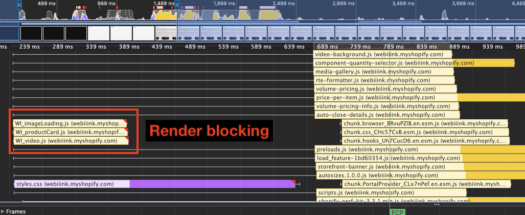
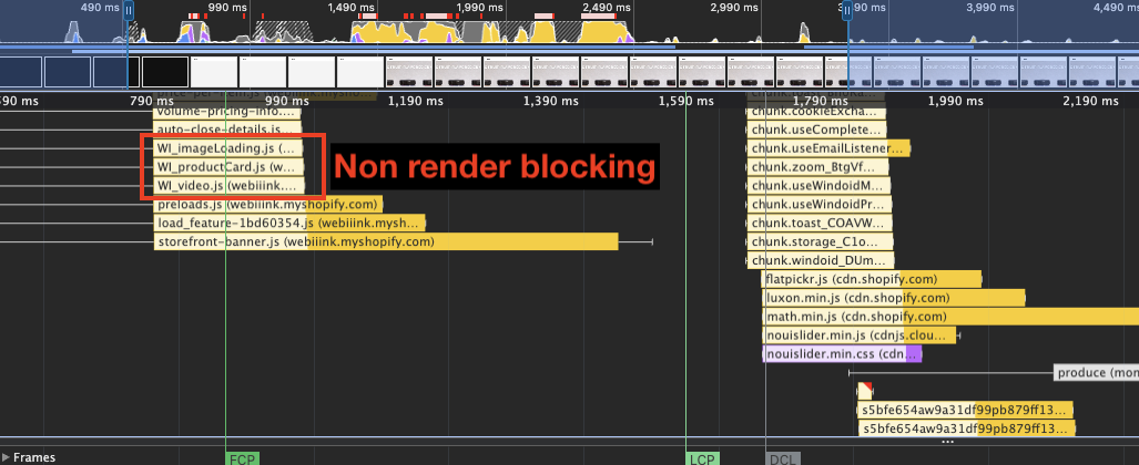
This request waterfall from Chrome DevTools shows multiple render-blocking JavaScript requests, as well as over 700 milliseconds of CPU processing time during the initial page load.
Avoid Shopify App Bloat
In the Shopify ecosystem, there are many features that are not available directly inside the theme. This helps keep the theme lightweight and fast. These additional features are usually provided through apps available in the Shopify App Store.
For example, features like product reviews, bundles, and subscriptions are typically added through Shopify apps that you install in your store.
However, while installing these apps you need to be very careful. Each app can add additional scripts and resources to your website, which can quickly make the store heavy and bloated if not managed properly.
Always Choose Apps with Strong Ratings and Reviews
Always prefer apps with high ratings and a large number of reviews. While this may sound obvious, it can save you from many unnecessary headaches.
Apps with many positive reviews usually provide better support and are actively maintained by their developers. They are also more likely to follow better development practices and keep their technology up to date.
Choosing well-reviewed apps reduces the risk of installing poorly built software that can slow down your store or cause unexpected issues.
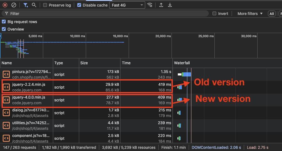
The website below doesn't use jQuery natively, but a poorly built third-party app has unnecessarily added it.
Uninstall Unused or Unnecessary Apps
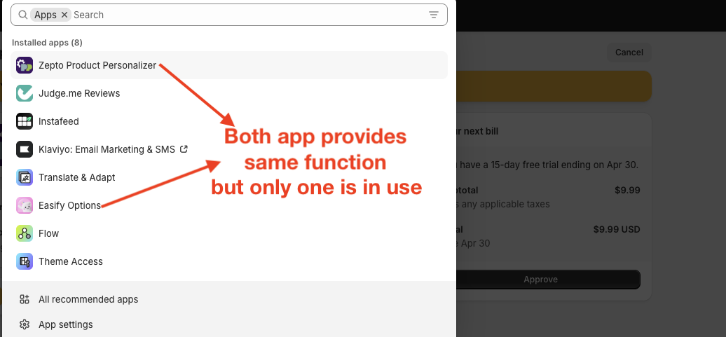
Shopify has made installing apps extremely easy — it feels almost like installing an app on your phone. Because of this, many store owners try multiple apps from the same category.
Testing different apps is not a bad practice. It helps you find out whether the app actually fulfills your requirements. However, the problem arises when unused apps are left installed.
Many store owners forget to uninstall the apps they no longer need, and over time these unused apps can make the website bloated and slower.
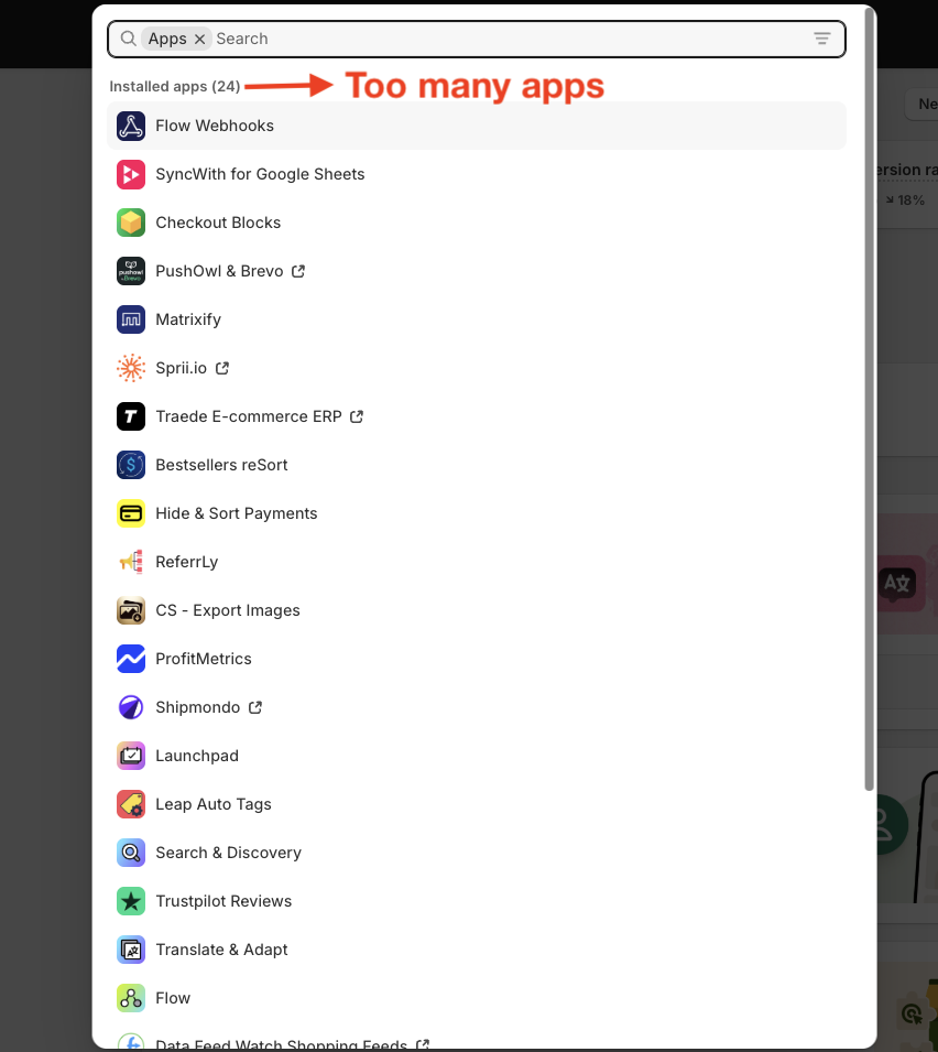
Avoid Installing Too Many Apps
One of the most common mistakes Shopify store owners make is installing too many apps. Even for very small features or functions, many people rely on apps instead of simpler solutions.
The more apps you install, the more extra scripts get added to your website. Each of these scripts must be downloaded and executed by the browser, which increases processing time.
As a result, the browser spends more time handling these scripts, which can slow down your website and negatively affect performance.
Many features can be built directly inside your website instead of installing an app for them. Hiring a good Shopify developer to build a custom feature with a one-time payment can often be a better solution.
When a developer builds a feature specifically for your store, they only implement the core functionality you actually need. Apps, on the other hand, often come with many additional features and scripts that you may never use.
Because custom code is native to the theme and lightweight, the impact on website performance is usually very minimal.
For example, many store owners install a cart app just to show a free shipping progress bar inside the cart drawer. What these apps often do is replace the entire native cart with their own custom cart system, which adds extra scripts and increases page weight.
A good developer, however, would keep the native cart and simply add a lightweight free shipping bar inside the existing cart drawer. This achieves the same result without adding unnecessary code or slowing down the website.
This screenshot shows a 540KB script used by a cart drawer app.
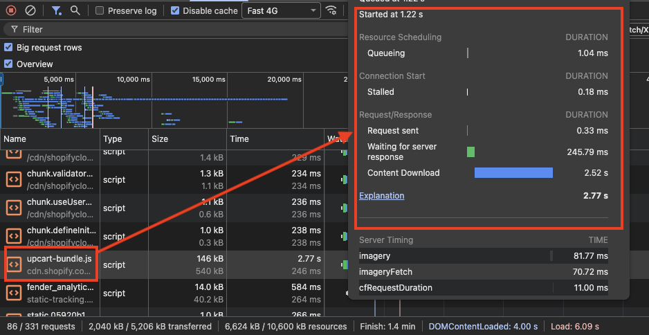
In contrast, a custom-coded native cart just takes about 6KB of code.
Load JavaScript Conditionally
In older Shopify theme versions, most JavaScript was bundled into one or two large files. This made the files heavy and forced the browser to download and process a lot of unnecessary code.
In newer themes, especially after the Shopify Online Store 2.0 update, JavaScript is often divided into multiple smaller files based on different features or functionalities. This structure makes conditional JavaScript loading possible.
Since JavaScript files are now separated into smaller chunks, each feature can have its own independent script. For example, search may have its own JavaScript file, and the same applies to features like the cart, collection filters, or the add-to-cart functionality.
This allows developers to load JavaScript only when it is actually needed. For instance, the add-to-cart script is only required on the product page, so it does not need to load on other pages of the website.
By loading scripts only where they are needed, the website avoids unnecessary downloads and execution, making the page lighter and improving overall performance.
{% if template == 'product' or template.name == 'product' or request.page_type == 'product' %}
  {% comment %} Scripts for product page {% endcomment %}
{% endif %}
Defer Non-Critical JavaScript
When a browser loads a webpage, it reads the HTML from top to bottom to build the page structure. If it encounters a JavaScript file during this process, it pauses HTML parsing to download and execute the script.
Think of it like assembling furniture from instructions. If a step requires a special tool, you must stop assembling, go find the tool, and only then continue building. Similarly, the browser pauses building the webpage until the JavaScript is processed.
This can negatively affect LCP and Interaction to Next Paint (INP), and may also contribute to Cumulative Layout Shift (CLS) if scripts modify the layout after the page loads.
JavaScript deferring solves this problem by using the defer attribute. With defer, the browser can continue parsing the HTML while the JavaScript file downloads in the background. The script is then executed only after the HTML document has been fully parsed.
This allows the page content to render faster while still loading the required JavaScript.
In Shopify themes, many scripts are already deferred by default. However, scripts added by apps or custom code are often not deferred, which makes managing them properly very important for performance.
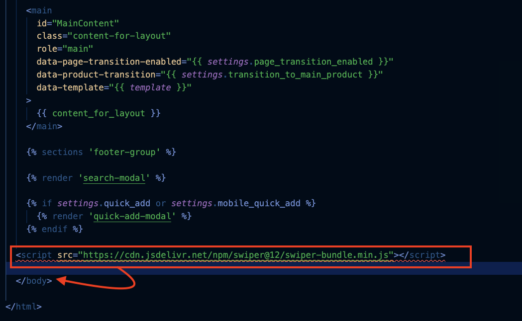
Some scripts may not work correctly if the defer attribute is added. In such cases, a good alternative is to place those scripts just before the closing </body> tag.
Since the </body> tag marks the end of the HTML document, placing scripts there ensures that the HTML content is already rendered before the script starts loading and executing.
Asset Strategy and Theme Architecture
Reduce CSS and Avoid Bloated Theme Bundles
After images and JavaScript, CSS is another important element that affects website speed and performance. CSS is render-blocking by default. When the browser loads a page, it parses the HTML and pauses rendering when it encounters a CSS file so it can download and process the styles first. If the CSS file is large, this process takes longer and can delay rendering, which may affect LCP.
Before the Shopify Online Store 2.0 update, many themes placed most CSS in a single large file such as theme.css, making it heavy to download and parse. After the update, CSS is typically split into smaller files based on pages or features (for example product, collection, or search pages). This allows the browser to load only the CSS needed for each page, reducing unnecessary downloads and helping the site load faster.
During custom development or app integration, developers often place all CSS inside a main stylesheet such as base.css. Since this file loads on every page and is render-blocking, adding too much code to it can quickly make it large and inefficient.
Instead, CSS should be organized based on where it is used. Global styles can remain in base.css, while page-specific styles should be placed in their corresponding files.
For example, if you are making changes that only affect the product page, the CSS should be added to product.css instead of base.css. This ensures that only the necessary styles are loaded on each page, helping keep the website lighter and improving performance.
Eliminate Duplicate Libraries
While developing custom features in a Shopify website or building a fully custom store, developers often use different JavaScript libraries to speed up development and implement complex features. However, sometimes the same library is added two or more times by mistake.
For example, a developer may update an older library by adding a newer version but forget to remove the old one. This results in duplicate libraries being loaded, which wastes resources and negatively affects website performance. Common examples include loading Alpine.js or jQuery multiple times.
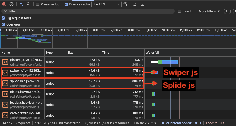
Sometimes the issue is not the exact same library but different libraries from the same category. Developers may add a new library without checking what is already being used on the website. This commonly happens with carousel libraries.
For example, a website may already be using Swiper.js for the carousel, but a new developer adds another carousel library they are more comfortable with. As a result, the website ends up loading and executing two different libraries, increasing JavaScript execution time and slowing down the page.
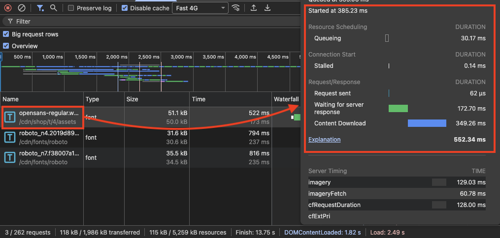
Subset Fonts to Reduce File Size
Font subsetting is something many developers and store owners don't take advantage of.
Font subsetting means removing unnecessary characters from a font file so the file size becomes smaller.
For example, if your Shopify store operates only in English, you don't need characters from other languages such as Cyrillic, Arabic, or Chinese in your font file. These extra characters increase the file size even though they are never used on the website.
By removing these unused characters, the font file becomes significantly lighter. Tools like Font Squirrel allow you to generate a subset version of a font that only contains the characters your website actually needs.
This process alone can reduce the font file size by 40% to 50%, which helps the browser download the font faster and improves overall page performance.
Non-subset font
Subset font
Organize Code Smarter for Performance
While creating sections, many developers (or even AI tools) place the section's CSS or JavaScript directly inside the section file itself. This may seem convenient during development, but it can create problems later.
If the same section is used multiple times on a page, the CSS inside that section will be rendered multiple times, and the JavaScript may also execute multiple times. This duplication is unnecessary and can negatively affect performance.
Because of this, the browser has to process duplicate CSS and repeatedly execute the same JavaScript, which increases the workload and makes the page less efficient.
However, in cases where CSS or JavaScript must be placed inside a section, snippet, or block file, Shopify provides a better approach using the Liquid tags {% javascript %} and {% stylesheet %}.
These tags collect and combine the code from all sections, blocks, and snippets into a single file for each type. This prevents duplicate styles or scripts from being rendered multiple times and keeps the code more organized and efficient.
Network Prioritization and Loading Strategy
Preload Critical Resources
Preloading is a technique that tells the browser to download an important resource earlier than it normally would. This ensures critical assets are available when the browser needs them.
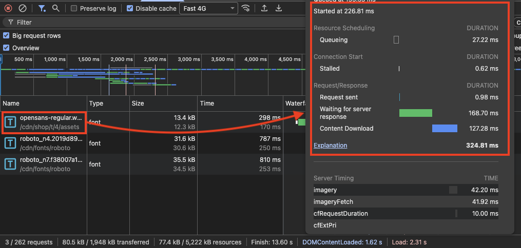
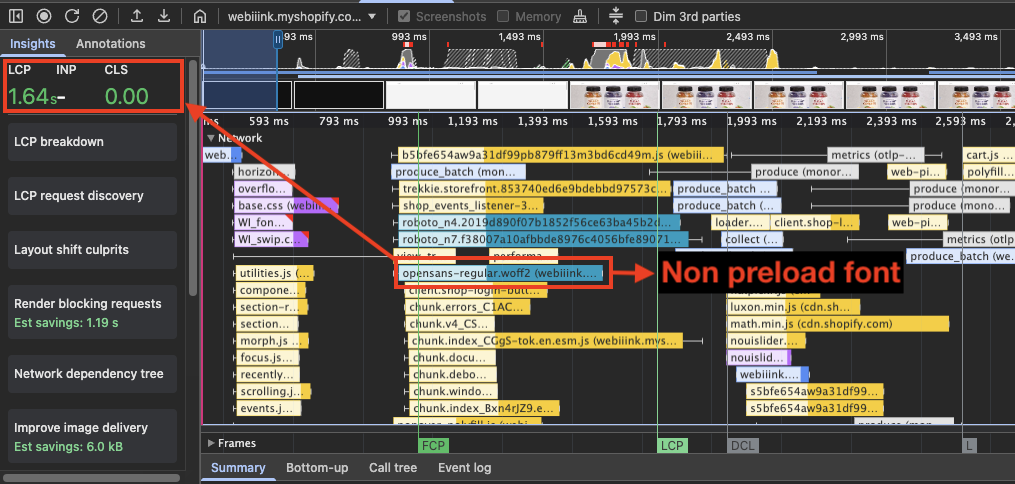
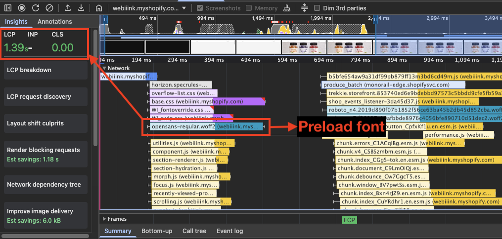
In Shopify stores, fonts are often discovered late in the network waterfall, usually after HTML, CSS, and JavaScript. If a website uses custom fonts for headings, navigation, or buttons, the text may not appear correctly until the font finishes downloading, which can delay First Contentful Paint (FCP).
Using font-display: swap allows the browser to display a fallback font while the custom font loads. However, if the font is not preloaded, the late swap can still cause a noticeable visual jump. Preloading the main font starts the download earlier, helping text appear sooner and improving FCP.
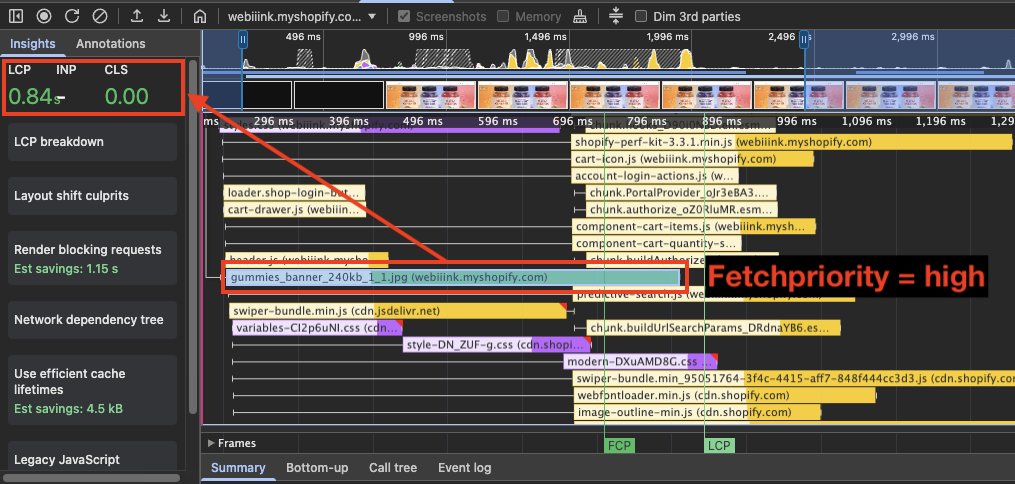
Use Fetch Priority
Fetch priority tells the browser how important a resource is so it can download critical resources first.
When a page loads, the browser fetches many assets like images, fonts, CSS, and JavaScript, but it may not know which ones matter most for the first screen. The fetchpriority attribute lets developers mark important resources to be downloaded earlier and less important ones later.
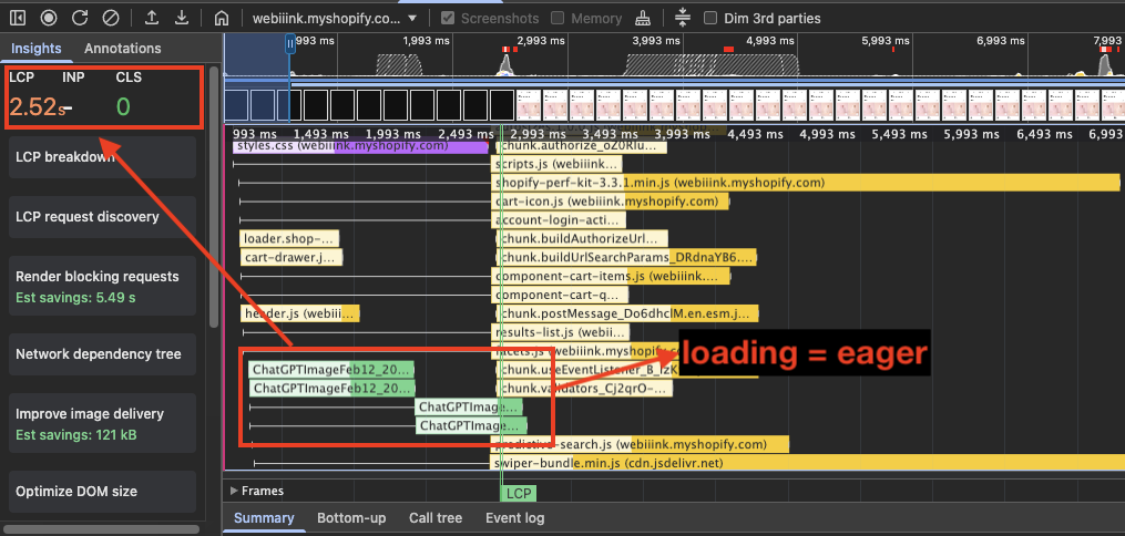
Most Shopify homepages have a hero banner or a large image at the top, which is usually the first visual element customers see. Because of this, it often becomes the LCP element of the page. Adding fetchpriority="high" to this image can help the browser prioritize its download, which may improve LCP and overall website performance.
On Shopify collection pages, the first visible elements are usually product cards with product images arranged in a grid. Since these images appear in the first screen, they are important for the initial page view.
To improve loading performance, the first one to four product images can use fetchpriority="high" so the browser prioritizes them. The remaining product images can use fetchpriority="low" so they do not compete for network resources.
The same applies to Shopify product pages. On desktop, product images may appear in a grid of one to four images, while on mobile it is usually a single image view. Since the first visible product image is part of the initial screen, it should use fetchpriority="high". The remaining product images can use fetchpriority="low" so they don't compete with the most important image during loading.
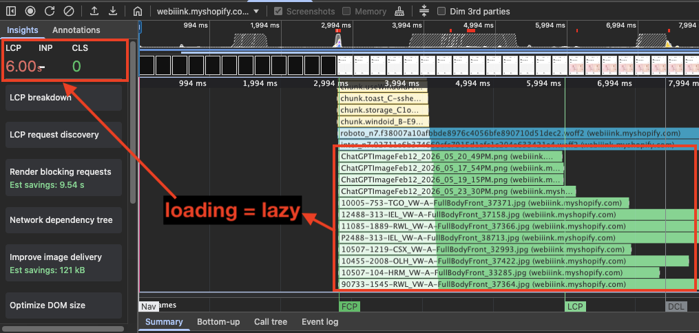
Lazy Load Images Below the Fold
Lazy loading is a technique that delays the loading of resources until the moment they are actually needed, instead of loading everything during the initial page load.
However, lazy loading should be used carefully, as improper use can negatively affect website performance.
On Shopify pages, the first visible images should never be lazy loaded because they are often part of the LCP element. Delaying these images can significantly worsen LCP and slow down the perceived loading of the page.
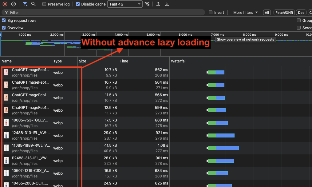
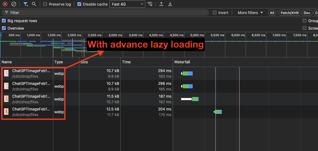
Advanced Lazy Loading with Intersection Observer
Default lazy loading works well, but it has limitations. Browsers usually start loading images when they are about 500–800px away from the viewport, and developers have no control over this behavior.
Using the Intersection Observer API, developers can build a more advanced lazy loading strategy. By adjusting the rootMargin, you can control how early images start loading before entering the viewport.
This provides more control over the loading behavior and can improve perceived performance on image-heavy pages.
Monitor Your Shopify Store's Performance
Optimizing a Shopify store is not a one-time task. New apps, theme updates, and custom code changes can introduce regressions at any time. Continuous monitoring helps catch these issues before they impact real users.
DebugBear provides synthetic performance monitoring and real user monitoring for Core Web Vitals, so you can track how your store performs over time and get alerted when there's a regression.
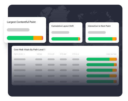
Monitor Page Speed & Core Web Vitals
DebugBear monitoring includes:
- In-depth Page Speed Reports
- Automated Recommendations
- Real User Analytics Data