
Publishing in the food and drink vertical is a competitive, high-traffic game. The independent recipe blog Recipe Tin Eats, for example, gets an estimated 16 million visits a month from readers searching for culinary inspiration.
Every SEO advantage matters, then – and that includes web performance. That's why we've analyzed 63 different English-language websites with a focus on food, drink and recipes.
They include sites published by major publishing groups like People, Condé Nast and Immediate Media, along with many independent blogs, including plenty that are part of the Raptive ad network.
We used DebugBear to capture each site's performance in Google's CrUX dataset at the origin level, revealing how they performed at delivering a delightful user experience across millions of real-world site visits. You can view the relevant dashboard here!
Sites with 'perfect' Core Web Vitals
48 of the sites had passing grades for all three Core Web Vitals, meaning at least 75% of their site visitors had a 'good' experience across the board. Here they are:
| Website | Publisher | Good% |
|---|---|---|
| Serious Eats | People Inc. | 91% |
| Simple Home Edit | Independent | 91% |
| The Spruce Eats | People Inc. | 91% |
| Liquor | People Inc. | 90% |
| Taming Twins | Independent | 90% |
| Food and Wine | People Inc. | 90% |
| Budgetbytes | Independent | 89% |
| Simplyrecipes | People Inc. | 89% |
| Skinnytaste | Independent/Raptive | 88% |
| Recipetin Eats | Independent/Raptive | 87% |
| Nora Cooks | Independent/Raptive | 87% |
| The Cozy Cook | Independent | 87% |
| Vegnews | Fresh Healthy Media | 85% |
| Inspired Taste | Independent/Raptive | 85% |
| Maangchi | Independent/Raptive | 85% |
| Steph Sunshine | Independent | 85% |
| Downshiftology | Independent/Raptive | 85% |
| Natasha's Kitchen | Independent/Raptive | 84% |
| Holy Cow Vegan | Independent/Raptive | 84% |
| Billy Parisi | Independent/Raptive | 84% |
| Cookunity | Independent (recipe kit) | 83% |
| AllRecipes | People Inc. | 83% |
| Plant Based on a Budget | Independent/Raptive | 83% |
| Tasting Table | Static Media | 83% |
| Connoisseurus Veg | Independent/Raptive | 83% |
| Preppy Kitchen | Independent/Raptive | 82% |
| Forks Over Knives | Independent | 82% |
| The Woks of Life | Independent/Raptive | 82% |
| Gimme Some Oven | Independent/Raptive | 81% |
| Minimalist Baker | Independent | 81% |
| Rainbow Plantlife | Independent/Raptive | 81% |
| Feel Good Foodie | Independent/Raptive | 81% |
| Once Upon A Chef | Independent/Raptive | 81% |
| Indian Healthy Recipes | Independent/Raptive | 80% |
| Love and Lemons | Independent/Raptive | 80% |
| Sporked | Independent/Raptive | 80% |
| Kitchen Sanctuary | Independent/Raptive | 80% |
| Sally's Baking Addiction | Independent/Raptive | 80% |
| Jamie Oliver | Independent | 79% |
| Make It Dairy Free | Independent/Raptive | 79% |
| The Pioneer Woman | Hearst | 79% |
| Tastes Better From Scratch | Independent/Raptive | 78% |
| Well Plated | Independent/Raptive | 78% |
| Delish | Hearst | 77% |
| Jane's Patisserie | Independent | 77% |
| Cookie and Kate | Independent/Raptive | 77% |
| The Kitchn | AT Media | 77% |
| Spend with Pennies | Independent/Raptive | 76% |
Recipe sites with one or more Core Web Vitals issues
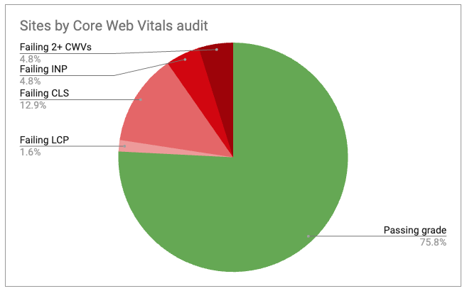
16 of the websites in our study had a failing grade on at least one Core Web Vital. The most common failing CWV was Cumulative Layout Shift, followed by Interaction to Next Paint.
Our take
Hats off to People Inc.
This major publisher of high traffic recipe sites, including Serious Eats, Food and Wine and Simply Recipes, received excellent performance scores across the board, dominating the top ten of our study. Congratulations!
Most sites are performing strongly
Overall, we saw pretty strong web performance in our study cohort – most users are having a good experience on most websites, most of the time. This highlights the care and attention publishers are putting into web performance, while the increasing performance of end-users' devices and network connections no doubt make a difference, too.
Don't forget, we've only studied the average performance for these sites across all their pages. Many of these sites will have underperforming pages with bugs they could improve.
INP and CLS issues are the bottleneck
As we saw in the gaming category, overall loading speed (as measured by Largest Contentful Paint) is rarely the limiting factor when it comes to passing Core Web Vitals standards.
Instead, underperforming sites tend to see issues with layout shift (often driven by third-party ads) and site interactivity issues.
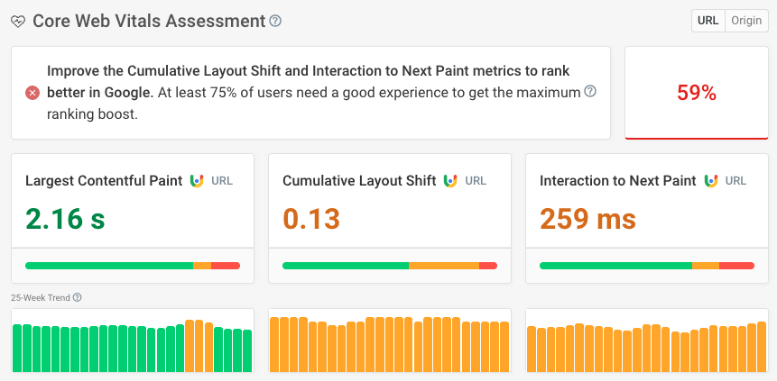
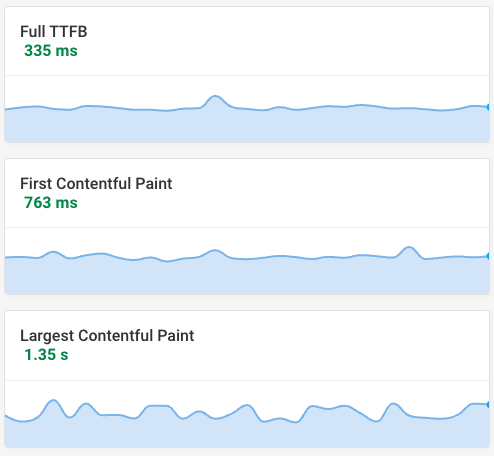
This report of Epicurious' performance in the CrUX dataset is typical for the underperforming set:
Potential fixes for underperforming sites
Holding space for ad banners
In this publishing vertical, we've again found issues with ad units leading to layout shift. In the example below on Condé Nast's Bon Appetit, we can see three phases of layout shift:
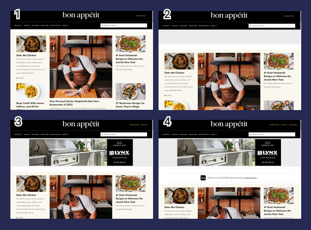
- The main page content loads
- The template adds space for a thin, leaderboard-shaped ad unit
- Unfortunately, a thicker billboard ad unit is delivered, shifting content down yet further
- Noting the user is not logged in, an additional subscription push banner is added
Altogether the hero image goes from fully featured to, well, just the chef's head.
One solution would be to hold space for the maximum possible amount of ad content (as in frame 4) but vary what appears in that space, depending on which ad ultimately loads.
For instance, if a large billboard-size ad unit loads (which is only a minority of the time!) then the push-to-subscribe could be sacrificed, whereas if the user is logged in and only a skinny leaderboard ad is displayed, a different slice of editorial content could be added to avoid an excess of empty space.
Be careful with hero images
On Food52, we identified an interesting issue which is affecting their Core Web Vitals on slow mobile connections.
The hero slot of the page contains a content carousel which auto-advances, one image of which will end up as the LCP.
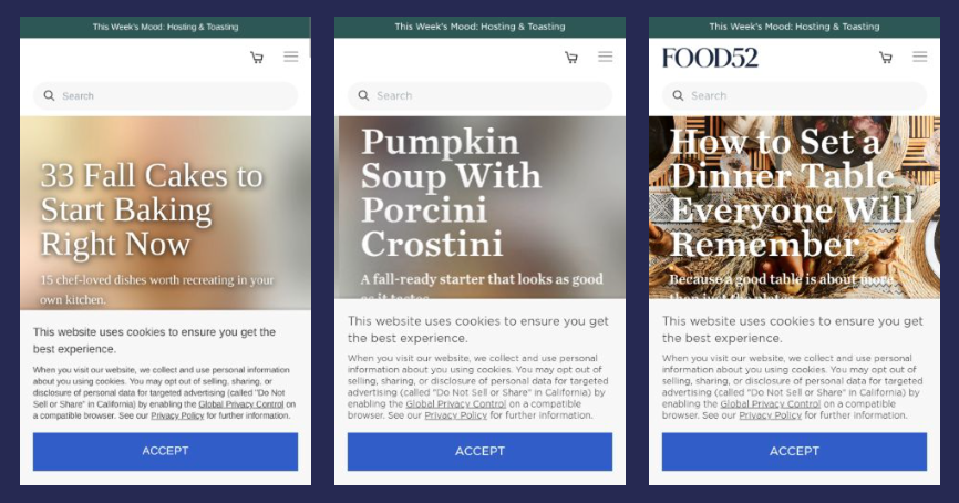
Unfortunately, all the images in this carousel use lazy loading, so they aren't downloaded as a priority by the browser. That means they must compete with other assets for bandwidth, some of which are quite large (one image of apple cookies is 900KB in size, for example.)
Looking at the request waterfall, we can see 12 different images that the browser is trying to download all at the same time, four of which finish downloading ahead of the LCP, even though ideally the LCP would take absolute priority.
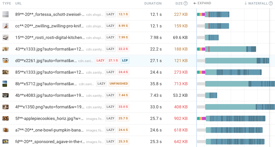
The dark blue shaded area on the waterfall bars shows when data is received for each request.
On a slow connection, the slides advance faster than the browser can download the relevant image, which means the full-resolution image never quite finishes loading before it disappears out of view, and a new image must start downloading instead.
In our Lighthouse test, the Largest Contentful Paint took 29.4 seconds! The right fix would be to make the first one or two carousel images a high priority, and let all other images on the page load lazily.
Likewise, the hero image on the BBC Good Food website is quite large, initially a low priority, and also loads lazily:
See how to fix this in our article: How To Fix Largest Contentful Paint Image Was Lazily Loaded
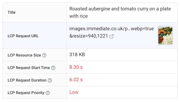
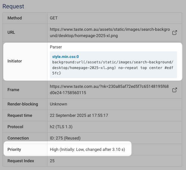
The taste.com.au website also illustrates a couple of others common LCP image issues.
On the homepage, the LCP is the background image (with two plates and a blue rectangle) which frames the search box:
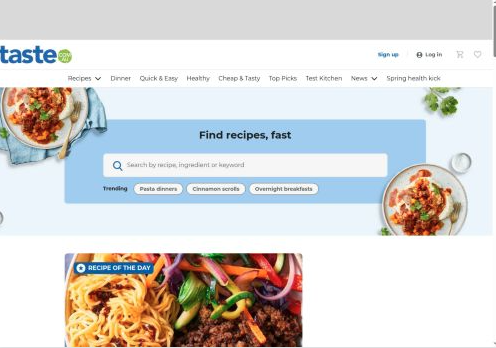
Looking at the request chain for this asset, we can see two redirects and two additional requests requests need to happen before the image download can begin, which really slows things down.
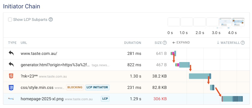
And because it's a CSS background image rather than an image embedded in the HTML, it's only discovered much later once the page has rendered.
We have some guidance on these issues, too: fixing Largest Contentful Paint for background images and avoid chaining critical requests.
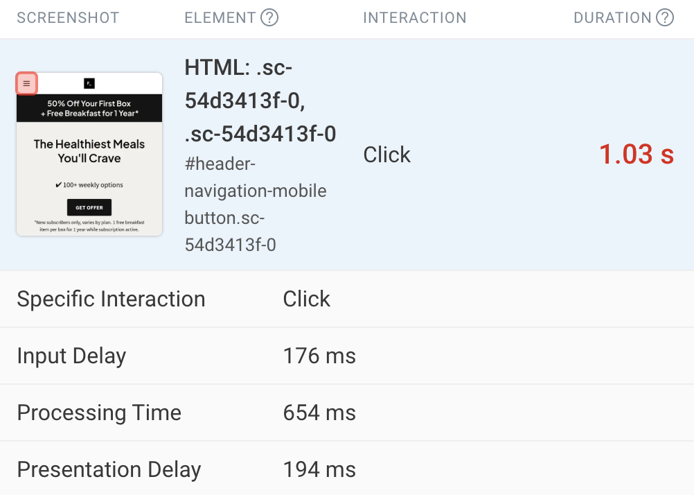
Use real-user monitoring to hunt down interactivity issues
Several sites in our study had performance issues with their Interaction to Next Paint metric. Interactivity issues are more difficult to diagnose using conventional lab tests, because the browser doesn't actually interact with the page, it simply loads it.
We can use our free INP debugger to learn a little more. The Factor website, for example, takes over a second to react when the menu 'burger' icon is clicked, highlighted in red in the top-left of the page:
Looking at the Lighthouse report in DebugBear, several diagnostics are flashing red in this department:

As luck would have it, we already offer guides to minimizing main thread work, reducing Javascript execution time and reducing unnecessary Javascript - all steps that can improve site interactivity by reducing background processing.
To learn more, though, we'd need to unlock the power of real user monitoring. Because it involves installing our script on a website, this is something only site owners can set up – so it's not part of our study! But once it's in place, developers can isolate the exact scripts and CPU tasks that are delaying real user interactions, pageview by pageview.
This kind of detailed, real world data is invaluable for optimizing site performance.
The importance of monitoring Core Web Vitals
Our study analysed a snapshot of current website performance, but investigating the historical performance of some of these websites revealed that page speed can vary dramatically over time.
For instance, our dashboard graph shows how Core Web Vitals performance has shifted for Taste of Home over the past year:
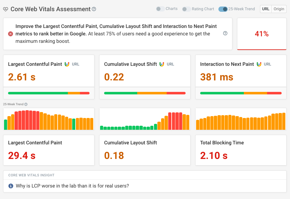
Notice how the LCP has gone from good to poor to 'Needs Improvement' while the CLS score has deteriorated sharply over recent weeks. As it stands today, all three of the Core Web Vitals are marked as needing improvement.
This demonstrates the importance of keeping a close eye on these metrics as sites evolve, templates are updated, and new adtech introduced. Web performance is an ongoing effort that needs monitoring over time rather than a one-and-done job.
With DebugBear, it's easy to set up automated scheduled tests for pages across your site, including homepages, category pages, articles, recipe and video pages, and get ongoing reports on your site's performance (as well as statistics on your competitors), plus alerts by Slack, Teams or email if things start to slow down.
Combined with our detailed analytics, waterfall charts, filmstrip views and real user data, there's everything a publisher needs to speed things back up.
To get started, take a look at our interactive demo, run a free website speed test, or sign up for our 14-day no-credit-card free trial which will give you tons of useful ideas on how to speed up your site – fast.
Monitor Page Speed & Core Web Vitals
DebugBear monitoring includes:
- In-depth Page Speed Reports
- Automated Recommendations
- Real User Analytics Data
Want a personal walkthrough for your publishing company? Our founder Matt will take you through how DebugBear could work for your team – book a call here!