
Optimize viewport for mobile for faster interactions is one of Lighthouse's new performance insights, which checks the mobile-friendliness of the viewport meta tag.
If the viewport isn't configured properly (e.g., the meta tag has a fixed value), mobile browsers delay all responses by up to 300 milliseconds. As a result, users will have to wait after each tap, the UI will feel sluggish, and Interaction to Next Paint (INP) scores will increase dramatically.
In this post, we'll use Qatar Airways' mobile homepage as an example to see why this web performance issue keeps happening and look into how to properly optimize the viewport for faster mobile interactions.
A Brief Overview of the 'Optimize Viewport for Mobile' Performance Insight
The 'Optimize viewport for mobile' performance insight replaces the 'Has a <meta name="viewport"> tag with width or initial-scale' audit in Lighthouse (as of the time of writing, you can switch between audits and insights using a toggle).
As the name suggests, the current audit checks the presence of the viewport meta tag in the <head> section of the HTML page — this is a static check. However, the new performance insight assesses the viewport's mobile-friendliness dynamically using Chrome DevTools' trace analysis functionality shared between the Performance tab and the LH report.
This is a crucial difference; for example, Qatar Airways' mobile homepage passes the static audit but fails the dynamic one:
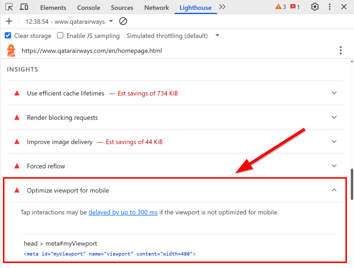
If the assessment fails, Lighthouse shows a 'Tap interactions may be delayed by up to 300 ms if the viewport is not optimized for mobile' notification. In practical terms, this means that the page remains unresponsive for about 300 milliseconds after each tap interaction (we'll see the reason behind this phenomenon below).
To pass the Optimize viewport for mobile insight, you need to review your viewport settings. However, checking the viewport meta tag in the HTML isn't always enough, as pages sometimes override it with JavaScript, which is exactly what happens on Qatar Airways' website.
Why & When Does the 300 Milliseconds Tap Delay Happen?
Historically, browsers waited about 300 milliseconds after each tap interaction to see whether the user was double-tapping to zoom into the text. Double-tap zoom (along with the 300 ms interaction delay) was removed for pages with mobile-optimized viewports in Chrome 32 back in 2014 to make interactions faster.
Today, users can only zoom with pinch gestures on mobile-optimized pages. However, pinch zoom is a multi-finger gesture that can be challenging for users with motor impairments. This is why double-tap zoom remains an essential accessibility feature on non-mobile-optimized pages since users need to zoom frequently there.
You can see how double-tap zoom works if you open Qatar Airways' homepage on mobile or another touchscreen device, and double-tap the text.
To find the middle ground between performance and accessibility, browsers still preserve double-tap zoom for non-mobile-optimized viewports, as they assume the user sees the desktop site shrunk to mobile size and will likely want to zoom. This also means that the 300 millisecond delay occurs after each tap on these pages, which severely increases mobile INP scores.
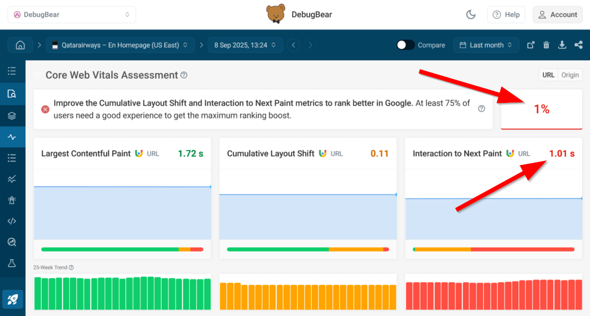
The screenshot below shows Qatar Airways' mobile CrUX score in DebugBear — a shocking 1%, which means that only 1% of users had a green score for all three Core Web Vitals over the last 28 days (in this case, because of the extremely poor INP results):
Looking Into Qatar Airways' Viewport Configuration
Qatar Airways defines the following viewport meta tag in the <head> section of its HTML page:
<!-- Responsive viewport defined in HTML -->
<meta
  id="myViewport"
  name="viewport"
  content="width=device-width, initial-scale=1.0, maximum-scale=3.0"
/>
At first glance, this viewport configuration looks fine, as it sets the viewport to the device's screen width and the initial scale to 100% zoom level. It also matches the criteria of the static LH performance audit (i.e., the tag is present and includes both the width and initial-scale attributes).
However, the dynamic Optimize viewport for mobile check fails in the mobile Lighthouse test (but not in the desktop one) and reports the following meta tag (see the first screenshot in this post for reference):
<!-- Fixed viewport defined in JavaScript -->
<meta id="myViewport" name="viewport" content="width=480" />
The above viewport rule forces the browser to render the page at exactly 480 pixels wide, then scale it to fit the device screen. Since the fixed viewport width indicates the site isn't mobile-optimized, browsers enable the 300 ms tap delay, and mobile INP scores crash.
This happens because Qatar Airways overrides the default viewport config in JavaScript twice, at two different breakpoints (480 and 810 pixels):
// First override
if (window.screen.width <= 480) {
  var mvp = document.getElementById("myViewport");
  mvp.setAttribute("content", "width=480");
}

/* ... */

// Second override
if (window.screen.width <= 810) {
  var mvp = document.getElementById("myViewport");
  mvp.setAttribute("content", "width=480");
}
While we could speculate about Qatar Airways' motivations for this approach (whether driven by a need for complete control over airline-specific layouts that require extra precision, such as seat selection, or technical debt), this viewport configuration significantly hurts performance. Instead of making the page mobile-friendly, Qatar Airways managed to severely slow down every interaction on phones and smaller tablets.
As the JavaScript above uses the device-based window.screen.width property instead of the viewport-based window.innerWidth to define the breakpoints, the viewport overrides will only happen on actual mobile devices. This may prevent developers from detecting the issue through standard responsive testing in DevTools because the 300 ms tap delays can only be detected when the site is tested on real devices (e.g., on manual tests, in Lighthouse, or using real user monitoring).
How to Optimize Viewport for Mobile for Faster Interactions?
To optimize your viewport for mobile, you can use the following value for the content attribute of the viewport meta tag:
<meta name="viewport" content="width=device-width, initial-scale=1" />
The content attribute above:
- Matches the viewport width to the device's screen width.
- Sets the initial zoom level to 100% (1:1) to prevent browsers from applying their own default scaling, which ensures the page loads without zooming.
Then you can use CSS media queries to configure the layout for different viewports, for example:
/* Default layout rules for small-screen devices */

@media (min-width: 811px) {
  /* Devices with a viewport width of 811 pixels and up */
}
Overall, to optimize viewport for mobile:
- Avoid using a fixed viewport width.
- Use CSS media queries (widely available across major browsers) instead of JavaScript to handle responsive design.
Since CSS media queries use viewport width instead of physical screen width, you avoid creating breakpoints that only work on real devices and won't trigger during typical responsive testing in DevTools.
Monitor Your Key Pages for Better Mobile Performance
The best way to ensure your key pages consistently pass Lighthouse's performance insights, such as Optimize viewport for mobile, is to set up scheduled performance tests so that you can detect issues and regressions as soon as they arise.
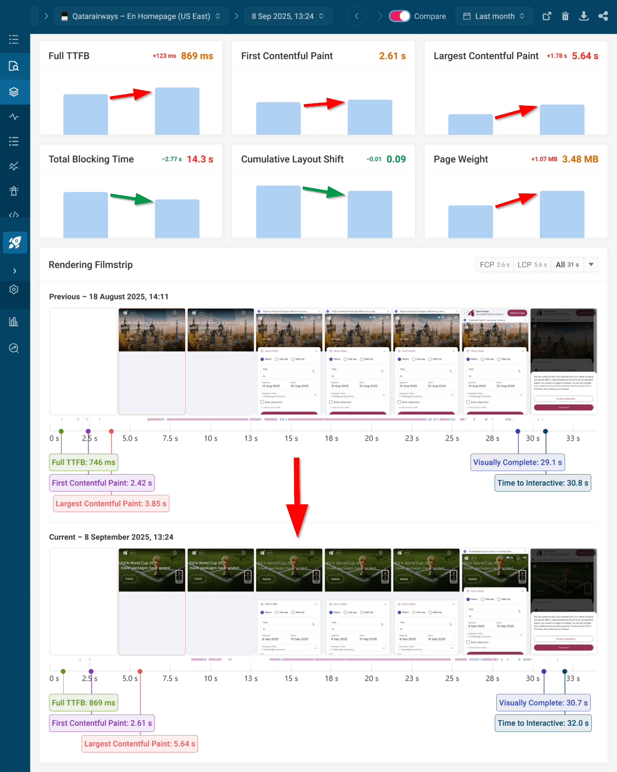
DebugBear allows you to monitor your website from 30+ server locations around the world and analyze the test data in multiple ways. For example, you can compare any two test results side by side:
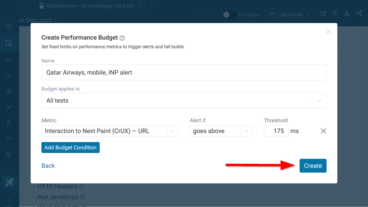
You can also create performance budgets for Core Web Vitals and other metrics to get alerted when they go above the preset threshold:
In addition to running simulated performance tests to proactively catch performance regressions, you can set up real user monitoring (RUM) with DebugBear, which provides performance data from your real users.
For example, you can see a detailed INP breakdown of each interaction that happens on the page (tap delay shows up as 'Input Delay' in mobile interactions):
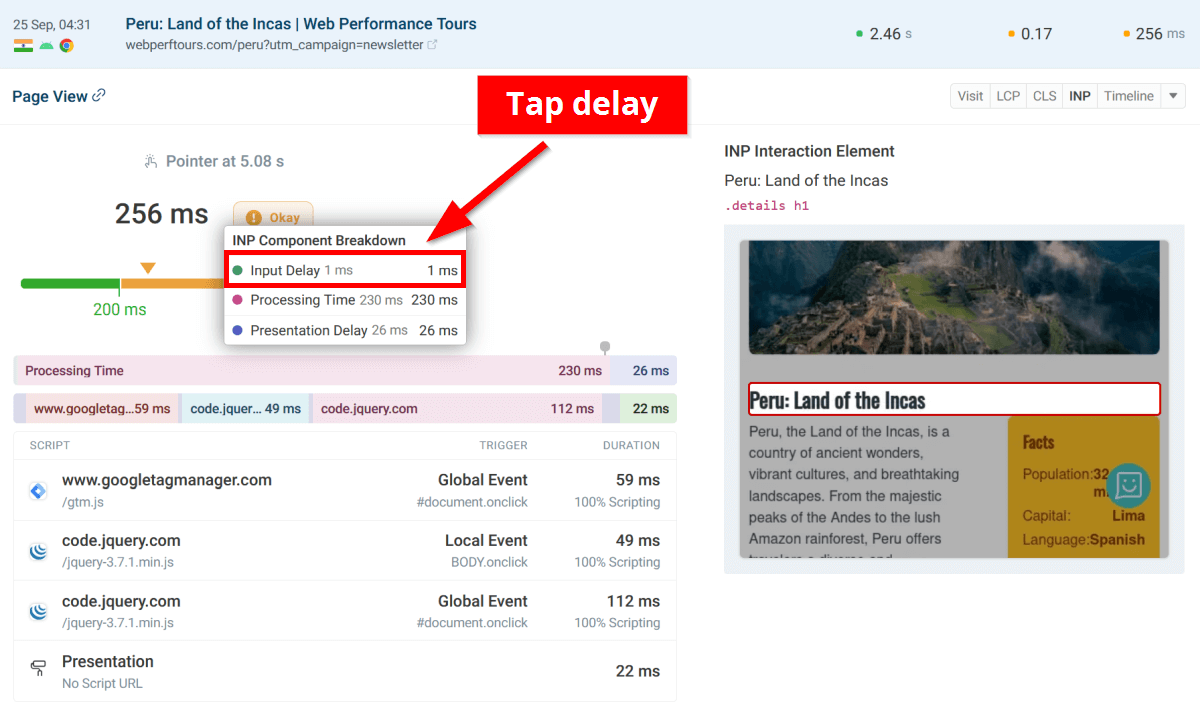
The screenshot above shows RUM data from our WebPerfTours.com demo site instead of Qatar Airways, since you can only use real user monitoring on domains you own (you need to add a small script to the HTML).
Sign up for a free 14-day trial to start detecting mobile and other performance issues on your website with DebugBear.
Monitor Page Speed & Core Web Vitals
DebugBear monitoring includes:
- In-depth Page Speed Reports
- Automated Recommendations
- Real User Analytics Data