Font performance optimization is a set of web development techniques that make fonts load faster and render more smoothly. They involve practices such as thoughtful font selection, the use of performant font formats, self-hosting, optimized @font-face declarations, font display strategies, and more.
Optimizing the fonts displayed on your website comes with many web performance advantages, including faster page load times, improved user experience, and better results for Core Web Vitals and other performance metrics.
On the other hand, improving font performance often comes at the expense of aesthetics and creativity (i.e. you’ll need to be careful about using custom typography), which can make it harder to establish a distinguishable brand identity.
Web-Safe Fonts vs Web Fonts: What's the Difference?
Before getting into the technical details of font performance optimization, let’s briefly look at an important aspect of font terminology — the difference between web-safe fonts and web fonts.
Both are digital font files, however:
Web-Safe Fonts Are Installed on the User’s Machine
Web-safe fonts, sometimes incorrectly used synonymously with system fonts, are pre-installed on most operating systems. As a result, the browser doesn’t have to download the font files and the related CSS from the web, which improves page load time and other web performance metrics, such as LCP and INP.
System fonts are a subset of web-safe fonts. They are used by the operating system to display UI elements in native applications. If you display system fonts on your website (we'll see below how to), you can provide a familiar look and feel to your users.
The main drawback of using web-safe fonts is that many of them can appear generic and tend to be overexposed. To create a more memorable and unique look for your website, you may want to use a custom web font instead.
Web Fonts Need to Be Downloaded from the Internet
Web fonts are custom fonts that are not installed on the operating systems of most web users, so the browser needs to download the font files and the related CSS file. They can be hosted on a third-party domain, such as Google’s CDN, or you can self-host them on your own domain.
When you test your website speed you can see the browser request these font files. In this example, three Woff2 files are loaded early on in the page load process.
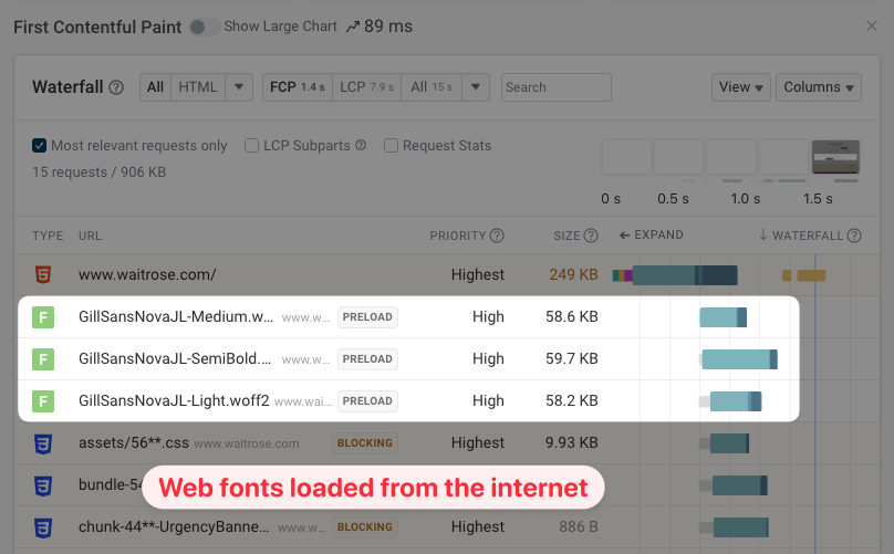
Loading web fonts takes longer for the browser than web-safe fonts since they need to be downloaded from the internet. However, you can still speed up web fonts to a reasonably acceptable level by implementing various performance optimization techniques (we'll see them below).
Note that while web fonts can enhance the look and feel of a website, custom typography requires fairly good design skills. Without the necessary expertise, your font selection may not be as successful, and your website may look worse than if you just used a more generic-looking web-safe font.
Use Web-Safe Fonts If Custom Typography Is Not That Important
Performance-wise, using solely web-safe fonts on your website is the best option. Below, we'll see how the browser loads local fonts in different scenarios and how you can still have some design freedom while using locally available fonts.
What Happens If You Don't Define a Font Family?
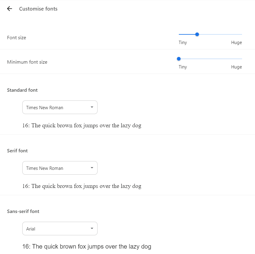
If you don't define any font family in your CSS, the browser will use the default font from the user's font settings. For example, in Google Chrome, you can find the default browser font (a.k.a. standard font) on the chrome://settings/fonts admin page:
What Happens If You Only Use Generic Font Names?
The CSS Font Module Level 4 web standard allows you to use five types of generic font names as values for the font-family property, each with a set of pre-defined characteristics for the exact definitions, see the docs:
serifsans-serifmonospacecursivefantasy
For example, you can use the following CSS rule to load a locally available serif font:
body {
  font-family: serif;
}
Generic font names map to different fonts on different platforms (depending on many things, such as the browser type and version, operating system, locally available fonts, user preferences, the Unicode range used on your website, etc.). It can also happen that different generic font names map to the same font (e.g. sans-serif and fantasy both map to Arial in Firefox on Windows 10).
Here’s an example of how the Chrome browser renders the same text in the five generic fonts on Windows 10 (if you want to see the generic fonts used on your own platform, open the demo in different browsers or download the source code):
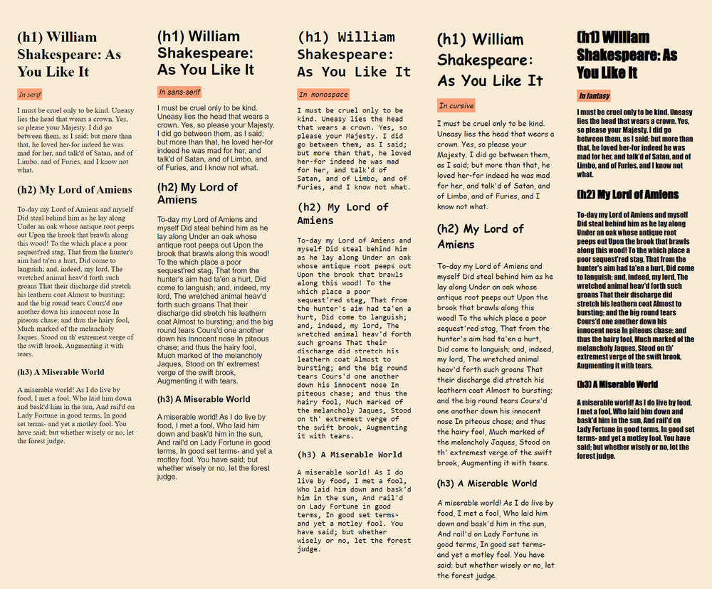
All in all, if you only use generic font names in your font-family declarations, your website will display somewhat similar-looking fonts across different platforms, but the aesthetic won’t be identical for all users.
How to Add Web-Safe Font Stacks?
A font stack is a list of fonts that defines one or more fallbacks for the primary font. The browser loads the first font in the list that’s available from either the network or the user’s machine. CSS allows you to assign a font stack (instead of just one font) to the font-family property in the following way:
div {
  font-family: Arial, Verdana, sans-serif;
}
If you want more control over your typography but don’t want to download custom web fonts, you can specify a web-safe font stack, which usually has a more unique look than the default font mappings. It’s also more likely that the same fonts will be displayed for website visitors who use the same operating system since they have the same fonts pre-installed on their machines.
You can check font availability manually for the operating systems you want to support, or you can use a pre-made font-family declaration from the CSSFontStack collection of web-safe font stacks for Windows and Mac systems.
When creating a web-safe font stack, start with the primary font that you want to use by default, then add similar-looking fallbacks until all the operating systems you want to support are covered, then end the declaration with the best-matching generic font name.
For example, CSSFontStack recommends the following font-family rule for the Book Antiqua font (note that all the fallbacks are web-safe fonts too):
body {
  font-family: Book Antiqua, Palatino, Palatino Linotype, Palatino LT STD, Georgia,
    serif;
}
How to Load the System Font on Each Operating System?
As I mentioned above, loading the system font on your website gives your visitors a sense of familiarity, which can improve the user experience on certain types of pages, for example, on the dashboard of a web application.
The following font-family rule includes the system fonts of the Mac, Windows, and Linux operating systems, and it (or its close variation) is used by popular web applications such as GitHub:
body {
  font-family: -apple-system, BlinkMacSystemFont, "Segoe UI", "Noto Sans",
    Helvetica, Arial, sans-serif, "Apple Color Emoji", "Segoe UI Emoji";
}
As an alternative, you can use the system-ui value, which loads the system font on the user’s operating system and is supported by all modern browsers:
body {
  font-family: system-ui;
}
If You Want to Use Web Fonts, Don’t Load More Than Two Font Families
If custom typography is important for your brand design and you've decided to use web fonts on your website, as a general rule, don't use more than two web font families on a page because of the negative performance implications such as a higher page weight and slower page load times.
For example, the page below (see the live version) downloads five custom font families — as you can see, the request waterfall generated by DebugBear shows that page rendering is blocked until all the five font files are downloaded):
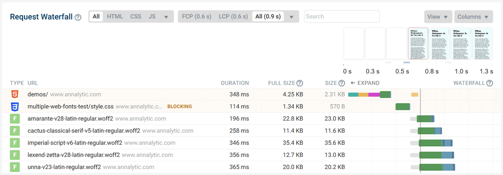
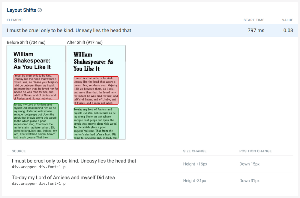
In addition, unexpected layout shifts can also happen when the fallback fonts are swapped with the custom fonts, which may harm your Cumulative Layout Shift results — to test the below demo, open our Free Website Speed Test tool and run a test on the https://www.annalytic.com/demos/multiple-web-fonts-test/ URL:
Self-Host Your Web Fonts
You can speed up your page by hosting your web fonts on your own domain (a.k.a. self-hosting them).
To self-host any web font, you need to:
- upload the font file(s) to your server
- add the relevant
@font-facedeclarations to your CSS (below, we’ll see how you can optimize them)
The web performance benefits of self-hosting web fonts stem from the following factors:
- You don't have to connect to one or more third-party servers (e.g. to download a Google Font, you need to make two external connections, one for the font files and one for the CSS), which reduces Time To First Byte (TTFB).
- You can optimize your
@font-facedeclarations (we'll see below how to do it). - As fonts are static assets, you can download them from a globally distributed content delivery network (CDN), which reduces latency (these days, most CDNs let you use your own domain).
Another advantage of self-hosting your web fonts is privacy, as your visitor’s IP address isn’t shared with a third party.
While in the past, self-hosting web fonts wasn't recommended unanimously (i.e. for websites that don't have access to a fast server or CDN), this is not the case anymore. The HTTP Archive's Web Almanac 2022 mentions that "there is no longer a performance benefit to using a hosted service after the introduction of cache partitioning", meaning that now self-hosting web fonts is universally recommended.
Despite the web performance advantages, self-hosting web fonts may not always be an option due to licensing restrictions. For example, this is the case with Adobe Fonts; even though there are still some solutions, especially if you're willing to pay.
How to Self-Host Adobe Fonts
Downloading and self-hosting Adobe Fonts is not possible officially — curiously, their 'Font licensing' page cites web performance reasons, according to which their CDN "performs much better and is more scalable than using local hosting for static assets" (evidence not included).
However, this statement contradicts the fact that you can still self-host some Adobe Fonts if you purchase a license through the Adobe Originals program (sold by resellers such as Type Network). Plus, Adobe Fonts has some open-source fonts available on GitHub, which you can self-host after downloading the font files and adding the relevant @font-face rules to your CSS.
Adobe Fonts also includes fonts from third-party providers (called type foundries). You can self-host some of these fonts if the third-party provider allows it in their license.
For instance, Google Fonts maintains a foundry at Adobe Fonts with 408 font families made available to Adobe users, which all use an open-source license, so you can self-host them if you download them from Google's network. For example, the Baloo Bhaina 2 Font is available from both Adobe Fonts and Google Fonts, plus a couple of other places e.g. as an npm package, as it's released under the SIL Open Font License.
How to Self-Host Google Fonts
To easiest way to add self-hosted Google Fonts to your website is using the Google Web Fonts Helper tool created by Mario Ranftl, which generates all the necessary @font-face rules, plus the font files converted to WOFF2 format (we'll look into WOFF2 in detail below).
Google Web Fonts Helper allows you to only download the font styles and character sets that you want to use on your website:
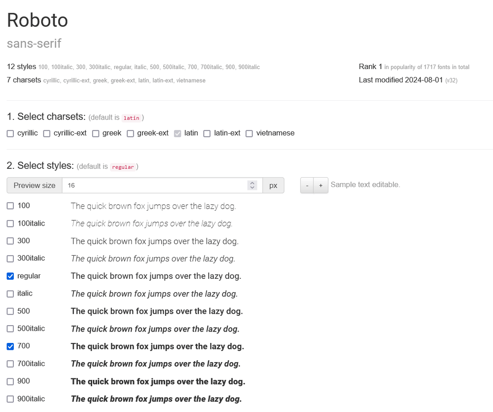
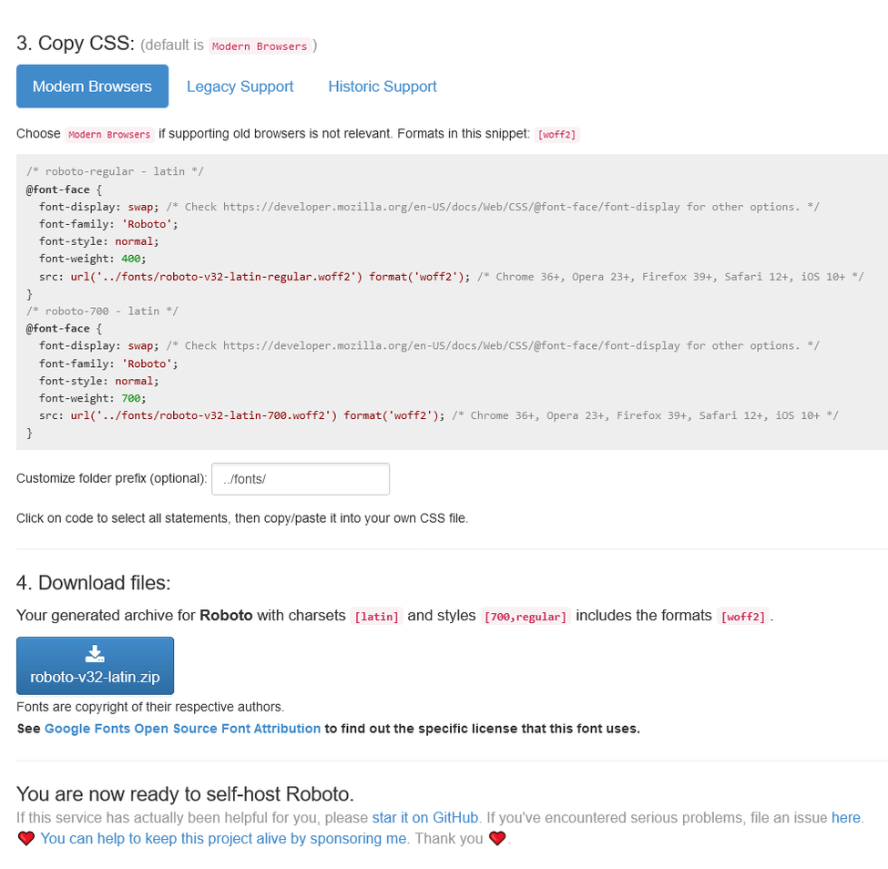
You can also copy the belonging @font-face rules that you'll need to add to your CSS.
At the bottom of the page, you can download the font files as a ZIP file — once it downloads, you'll need to unzip it, and upload the font files to your server:
Convert Your Self-Hosted Web Fonts to WOFF2 Format
Currently, WOFF2 (Web Open Font Format, version 2) is the most performant font compression format, with a 26.61% higher average compression ratio than WOFF1, since it uses Brotli compression (while WOFF1 uses GZIP, which is a less efficient compression algorithm — see the difference between GZIP and Brotli).
While the WOFF2 format is widely used nowadays, it still frequently happens that you can only download a web font in a less performant format, such as TTF, EOT, OTF, or WOFF1. For example, if you download a Google Font from the official fonts.google.com website, the font files still download in TTF (TrueType Font) format.
WOFF2 is supported by all modern browsers, which means that you only need to host your font files in WOFF2 format, and, as the Web Almanac 2022 puts it, "forget about everything else" (referring to the past when developers had to provide self-hosted fonts in different formats for different browsers).
To convert your font files to .woff2 format, you can use a conversion tool such as CloudConvert's WOFF2 Converter. Or, if you use the aforementioned Google Web Fonts Helper, you’ll download the font files as WOFF2 by default.
Optimize Your @font-face Declarations for Core Web Vitals
When you self-host a web font on your site, you need to add a @font-face declaration to your CSS for each font file, which defines its name, location, and other characteristics.
The @font-face at-rule has required and optional descriptors — with the former, you define the name and URL of the font, while the latter lets you specify its character set, loading method, size, and other features.
Required Descriptors of the @font-face Declaration
To define a custom font, you need to add the font-family and src descriptors to your @font-face declaration in the following way:
@font-face {
  font-family: "Anonymous Pro";
  src: url("fonts/anonymous-pro-v21-latin-regular.woff2") format("woff2");
}
Note that if you use more than one font style, you need to add one @font-face declaration to each file.
Here's an example of the Anonymous Pro font family if you want to download both the regular and italic styles — as you can see, we also add the font-style and font-weight descriptors that specify the supported weight and style values:
@font-face {
  font-family: "Anonymous Pro";
  font-style: normal;
  font-weight: 400;
  src: url("/fonts/anonymous-pro-v21-latin-regular.woff2") format("woff2");
}

@font-face {
  font-family: "Anonymous Pro";
  font-style: italic;
  font-weight: 400;
  src: url("../fonts/anonymous-pro-v21-latin-italic.woff2") format("woff2");
}
When Does a Web Font Download?
One of the most important things to understand about the performance implications of @font-face declarations is that they don't send a download request to the server.
A web font only downloads when it's used on the page.
For example, if you assign the Anonymous Pro font to the <body> tag with the font-family property, the browser will only send the belonging HTTP request to the server before it starts rendering the <body> element (not when it parses the @font-face declaration):
body {
  font-family: "Anonymous Pro", monospace;
}
The above font-family rule will only download the regular font file (anonymous-pro-v21-latin-regular.woff2), but not the italic one.
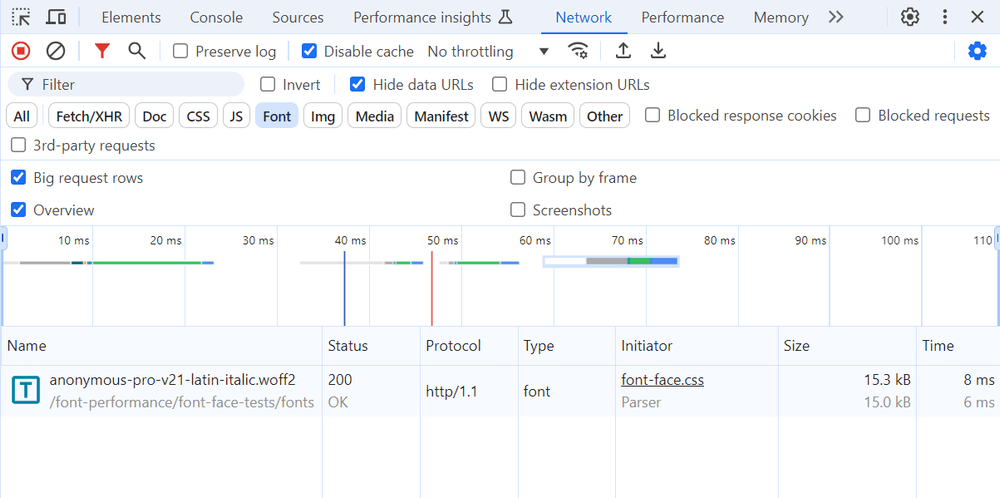
On the other hand, the following code will only download the italic font file (anonymous-pro-v21-latin-italic.woff2), but not the regular one:
body {
  font-family: "Anonymous Pro", monospace;
  font-style: italic;
}
Here's the evidence from the Network tab in Chrome DevTools (showing the latter example — as you can see, the regular font file didn't download):
If you want both font files to download, you’ll need to reference both in the CSS, e.g.:
body {
  font-family: "Anonymous Pro", monospace;
}
h1 {
  font-style: italic;
}
Optional Descriptors That Improve Font Performance
The following optional descriptors of the @font-face declaration can help you improve font performance — below, we'll see them one by one, in detail:
| Descriptor | Web performance benefit | Which metrics does it improve? |
|---|---|---|
unicode-range | only downloads the font file if the specified characters are used on the page | FCP, LCP |
local() | checks if the user has the font installed locally and if yes, it loads the local version instead of downloading the font file from the network | TTFB, FCP, LCP |
font-display | defines what fallback strategy the browser will use | CLS |
size-adjust | adjusts the sizes of the primary and fallback fonts | CLS |
1. The unicode-range Descriptor
The unicode-range descriptor allows you to specify the characters you want to use from a particular font file. If the HTML doesn't include any of the characters defined by unicode-range, then the font file won't download.
You can use the following CSS code to test this behavior (the unicode-range descriptor below defines one single Unicode character, the smiling emoji — unless you have a smiling emoji inside your <body> tag, the custom font won't download and the generic monospace fallback will be used instead):
@font-face {
  font-family: "Anonymous Pro";
  font-style: italic;
  font-weight: 400;
  unicode-range: U+1F642; /* smiling emoji */
  src: url("/fonts/anonymous-pro-v21-latin-italic.woff2") format("woff2");
}
body {
  font-family: "Anonymous Pro", monospace;
  font-style: italic;
}
There are a couple of ways to define the unicode-range descriptor, for example you can use multiple Unicode values, wildcard ranges, and more (see the syntax in the docs).
The Two Directions of Font Subsetting
Using the unicode-range descriptor shown in the code example above is one direction of font subsetting: you've already generated the WOFF2 font file and uploaded it to your server, but the browser only downloads it if the specified Unicode characters are used on the page.
However, you can also subset the font files themselves. For instance, when you select the character sets in Google Web Fonts Helper, it generates a subsetted font file that only includes characters from the selected charsets.
To give an example, if you select the Greek and Latin charsets of the Anonymous Pro font, you'll download a file called anonymous-pro-v21-greek_latin-regular.woff2, which will only include the Greek and regular Latin characters (but not the Cyrillic and extended Latin ones):
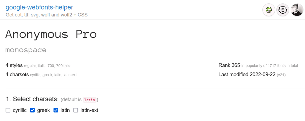
You can further improve web performance by creating subsetted font files that only include the characters you use on your website (e.g. this can be a good solution for a display font you only use for your logo). To create custom subsetted font files, you can use a tool such as subfont created by Peter Müller.
Note that it can happen that a font license doesn't allow subsetting. However, the SIL Open Font License used by most Google Fonts does support it — you can check other font licenses on the subsetting.xyz website built by Jeff Frankl.
2. The local() Function
The local() function is an optional value of the required src descriptor of the @font-face declaration. It allows you to check if the font is installed on the user's machine so that the browser can use the local font file instead of downloading it from the web.
As the src descriptor can take more than one value, you can combine the local() and url() functions in the following way:
@font-face {
  font-family: "Anonymous Pro";
  font-style: normal;
  font-weight: 400;
  src: local("Anonymous Pro Regular"),
    /* Full name */ local("AnonymousPro-Regular"), /* PostScript name */
      url("/fonts/anonymous-pro-v21-latin-regular.woff2") format("woff2");
}
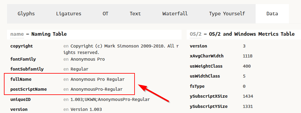
The local() declarations must come before the url() function because if the browser finds the local file, it won't send an HTTP request for the online file. It's also recommended that you add both the full name and PostScript name of the font file (PostScript is a page description language used by Adobe programs, which can also install fonts on your user's machine).
If you're not sure about the local names of a font, you can use a font viewer tool such as the FontDrop! app created by Viktor Nübel to check the fullName and postScriptName values in the font's naming table:
3. The font-display Descriptor
The font-display descriptor allows you to choose from four pre-defined font display strategies that specify the style of the text users see until the browser downloads the web font.
Unfortunately, none of the existing font display strategies are perfect, so you'll have to sacrifice either performance or aesthetics to an extent (or both, but to a lesser degree).
With web fonts, you can basically choose between three display problems:
- FOIT (Flash Of Invisible Text) – The browser shows invisible text until the web font downloads.
- FOUT (Flash Of Unstyled Text) – The browser renders text blocks using the fallback font until the web font downloads.
- The web font isn't shown. – The browser shows the fallback font permanently if the web font doesn't arrive in time (when using this strategy, it frequently happens that the browser doesn't even request the web font as it pre-calculates the download time from the user's network connection).
Both FOIT and FOUT can cause unexpected layout shifts (you can tackle this by matching the sizes of the web and fallback fonts; we’ll see later how to do it).
The font-display descriptor can take the following values, each representing a different font display strategy (each strategy has two periods: the block period when the font rendering process is halted and the swap period when the fallback font is swapped with the web font):
-
block:- Block period: Short (3s is recommended for browser vendors by the CSS Fonts Module standard)
- Swap period: Infinite
- Advantages: The custom font will be used (the user most likely won’t see the fallback font, as three seconds is a fairly long block period).
- Disadvantages: It can cause FOIT and unexpected layout shifts (the fallback font is used to calculate the size of the invisible text).
- Recommended for: If custom typography is important, and for short text strings (e.g. for a display font used for the logo) or text blocks that are below the fold.
-
swap:- Block period: Extremely short (100ms or less is recommended)
- Swap period: Infinite
- Advantages: The text will be rendered early in the fallback font, and later the custom font will be used.
- Disadvantages: It can cause FOUT and unexpected layout shifts.
- Recommended for: If custom typography is important, and for longer text blocks.
-
optional:- Block period: Extremely short (100ms or less is recommended)
- Swap period: 0
- Advantages: The text will be rendered early either in the web font or the fallback font, there’s neither FOUT nor FOIT, and it won’t cause unexpected layout shifts.
- Disadvantages: The custom font won’t be used if it doesn’t arrive under 100ms.
- Recommended for: For longer text blocks (e.g. the
<body>text) if performance is the priority and custom typography is not that important.
-
fallback:- Block period: Extremely short (100ms or less is recommended)
- Swap period: Short (3s is recommended)
- Advantages: The custom font has three seconds to arrive (as opposed to just 100ms provided by optional), so it's more likely that it'll be shown.
- Disadvantages: It can cause FOUT and unexpected layout shifts (but less likely than the swap strategy).
- Recommended for: For longer text blocks (e.g. the
<body>text) if custom typography is more important, as it finds the balance between aesthetics and performance.
-
auto:- Block period: n/a
- Swap period: n/a
- Advantages: n/a
- Disadvantages: n/a
- Recommended for: This is the default value of font-display; it uses the browser's built-in display strategy, which is usually the same as the block strategy.
For a good Cumulative Layout Shift result, use either the optional or fallback strategy for longer text blocks in the following way:
@font-face {
  font-display: optional;
  font-family: "Anonymous Pro";
  font-style: normal;
  font-weight: 400;
  src: local("Anonymous Pro Regular"), local("AnonymousPro-Regular"),
    url("/fonts/anonymous-pro-v21-latin-regular.woff2") format("woff2");
}
To learn more about how the different font display strategies work, check out our article on how to fix layout shifts caused by web fonts.
4. The size-adjust Descriptor
The size-adjust descriptor is a newer addition to the @font-face declaration, but its browser support is already fairly good (supported by the newer versions of all modern browsers). It allows you to match the sizes of the web and fallback fonts to prevent unexpected layout shifts during the swap period.
Size adjustment is important because glyphs in different font faces frequently have slightly different widths and heights, so larger text blocks will occupy different areas on the screen, which can cause unexpected layout shifts when the fonts are swapped.
The size-adjust descriptor takes a percentage value that defines the multiplier with which the outline of the glyphs will be increased or shrunk. You can either calculate the multiplier manually by comparing the exact sizes of the web and fallback fonts or by using a tool such as Fallback Font Generator created by Brian Louis Ramirez.
Below, you can see how to adjust the sizes of the Anonymous Pro web font and the Courier New fallback font.
First, set size-adjust to 100% (its default value), and check if the two fonts occupy the same space (you need to compare the rectangles around the text blocks, as that's what needs to be adjusted to avoid unexpected layout shifts):
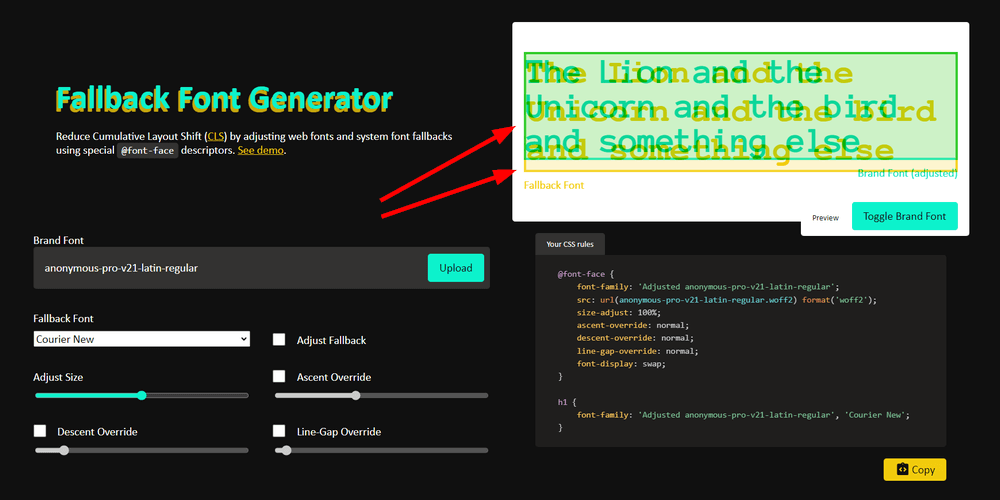
As you can see above, the custom font (in green) is a bit smaller than the fallback font (in yellow), so I increased the value of size-adjust until the two rectangles occupied the same space.
The sizes matched at 113% (it’s recommended that you test the value of size-adjust with both shorter and longer text strings):
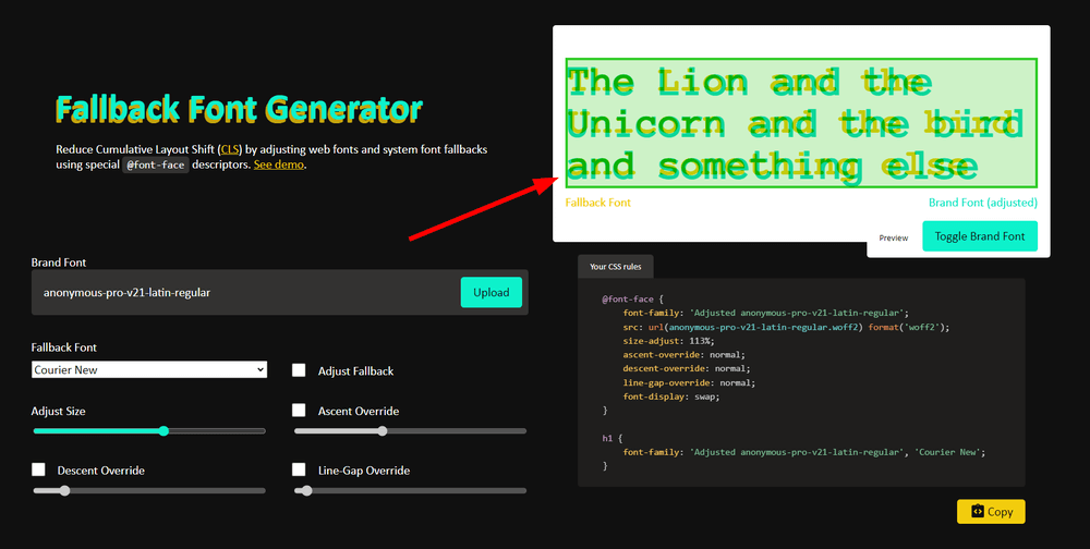
So, this is what the @font-face declaration looks like with the size-adjust descriptor (in the <body> tag, we also need to define the order of the fallback fonts for size-adjust to properly work):
@font-face {
  font-display: fallback;
  font-family: "Anonymous Pro";
  font-style: normal;
  font-weight: 400;
  size-adjust: 113%;
  src: local("Anonymous Pro Regular"), local("AnonymousPro-Regular"),
    url("/fonts/anonymous-pro-v21-latin-regular.woff2") format("woff2");
}

body {
  font-family: "Anonymous Pro", "Courier New", monospace;
}
The @font-face declaration also has three other optional descriptors that can help you fine-tune the sizes of the web and fallback fonts.
While you can optimize your web fonts for CLS without them, if you want to provide a more seamless swap period, you can consider using them too (all are available in the above Fallback Font Generator tool, however note that, as of the time of writing, none are supported by the Safari browser):
ascent-override– It specifies the percentage value by which the glyph’s height above its baseline will be increased or decreased.descent-override– It specifies the percentage value by which the glyph's height below its baseline will be increased or decreased.line-gap-override– It specifies the percentage value by which the line gaps will be increased or decreased.
Inline Your @font-face Rules in the Head Section of Your Page
To make your fonts download as fast as possible, inline your @font-face rules in the <head> section of your HTML page as part of your critical CSS.
There are two important things to remember:
- If you have more than one
@font-facedeclaration on a page, start with the most important one so that it'll be requested first (e.g. the custom font used for the<body>tag). - As I mentioned earlier, the
@font-facedeclaration doesn't send a request to the server. To initiate the download process, you need to reference the font face on the page by defining afont-familyrule.
Here's a code example of an inlined and minified @font-face declaration, together with a font-family rule added to the <body> tag, which will initiate the HTTP request (the code was minified with Minifier.org):
<style>
  @font-face {
    font-display: optional;
    font-family: "Anonymous Pro";
    font-style: normal;
    font-weight: 400;
    size-adjust: 113%;
    src: local("Anonymous Pro Regular"), local("AnonymousPro-Regular"),
      url(/fonts/anonymous-pro-v21-latin-regular.woff2) format("woff2");
  }
  body {
    font-family: "Anonymous Pro", "Courier New", monospace;
  }
</style>
Optimize Your Downloads if You Can't Self-Host Your Web Fonts
While self-hosting is the recommended way to serve custom fonts, it can happen that you can't do it for some reason.
Below, we’ll see how you can still improve web performance if you need to download your web fonts from Google’s or Adobe’s CDNs.
How to Optimize Google Fonts for Web Performance if You Can’t Self-Host Them
Google provides you with some options to optimize your web fonts for performance and Core Web Vitals if you download them from their CDNs instead of self-hosting.
Before looking into them, let’s see the default setup:
What Happens When You Download a Web Font from Google’s CDN?
This is the default code Google Fonts shows you if you want to download the normal and italic styles of the Anonymous Pro font from Google’s CDN (you need to add it to the <head> section of your HTML page):
<link rel="preconnect" href="https://fonts.googleapis.com" />
<link rel="preconnect" href="https://fonts.gstatic.com" crossorigin />
<link
  href="https://fonts.googleapis.com/css2?family=Anonymous+Pro:ital@0;1&display=swap"
  rel="stylesheet"
/>
The code above downloads two WOFF2 files (one for the normal and one for the italic style) and a CSS file with eight @font-face rules — for the four character sets that Anonymous Pro supports (Cyrillic, Greek, Latin Extended, Latin) for the normal and italic styles (if you also want to download the bold and bold italic styles, there'll be 16 @font-face rules in the CSS):
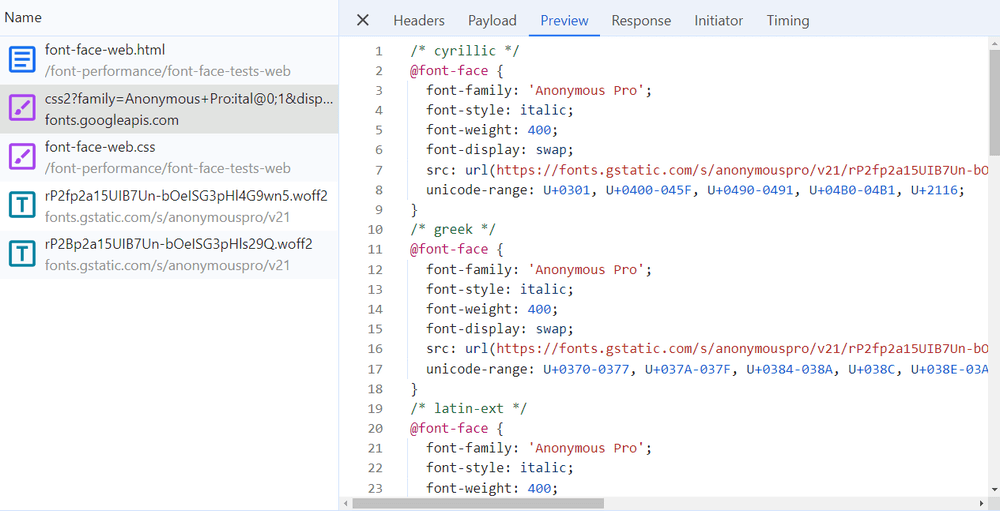
This is a lot of code, especially if you just want to use the Latin character set.
How Can You Optimize Your Web Font Downloads?
Currently, there's no way to get rid of the @font-face rules belonging to the character sets you don't want to use (unless you use the text URL parameter — see below), so the "best" solution is to only request the styles that you really need (e.g. if you don't need bold italics, omit it from the URL).
The WOFF2 font files you download from Google’s CDN are automatically optimized for modern browsers that support the unicode-range descriptor, as they detect which character sets you need on the page and only request those subsets of the font (e.g. if you don’t have Greek or Cyrillic characters on the page, your WOFF2 files won’t include those glyphs). In the past, this was done with the subset parameter, which is not necessary anymore, unless you want to support legacy browsers.
As subset is ignored by modern browsers, today, we only have access to two optional URL parameters to improve web performance:
display– This is the equivalent of thefont-displaydescriptor of the@font-facedeclaration (see above). By default, Google Fonts usesdisplay=swap, but you can change it todisplay=fallbackordisplay=optionalto improve your Cumulative Layout Shift results.text– It further subsets the font by only including the characters that are present in the specified text (e.g.text=YourBrand).
For example, the following <link> element uses the fallback display strategy and only downloads the characters included in the "YourBrand" text:
<link
  href="https://fonts.googleapis.com/css2?family=Anonymous+Pro:ital@0;1&text=YourBrand&display=fallback"
  rel="stylesheet"
/>
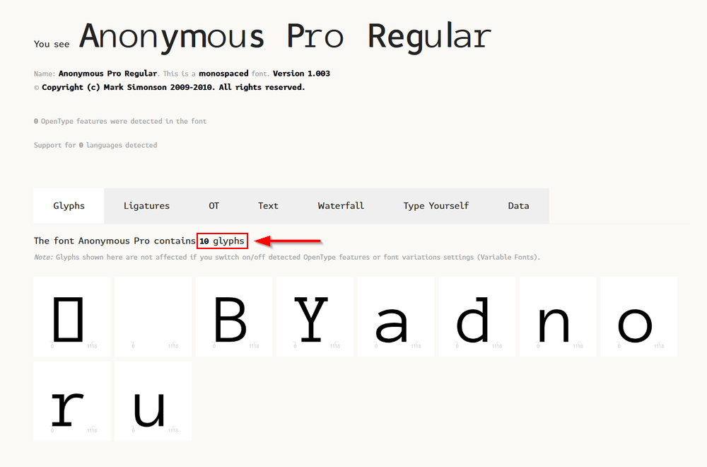
Here’s what the subsetted WOFF2 file looks like (opened in the aforementioned FontDrop! app) — as you can see, it only includes the glyphs we requested (it even differentiates uppercase and lowercase letters):
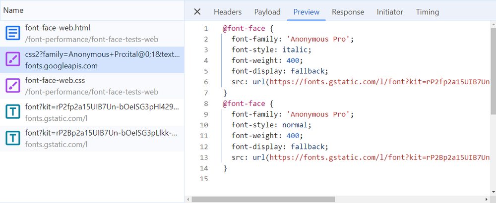
Interestingly, if you use the text parameter, the downloaded CSS file will only include two @font-face declarations, which define the character sets that belong to the requested glyphs (in this case, the regular and italic styles of the Latin charset):
Now, you may ask whether it’s a good idea to assign all the Latin characters to the text parameter to prevent Google API from adding all the unnecessary @font-face declarations.
Technically, it’s possible, and in that case, the CSS file will only include two @font-face declarations.
However, URL parameters only accept alphanumeric characters, so you can’t add extra characters such as quotation or exclamation marks (if you do so, the browser will ignore them). So if there are such characters on the page (which is very likely), the browser will load them using the fallback font. As a result, your text blocks will look “a bit” strange, plus the browser will have to load both the web and fallback fonts.
So overall, it’s not recommended (probably it’s not a huge performance gain, either). If you still want to do it, here’s the code you need to use:
<link
  href="https://fonts.googleapis.com/css2?family=Anonymous+Pro:ital@0;1&text=abcdefghijklmnopqrstuvwxyzABCDEFGHIJKLMNOPQRSTUVWXYZ0123456789&display=fallback"
  rel="stylesheet"
/>
How Do the Preconnect Links Speed Up Font Rendering?
The other two <link> elements you need to add when you download Google Fonts from Google’s CDNs are two preconnect links — the first one preconnects to the fonts.googleapis.com subdomain for the CSS file while the second one preconnects to fonts.gstatic.com for the WOFF2 files:
<link rel="preconnect" href="https://fonts.googleapis.com" />
<link rel="preconnect" href="https://fonts.gstatic.com" crossorigin />
Preconnect is a type of resource hint that allows you to set up an HTTP connection with a third-party domain early in the page rendering process so that you can immediately use that connection when you need a resource (e.g. a font). By preconnecting to Google’s CDNs, you can make your fonts load faster.
As you can see above, the second <link> tag also includes a crossorigin attribute, which is necessary because font files must be requested over a CORS connection.
Is It a Good Idea to Preload Google Fonts?
To speed up font rendering even more, you can consider preloading your most important font files after preconnecting to the servers. Preload is another type of resource hint that allows you to download a resource file.
Preloading web fonts is a somewhat controversial topic, as developers sometimes overdo it, say, they preload 10 different font files on a page. Google’s web.dev documentation also warns against preloading too many web fonts, as it’s “taking away browser resources from the loading of other resources”.
Still, according to our experience, preloading one or two font files (the ones you use most on the page) can help with page load times.
For example, it’s a good idea to preload the font files that you use for the <body> text and the headings. The following code snippet preloads the regular and bold styles of the Anonymous Pro font (you need to add it to the <head> section below the preconnect hints):
<!-- Anonymous Pro Regular -->
<link
  rel="preload"
  href="https://fonts.gstatic.com/s/anonymouspro/v21/rP2Bp2a15UIB7Un-bOeISG3pHls29Q.woff2"
  as="font"
  type="font/woff2"
  crossorigin
/>

<!-- Anonymous Pro Bold -->
<link
  rel="preload"
  href="https://fonts.gstatic.com/s/anonymouspro/v21/rP2cp2a15UIB7Un-bOeISG3pFuAT4C7c7Q.woff2"
  as="font"
  type="font/woff2"
  crossorigin
/>
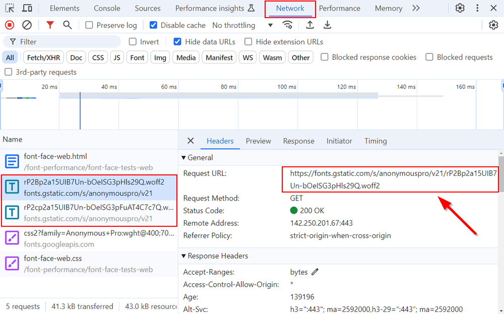
To get the URLs for the WOFF2 files, open the Network tab of your DevTools, load your site, find the fonts in the file list, and copy the URLs from the Headers tab:
How to Optimize Adobe Fonts for Web Performance if You Can’t Self-Host Them
To add Adobe Fonts to your website, you need to create a web project on the Adobe Fonts website.
Here are Adobe’s guides you can use to optimize your Adobe Fonts for Core Web Vitals and other performance metrics within the web project:
- Customize your font display strategy
- Choose the character sets you need, then use dynamic subsetting
It’s also recommended that you preconnect to Adobe’s server in the following way:
<link rel="preconnect" href="https://use.typekit.net" crossorigin />
<link rel="preconnect" href="https://p.typekit.net" crossorigin />
If your Adobe Fonts download only from one server (use.typekit.net is the subdomain for the legacy service while p.typekit.net is the subdomain for Adobe’s new web font service), only add the belonging preconnect hint (you can check it in either your browser DevTools or our DebugBear app).
Similar to Google Fonts, it’s also a good idea to preload your most important font files after preconnecting to the font servers (you can use the code snippet discussed in the previous section; you only need to change the URLs).
Measure Font Performance with DebugBear: Lab vs RUM
The request waterfall shown above in this post highlighted how font downloads affect page rendering in a lab (simulated) environment set up in one of DebugBear's test locations.
Here it is again:

The above is a lab-based test, as opposed to a real user monitoring (RUM) page view.
DebugBear offers both lab-based and RUM tests.
When using DebugBear's real user monitoring feature, you can see a partial network request waterfall for each page view, showing when key resources were loaded for the particular user. If a web font is present, it may have a noticeable impact on web performance metrics such as LCP, CLS, TTFB, download time, and others:
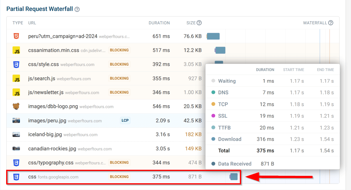
Understanding how web fonts affect your real users can help you a lot in fine-tuning your font performance strategy.
What Else Can You Do for Fast-Loading Fonts?
Optimizing the fonts on your website, including finding the right balance between performance and aesthetics, is essential to providing a good user experience for your visitors.
Essential, but not enough.
To serve fast-loading fonts, we also recommend implementing the following web performance best practices:
- Use code splitting for your CSS files and remove unused CSS, as these techniques can reduce the number of fonts downloaded on a page (since the font file needs to be referenced in the CSS code to initiate the HTTP request).
- Support the HTTP/3 network protocol, as it can result in faster downloads.
- Download your static resources, including fonts, from a CDN.
- Implement caching — this is usually done automatically by your web host or CDN provider, but if you need to handle it manually, use long-expiration caching headers for your font files.
- Monitor your most important pages with a web performance analysis tool such as DebugBear, as it can help you detect and fix your unique performance issues and bottlenecks.
Optimize fonts and overall performance
To get started with DebugBear monitoring, sign up for a free 14-day trial that gives you access to the full functionality, including synthetic and real user monitoring, CrUX trends, historical charts, test comparisons, and more.
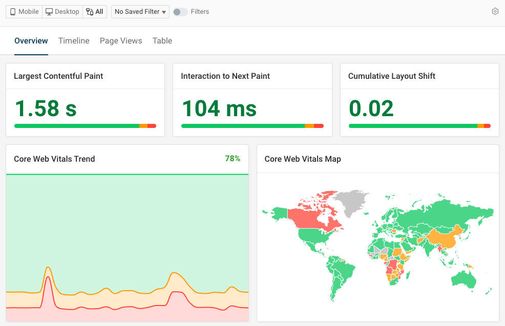


Monitor Page Speed & Core Web Vitals
DebugBear monitoring includes:
- In-depth Page Speed Reports
- Automated Recommendations
- Real User Analytics Data
