
In our previous article, we covered some core tactics for using images to boost your site's SEO.
But as we discussed then, heavy image use can backfire badly if the files slow your site down, degrade user experience, and damage your Core Web Vitals.
So optimizing your images is a crucial part of improving your website performance. In this article, we'll go through all the best practices so that your beautiful images load for your users as smoothly and swiftly as possible.
How to optimize your images for page speed
There are a few strategies you can follow to speed up loading your images:
- Reducing file size so images load more quickly
- Prioritizing important images to use network resources efficiently
- Avoiding layout shift when images render
- Setting up caching properly
- Not embedding large images in HTML or CSS
- Using optimization features inside your CMS or plugins
Let's look at each of these in detail.
Avoid huge file sizes
The easiest way to manage performance is to simply minimize the size of your image files. Uncompressed full-size images can easily be 5 to 10 megabytes, so if multiple images like that appear on a page, your page weight could easily reach 50 or even 100 megabytes!
Let's look at some ways to reduce image file size.
Use correct image sizing
It's simple but bears repeating: there's no point in embedding images vastly larger than they're displayed on your website!
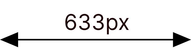
On a desktop, the width of this article content is 633 pixels.
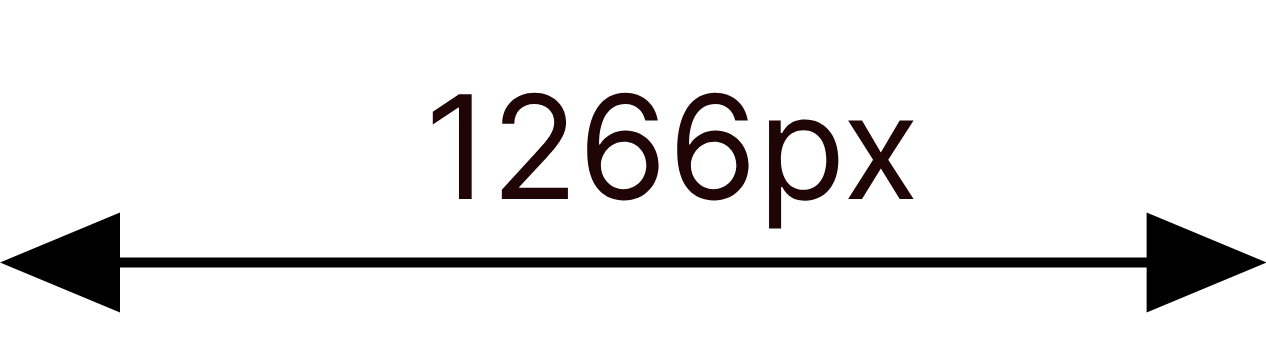
On a 2x Retina screen, we can serve up an image twice as wide (1266 pixels) to keep things extra crisp.
But any more detail than that is simply going to waste.
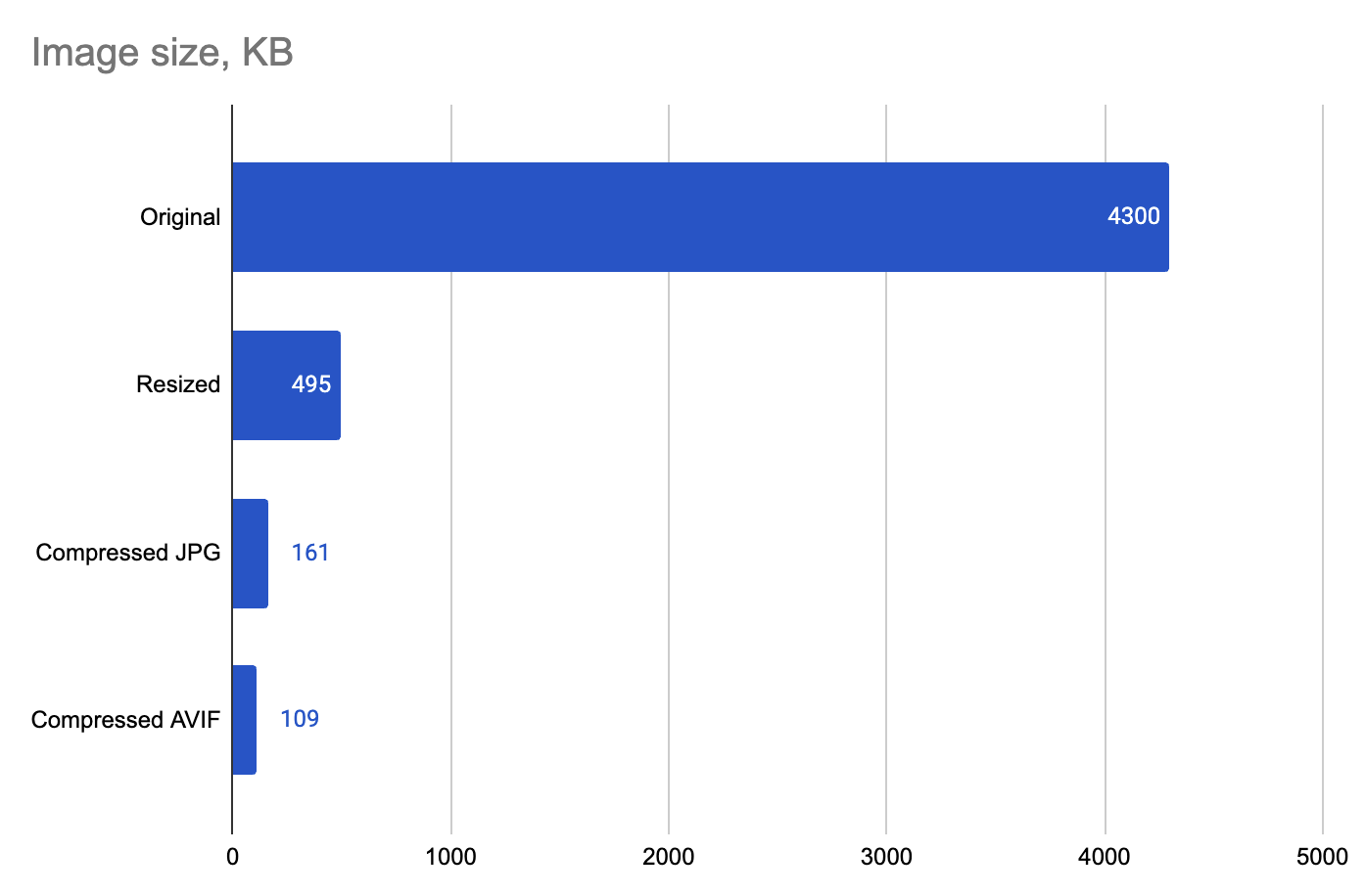
The image below, downloaded from Pexels, was originally 7108 x 4744, which is 33.7 million pixels and weighs 4.3 megabytes.

Simply by resizing it to the appropriate screen size for this article - 1266 x 845 – the filesize drops to 495 kilobytes, a reduction of 89%. Laid on top of one another, the difference is pretty stark:

Compress your images appropriately
Many image formats allow for different levels of compression - this reduces the filesize without making a major difference to the visual quality. Let's start with the 495 kilobytes image we just resized above:
Using Squoosh, we can create a JPG with quality set to 75%. Can you spot the difference?

This image is just 161 kilobytes, another 67% saving on the uncompressed version. Choosing a compression level that suits your use case makes good sense.
We take a look at two popular image compression tools: Optimizilla vs. Squoosh.
Use modern file formats
All modern browsers support new image formats such as WebP and AVIF, which can squeeze out some additional file-size reductions through newer compression algorithms.
Here's that image again, this time as an AVIF with medium quality:

Now the file size is down to just 109 kilobytes, a further 32% saving (or 78% from the original uncompressed version).
Now we've gone through each of these steps, we could deliver 40 of these images on a page for the same total page weight as the original image we downloaded from Pexels. That's a huge difference.
Use our free JPEG to WebP and PNG to WebP conversion tools to optimize your images.
Use SVGs for vector graphics
SVGs are a web format for delivering vector graphics that stay sharp at any scale. Rather than storing individual pixels (raster graphics), SVGs store shape descriptions that can then be converted to pixels later.
That makes them a great format for logos, digital illustrations, icons, and other pictures. The file size stays the same no matter how large they're ultimately rendered, whereas regular raster graphics files get larger.

For example, the 1266-pixel-wide file above is 26 kilobytes as a JPG but just 2 kilobytes as an SVG file. As the image dimensions get larger, the JPG will increase in size, while the SVG would stay the same.
Responsive images: offer different files for different user devices
Some users might be viewing your website on a large desktop monitor, while others visit on a small mobile device. Historically, we'd feel the need to serve up a high-resolution image (so it isn't blurry on desktop) even though that's overkill on a smaller screen.
For instance, a common web page element is a full-width 'hero' graphic. On an Apple Studio monitor, that's 5120 pixels across, whereas an iPhone 17 only has a 1206-pixel width.
Even among a device type, screens will have different resolutions, users may use different zoom settings, and browser windows can be all sorts of sizes.
The solution? By using responsive images in HTML, we can actually provide alternative image files depending on the final size the image will be rendered at. This way, the browser only needs to download the most appropriate image for its use case.
This is particularly useful as the devices with the smallest screens (mobiles) are most likely to be on a slower connection, so we want to avoid serving these users unnecessarily large images if we possibly can!
There are a number of approaches to optimize this in code, but one of the simplest is to use srcsets in img tags, like so:
<img
  srcset="img-400.png 400w, img-800.png 800w, img-1600.png 1600w"
  sizes="(max-width: 600px) 400px, 800px"
/>
In this example, the browser is given three image options of different sizes (400px, 800px, and 1600px wide) and instructions to display the image at 400px wide on screens 600px or smaller, or 800px wide on larger screens, allowing it to automatically choose the most appropriate image file based on the device's screen size and resolution for optimal performance and image quality.
Other approaches involve using <picture> and <source> elements to provide the browser with multiple options, or using media conditions instead. You can also use similar techniques with CSS.
It can get complicated – the Waitrose site offers image files in 180 different sizes per slot! – but the data savings can be considerable, allowing you to serve up beautifully high-resolution imagery on the largest screens while conserving bandwidth for mobile users.
Prioritize the right content
It's entirely possible to deliver a lot of images on a page—even high-resolution ones—without disrupting the user's experience of page speed. The secret is to properly prioritize the visible content.
Lazily load images that are out of the viewport
If an image doesn't currently appear on the user's screen—for instance, it's further down the page—the browser doesn't need to download it right away. There may be other, more important files to download and process in the critical rendering path.
You can define this explicitly by adding the loading="lazy" attribute to the image tag.
<img
  loading="lazy"
  src="https://www.debugbear.com/dimg/f71b1e5e31326bcad9ae3b014d491d68.png"
  alt="Screenshot of LCP data"
/>
Prioritize loading images that are in the viewport
Conversely, check that images that appear above the fold, and should be displayed right away, are downloaded as a priority.
For starters, check that your site template is not indiscriminately adding a loading="lazy" to every single image, including your LCP image at the top – this will slow down the download. (Read more: How to Fix Largest Contentful Paint Image Was Lazily Loaded.)
Browsers attempt to prioritize images that appear towards the top your page, but they don't always get it right. To enforce this, you can add a fetchpriority="high" attribute to your high-priority image to encourage speedy downloading.
How to prioritize background images in the viewport
If the image is rendered through CSS (perhaps as a background image) you will need to set the fetchpriority separately by offering a preload hint. In the <head> of your page, add a tag like this to help the browser discover and download the image sooner:
<link
  rel="preload"
  as="image"
  href="important-background-image.png"
  fetchpriority="high"
/>
There's more detail in our guide: How To Fix Largest Contentful Paint For Background Images.
Define the height and width of images
When no image size is provided in the HTML, the loaded image can "push down" other content when it appears because the browser has no way of knowing how much space to hold in reserve. This "layout shift" negatively affects your Cumulative Layout Shift (CLS) Core Web Vital.
Instead, define the image size or aspect ratio with attributes, like so:
<img src="header-banner.png" width="800" height="200" />
Learn how to fix this issue: Fix Image Elements Do Not Have Explicit Width And Height.
Avoid encoding large images with Base64
Here's a little black-and-white smiley face:

Rather than deliver a separate image file, we can turn it into a string of base64 characters using an online tool, and then just include that in the image URL, like this:
data:image/png;base64,iVBORw0KGgoAAAANSUhEUgAAACAAAAAgBAMAAACBVGfHAAAAAXNSR0IB2cksfwAAAAlwSFlzAAALEwAACxMBAJqcGAAAACRQTFRF////7+/vz8/Pv7+/cHBwQEBAb29vn5+fYGBgAAAAX19foKCgZkRRUwAAAOFJREFUeJxjZEADjAyMSvz3PoCZYAYjA5Mz/5kHIAGm5PdABiOjWtx5mMBnqXkfGJnctPfDtIj4znnAyOR05wHMQKakPQ8YGRXffYDbAGQzMsCtgdkCNR1uCwMDc5jN7AsMMBqbAMxlcC0YhiL8AfEcA8IfCAGEh6ACTGnc+1G0MAfdvgAPIKwCiDCAG1q3Hm4o2P8Q10K8z5Sy6wHUYeAAAurXmgfVrhYLDEIgFT/rAdQ1XnGgEANacQAswAIMY7Bv1eo2QFwTFQfxLZOzAFjgP8hmRrDfoQIgtzFiRjYhAQBTJGwhZMdZsQAAAABJRU5ErkJggg==
For a tiny image, that's not too bad. But if it was a larger image, the many thousands of characters would take up a large part of your HTML file, which slows down the browser from parsing all the subsequent HTML or CSS. As HTML and CSS are render-blocking, that's not ideal.
Image data expressed this way also has a larger file size than if it was embedded as an image file.
In general, this is a method best avoided for all but the smallest images. For more information, see our explainer: Avoid Large Base64 Data URLs in HTML and CSS
Set up caching properly
Even perfectly optimized images need to travel from a server to your visitor's device—and that journey takes time. Caching and CDNs are techniques that dramatically reduce this delivery time.
Browser caching: Once a visitor downloads an image from your site, their browser can save it locally. On their next visit, the image loads instantly from their device instead of being downloaded again. This is especially valuable for logos, icons, and other images that appear on multiple pages. You can control how long browsers cache your images through HTTP headers—longer cache times mean faster repeat visits.
Server caching: Your server can store pre-processed versions of your images, so it doesn't have to resize or optimize them from scratch every time someone requests them. This reduces server processing time and speeds up initial page loads.
CDNs (Content Delivery Networks): CDNs store copies of your images on servers distributed around the world. When someone in Tokyo visits your site, they get images from a nearby server in Asia rather than from your origin server in, say, New York. This geographic proximity can cut image load times by 50% or more for international visitors.
Steps to take:
- Enable browser caching through your server configuration or CMS settings (your host or developer can help with this).
- Consider using a CDN, especially if you have a global audience—many hosting providers include CDN services, or you can use standalone options like Cloudflare's free tier.
- Check that your CDN is actually serving images cached at a CDN edge node.
Understand your site's CMS, templates, and plugins
Your site likely has a content management system (CMS) that lets you upload images. Here's the thing: that system may already be resizing, renaming, and optimizing your images automatically—or it might not be doing anything at all. (It might even, in theory, be making things worse!)
Before you spend time manually optimizing images, find out what's already happening behind the scenes. Your CMS might be handling some (or all) of the optimization work for you. On the flip side, if nothing's being optimized automatically, you'll need to either configure those settings or handle optimization before you add images to the system.
Common example: Many WordPress sites use image optimization plugins that automatically convert images to WebP format, resize them to fit your template's dimensions, and even add AI-generated alt text. Meanwhile, your WordPress theme controls other aspects like lazy loading and responsive image delivery.
What to check:
- Review your CMS settings and any installed plugins to see what image processing is enabled.
- Look at your template's documentation to understand how it handles images.
- Audit a few existing images on your site (see below!) to see if they're already optimized in practice—this will tell you whether your current setup is working.
Once you understand what's already happening, you can adjust your workflow accordingly and ensure your settings align with the best practices outlined earlier.
How to audit image delivery on your website
Test your pages with DebugBear
- Grab a list of your most-visited URLs from your web analytics, like Google Analytics.
- Create a free trial account with DebugBear, and choose Bulk Add.
- Import your list of URLs, and wait a few minutes for us to test your pages.
- Add 'Page Weight (Images)' to the columns in the lab test dashboard, and click 'Page Weight' in the column header to sort your pages by size.
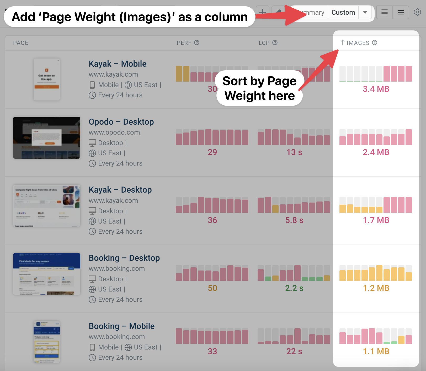
This will make it easy to spot any pages with a surprisingly high page weight.
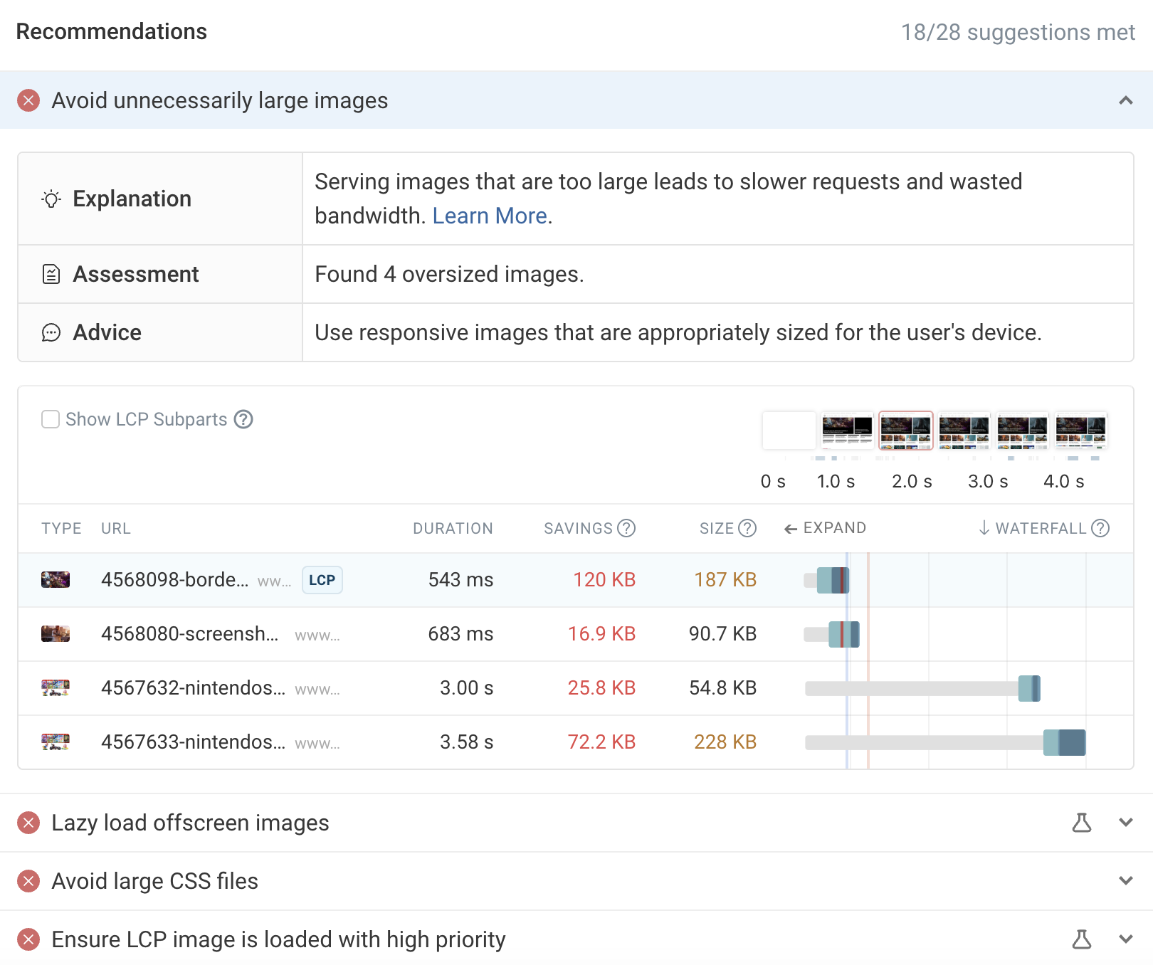
Diving into any given result, you can check out the recommendations on the Overview page:
Or, click the Lighthouse tab in the left-hand navigation and scroll down to look for applicable insights:
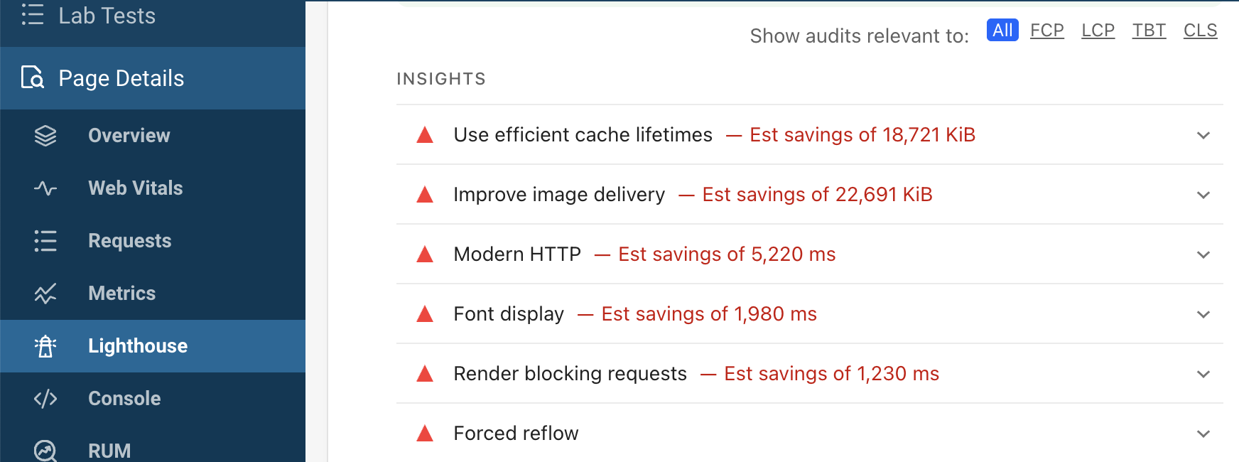
On the page above, for example, we can see over 22 megabytes of possible savings through improved image delivery!
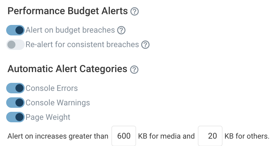
Finally, you can use scheduled lab tests and Performance Budgets in DebugBear to alert you to any major changes. For instance, this setup will let you know via email, Slack or Microsoft Teams if a key page experiences an increase in page weight over 600 kilobytes:
And it's not just images: DebugBear can help you identify all kinds of page speed issues on your website and shows you how to fix them. Sign up for a free trial.
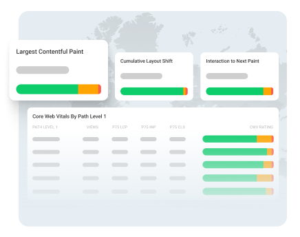
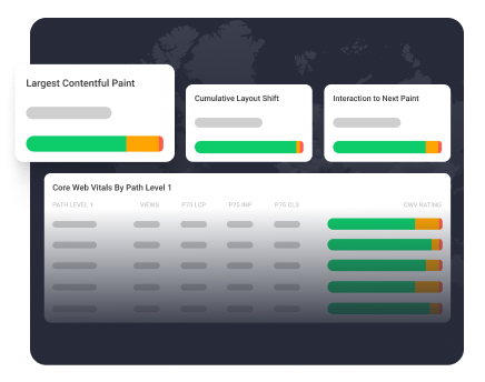
Monitor Page Speed & Core Web Vitals
DebugBear monitoring includes:
- In-depth Page Speed Reports
- Automated Recommendations
- Real User Analytics Data