
There are different reasons why site speed is important. However, providing a good user experience is the most important one. A slow website will frustrate users while a fast one will keep visitors happy and engaged.
In this article, we'll explore the role speed plays for website visitors:
- How do response times impact user experience and behavior?
- How can you measure performance and business metrics?
- What are common pitfalls when interpreting website metrics?
Computer response time and user experience
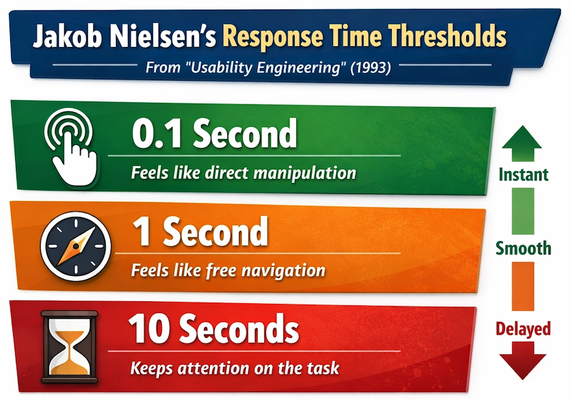
In his 1993 book "Usability Engineering", Jakob Nielsen describes three response time thresholds with different impacts on user experience.
- 0.1 second: Limit for users feeling that they are directly manipulating
- 1 second: Limit for users feeling that they are freely navigating
- 10 seconds: Limit for users keeping their attention on the task
Let's take a look at each of these and what they mean for modern web interfaces.
0.1 second: direct manipulation
If an interface responds to input within 100 milliseconds, users do not perceive any delay and feel in control of the interface.
A fast response is especially important for frequent interactions, like typing into a text field or dragging a slider.
When it's not possible to fully update the UI quickly it can still make sense to provide immediate feedback that the input has been received. For example, by showing that a button was clicked or by showing a loading spinner.
1 second: free navigation
When a UI update takes up to a second the user can notice the delay, but it doesn't impede their ability to navigate through your website.
Start showing new content as soon as it's available, even if some page content (like images) isn't ready yet. That way visitors can start engaging with new content as soon as possible.
10 seconds: keeping user attention
If an interaction takes longer than 10 seconds, users start to lose focus on the task they were trying to accomplish. They may check their phone, switch to another tab, or even leave the website entirely for non-critical tasks.
While long delays are a big discouragement for exploratory browsing, a 10-second wait can be unavoidable for complex processing. Ensure that the user receives feedback that the task is still being processed.
When navigations have a 10-second delay users are likely to hesitate before deciding where to go next, rather than exploring freely.
These are not absolute thresholds
This three-threshold framework is easy to remember and provides useful guidelines when building user interfaces. However, that doesn't mean you won't see changes in user behavior for smaller performance changes or that visitors won't tolerate slightly longer delays.
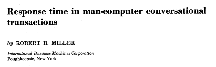
The original idea behind these thresholds comes from a 1968 paper by Robert B. Miller, titled "Response time in man-computer conversational transactions".
In the paper, Miller explains the importance of evaluating response times in the specific context of the task:
The estimates of delay times offered in the following pages are the best calculated guesses by the author, a behavioral scientist, who has specialized in task behavior, including thinking and problem solving. ...
[These estimates should] be verified by extended systems studies-not in artificial laboratories using abstract tasks-but in carefully designed, real life task environments and problems.
Evaluate user experience in the context of your website and usage scenarios.
Measuring user experience
To evaluate UX on your website you can test the user interface yourself or talk to and observe real users. However, you need automated performance measurements to quantify user experience, track improvements over time, and quickly identify regressions.
There are many different website performance metrics, both standardized metrics like the First Contentful Paint or website-specific ones collected with the User Timing API.
You can also measure user behaviors like bounce rate or conversion rate.
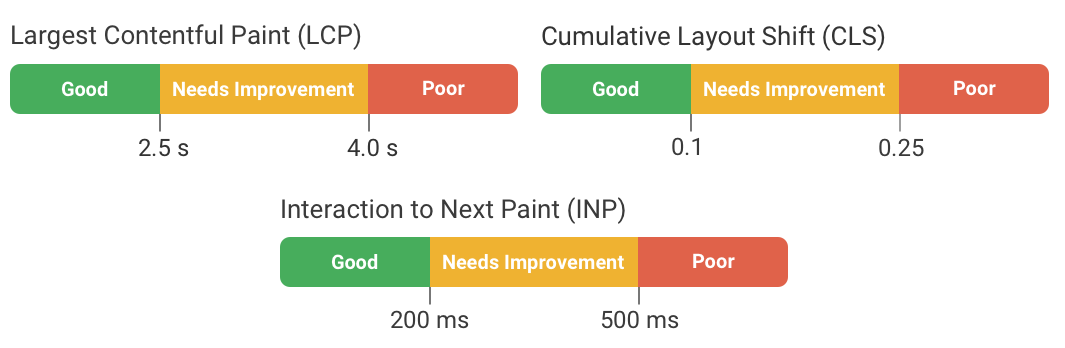
Google's Core Web Vitals metrics
Starting in 2020, Google introduced the Core Web Vitals metrics:
- Largest Contentful Paint (LCP) measures loading speed
- Interaction to Next Paint (INP) measures interaction response time
- Cumulative Layout Shift (CLS) measures visual stability
Except for CLS, these metrics can now be measured in Chrome, Safari, and Firefox. Google has also defined thresholds for what counts as a good experience according to each metric.
Lighthouse and PageSpeed Insights scores
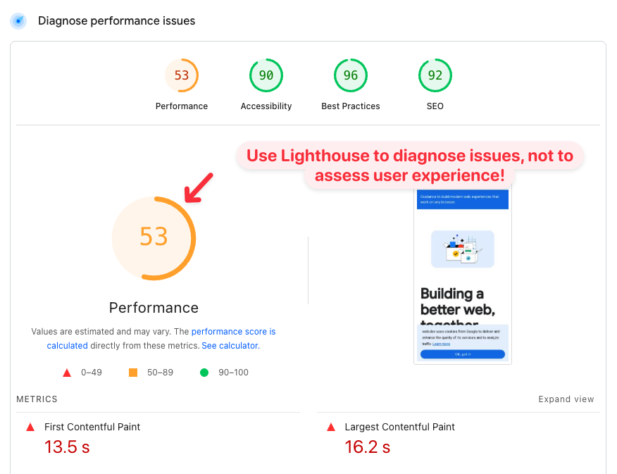
Google's free Lighthouse tool can analyze page speed and report a Performance score between 0 and 100. Lighthouse is also what powers the performance score in the diagnostics section of PageSpeed Insights.
But this score does not tell you how real users experience your website! Lighthouse scores are useful to identify changes over time and find ways to improve your page speed.
To assess website experience you need real user metrics, for example from Google's Chrome User Experience Report (CrUX) or real user monitoring.
Custom website metrics
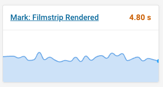
The performance.mark() function of the User Timing API allows you to record custom rendering milestones as well as delays between different milestones.
For example, you can record when a specific key part of the page has rendered:
performance.mark("Filmstrip rendered");
You can then track that metric with synthetic tests and for real users.
Interpret standardized metrics carefully
Standardized performance metrics can be measured on any website. That makes it a lot easier to get started, compared to having to add custom instrumentation to your site.
However, these metrics don't always reveal the full picture. Ultimately you need to think about performance in the context of your own website.
How does the Largest Contentful Paint metric work?
Unlike earlier load time metrics like Time to First Byte or the Load event, the Largest Contentful Paint metric doesn't just record a technical milestone. It actually looks at what content is visible to the user!
Every metric relies on a specific definition, and Google has tried to identify a page load milestone that matters most to user experience. The First Contentful Paint might be recorded when only a small part of the page has loaded. At the same time, many web pages are never fully loaded, as sliders show new content or a UI element is animated.
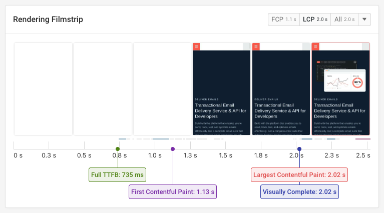
The Largest Contentful Paint describes when the largest content element becomes visible. In most cases this gives a good indication of when important page content has loaded.
For example in this filmstrip view from the DebugBear website speed test, we can see that the page starts loading after a bit over a second, but the main image only loads about a second after that.
When LCP doesn't show the full picture
After looking at the happy case, let's look at an example where the Largest Contentful Paint milestone does not match the time when key page content is visible to the user.
This page contains many relatively small individual content elements. The browser identifies the logo in the header as the largest one. But most of the page actually remains blank until two seconds after the LCP!
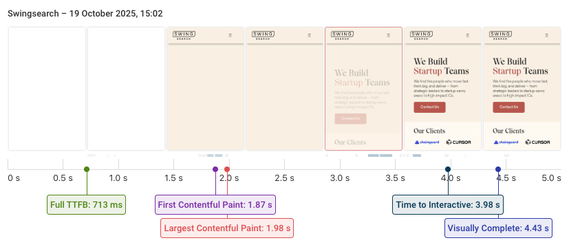
Here's a side by side view of the rendering process for two websites where both have a 2-second Largest Contentful Paint score:
Interaction to Next Paint does not measure when new content appears
User interactions trigger a bunch of CPU processing that needs to run before the browser can render the next frame. INP measures this delay.
However, INP only measures the initial processing of the interaction. It does not check if the UI has updated, and whether the update actually shows the content the user is waiting for!
This video shows an interaction with an INP score of 34 milliseconds, despite a very noticeable delay when loading the content!
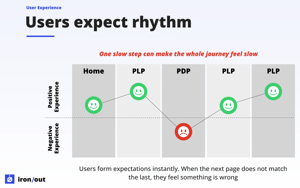
Speed up the whole user journey, not just specific steps
Good user experience is ultimately about making it easy for visitors to achieve their goals. Speeding up specific page loads and interactions is part of that. But you also need to think about whether users can identify what page they need to go to next, and reducing the number of steps required to complete what they want to do.
Sander van Surksum talked about the role of friction and flow in a recent article in the 2025 Web Perf Calendar.
It only takes one break in the rhythm to make the whole experience feel slow
Need help fixing web performance on your website? Sander runs Iron/Out, one of the web performance consultancies we partner with.
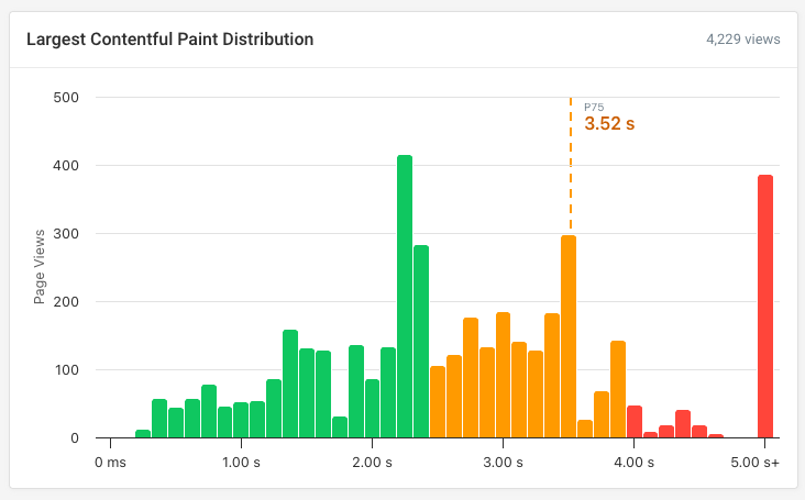
Embrace histograms and distributions
When looking at performance metrics we often look at a single value, like the 75th percentile that's commonly used for Core Web Vitals. Real user monitoring data consists of thousands of individual user experiences and tools try to summarize them with a single number that you can track over time.
But if one in five pages in a user journey is slow while the rest is fast, checking just a single p75 score will tell you that everything is fine. In contrast, histograms reveal the full distribution of visitor experiences: how often users have a good experience, as well as how often they run into slow pages.
In this example, the p75 LCP score is 3.5 seconds. Not great, but borderline ok. But the histogram also reveals that visitors wait for key content to load for over five seconds 9% of the time!
Connecting user experience to business outcomes
A faster website provides a good user experience to a larger percentage of visitors. But how big is the effect, and does it actually translate into better business outcomes?
Tracking conversions along with your web performance data can provide insight into the relationship between speed and business metrics like bounce rate, session duration, or completed purchases.
Don't confuse correlation with causation
When you look at your business and page speed metrics you'll often see strong correlations. But more often than not it's not a causal relationship!
Here are a few examples of how things can go wrong:
- Faster pages and low bounce rate: maybe mobile users just bounce in general, and just happen to have a slower connection
- More conversions for fast sessions: users with money to buy a high-end phone are more likely to buy other things too
- Longer sessions with poor performance: more engaged users might be accessing more complex content that takes longer to load
There are many case studies that aim to conclusively prove that performance is good for business. But many of these don't really show what they claim.
Martin Michálek explains this in his article in the 2025 web performance calendar, looking at the famous claim that Amazon saw a 1% decrease in sales for every 100ms of delay:
This famous Amazon “study” is now more of a historical meme and a perfect example of how a lack of context and the continuous repetition of old data undermine the credibility of the entire field.
In his article Martin also explains what to look for in a good performance case study!
Tips to interpret your data
When reviewing your own web performance and business data, keep these tips in mind:
- Set up your filters carefully to avoid confounding factors
- Check how data is aggregated across sessions and page views
- Validate findings by looking at different segments and time periods
For example, you might find that a page speed change appears to impact conversions. But it could be that an unrelated deployment of a new website version caused both the change in performance and in conversions.
Checking different time periods and looking at historical conversion and page speed data will reveal whether that could be the true underlying cause.
Ideally you're able to run an A/B test where you artificially slow down the page load to measure the impact on user behavior. But of course that's not always possible, and you'll need to rely on the correlations you have available.
Measure and improve performance
If you're working on improving user experience through better performance, DebugBear can help you identify poor user experiences, diagnose slow performance, and track how page speed impacts user behavior.
Sign up for a free trial to get detailed insights based on scheduled synthetic tests, Google CrUX data, and real user monitoring.
You can also benchmark website performance within your industry using data from Google's Chrome User Experience Report.
This way you can see how your website's user experience compares to competitors and how the industry is trending.
Monitor Page Speed & Core Web Vitals
DebugBear monitoring includes:
- In-depth Page Speed Reports
- Automated Recommendations
- Real User Analytics Data