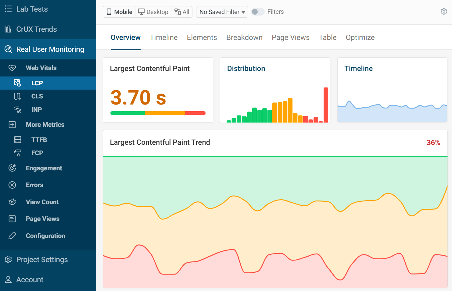
RUM Metric Dashboards
DebugBear real user monitoring provides reporting and analysis of the Google Core Web Vitals and other page speed metrics. Selecting a metric will pull up the specific data for you with different breakdowns. The most viewed pages are presented in a table.
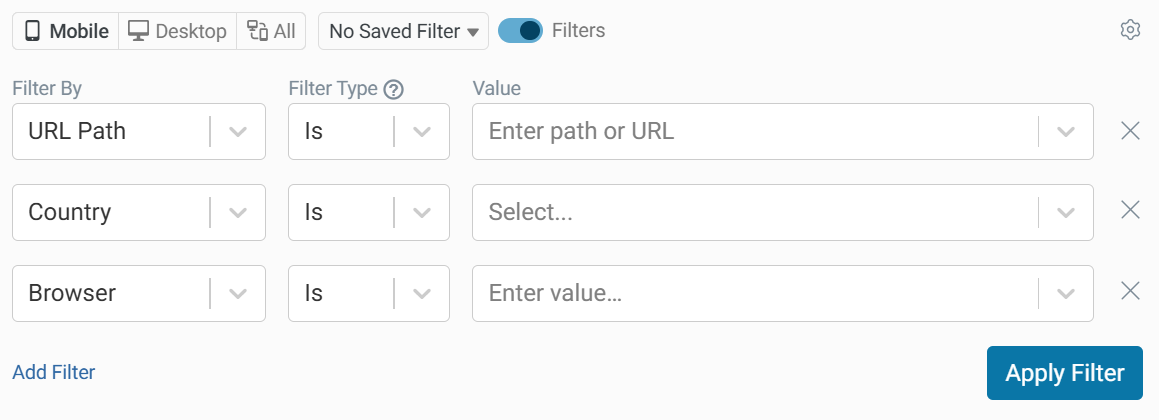
RUM Filters
You can use the filter options at the top of the page to filter by properties like country, domain, URL, and browser.
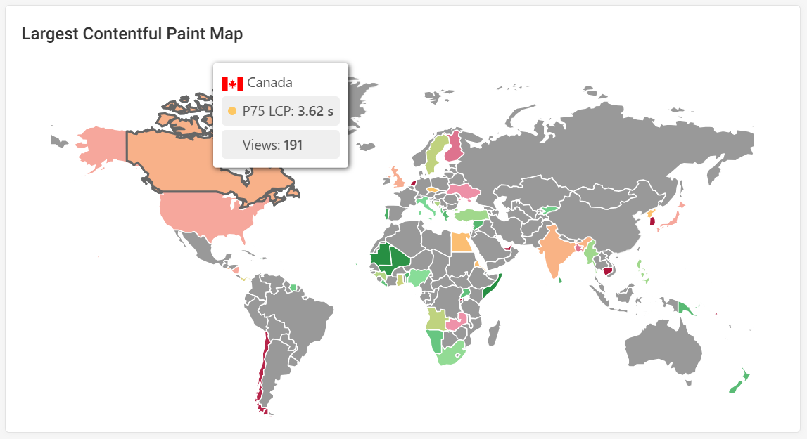
Map View
The map shows the 75th percentile of the selected metric for each country. The darker green indicates a good score whereas the dark red indicates a bad score. If the region has had no visits then it will be displayed as gray with no data to show.
Hovering over a country will show the metric score and the number of page views from that region.
Distribution
This histogram shows the distribution of how different visitors experience the website. Instead of looking at a single statistical metric the histogram lets us see what the most common experiences are, as well as how many users have an especially fast or slow experience.
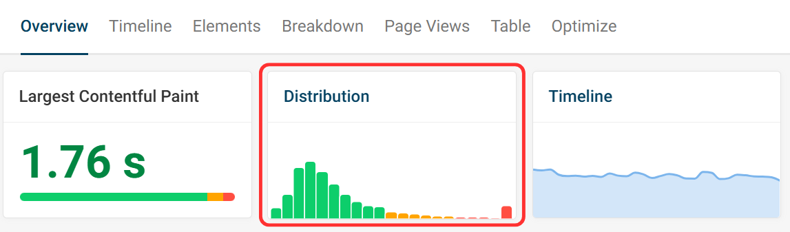
In this example each bar represents an LCP range, starting from under 125 milliseconds then incrementing up towards over 5 seconds at the end.
The highest bar is the LCP score for the largest percentage of visitors.
When hovering over a bar we can see more data about the experiences falling into that bucket:
The Percentage of page views falling into that score range bucket. In this case we can see that 2.7% percent of visitors wait between 1.75 and 1.88 seconds for the main page content to appear.
The Total Number Of Visitor Experiences within that LCP range. There were 473 page views.
The Percentile that the LCP range falls into. This screenshot shows that it falls just outside the 75th percentile, at 77.4%.
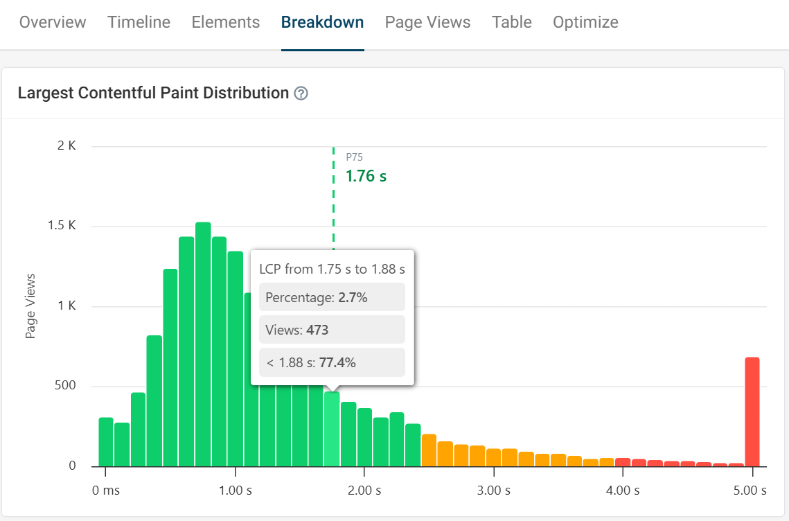
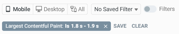
Clicking on a bar will apply a filter to the page so only page views within this LCP range are included. You can then take a closer look at these user experiences to find out how to optimize them.
Percentile Trends
A percentile trends graph can be found in the Timeline tab. This graph shows a breakdown of the 50th, 75th and 90th percentile on each day from the last month.
Looking at different percentiles lets you see for example how changes on your website impact the slowest x% of experiences. If you always just looked at the p75 you’d not notice a performance degradation that impacts only the slowest 25% of visits.
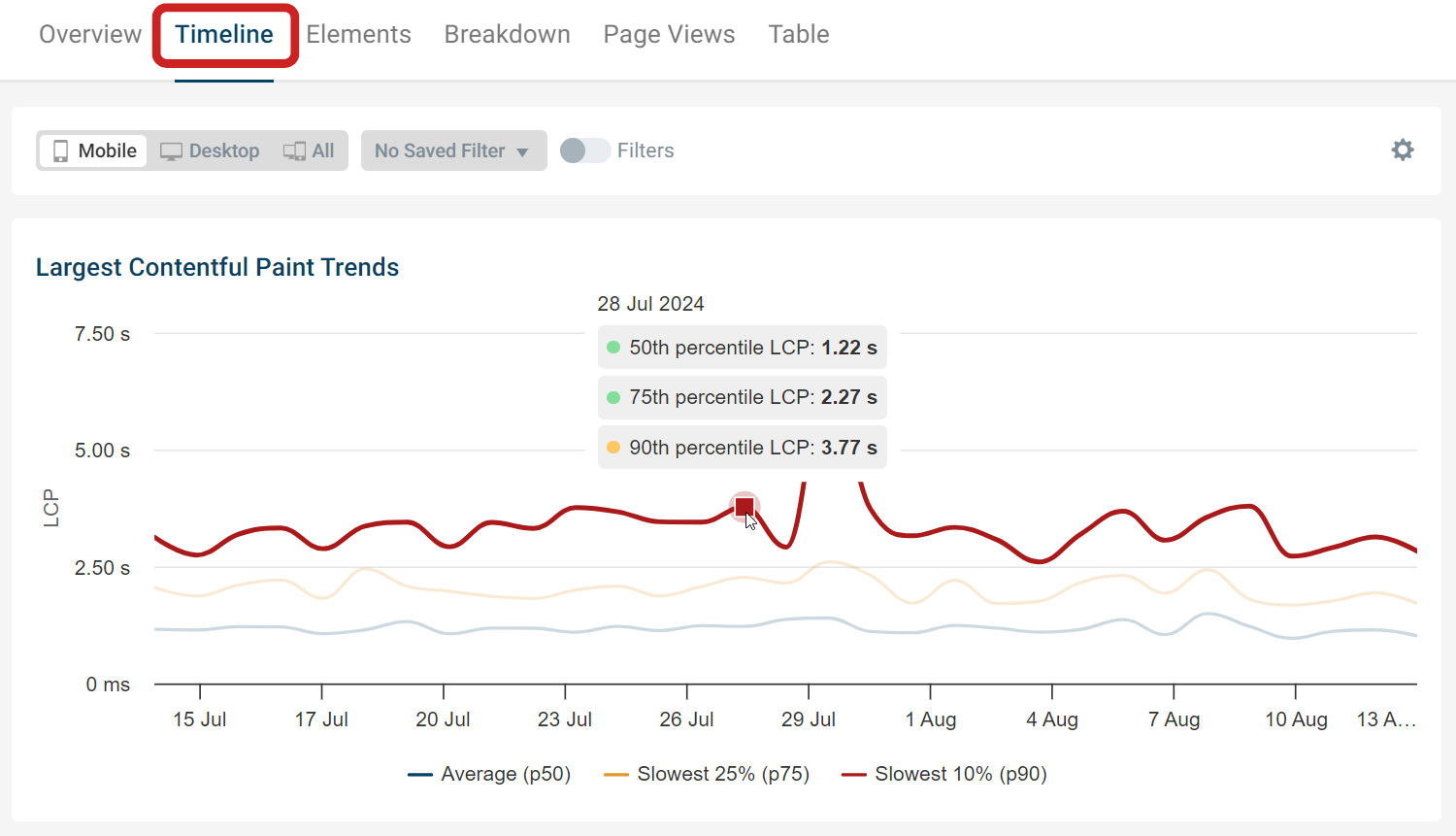
When looking at the histogram we saw that the overall 75th percentile LCP score over the last month was 1.76s. But the score on this specific date was a bit higher at 2.27s. This demonstrates how a metric can fluctuate over time.
Top and Slow Pages
These tables help to quickly identify which pages are performing well and poorly at a glance. Focusing on optimizing pages with the higher view count will affect a website's overall Core Web Vitals rating. Hovering over the URL path will allow you to select the page as a filter.
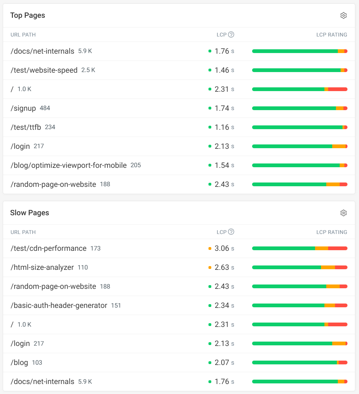
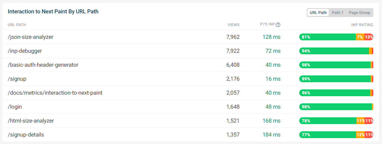
Top Viewed Pages by URL Path
This table shows the 8 most viewed pages by page URL and their p75 metric score, the INP metric in this case.
Looking at the most popular pages shows you if visitors are having a poor experience on key, high-traffic pages which should be prioritized for optimization.
In this example the scores are good for all pages, but the sign up and size analyzer pages could probably be improved.
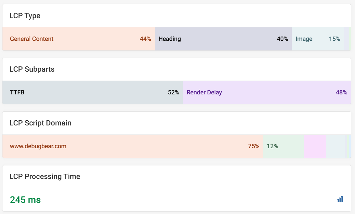
Metric Score Breakdowns
Some metrics can be broken down into separate components, for example LCP and INP.
LCP Breakdown
When viewing the Largest Contentful Paint metric, an LCP Sub-parts breakdown is presented. The parts are: TTFB, Load Delay, Load Duration and Render Delay.
The example below shows the average for each sub-part over the selected time period. In this case, the LCP element is usually text content, so TTFB and Render Delay are present.
This is the 75th percentile and will most likely not add up to the score, as different pages will have different LCP elements. In that case it is best to filter by URL first for a more specific breakdown.
The render delay shows that most of the time is spent waiting for the LCP element to be discovered by the browser.
LCP script domains are also highlighted, with the LCP processing time showing the duration of CPU tasks leading up to the LCP milestone.
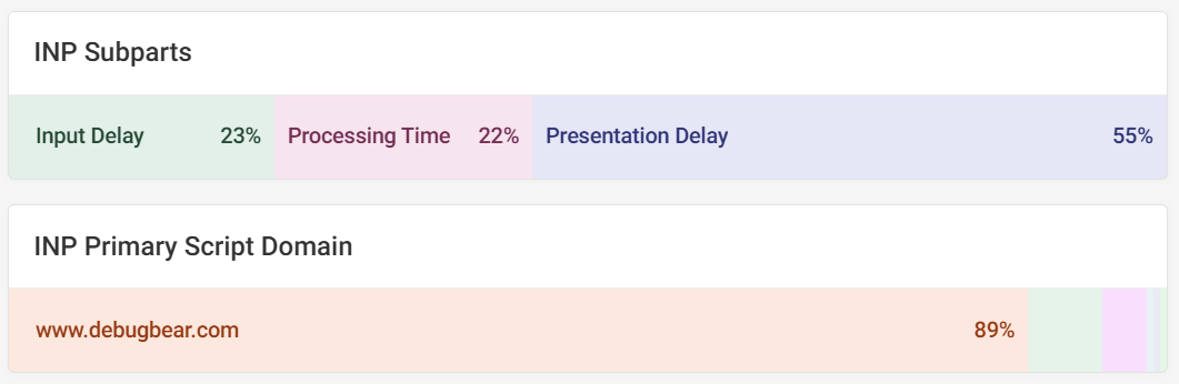
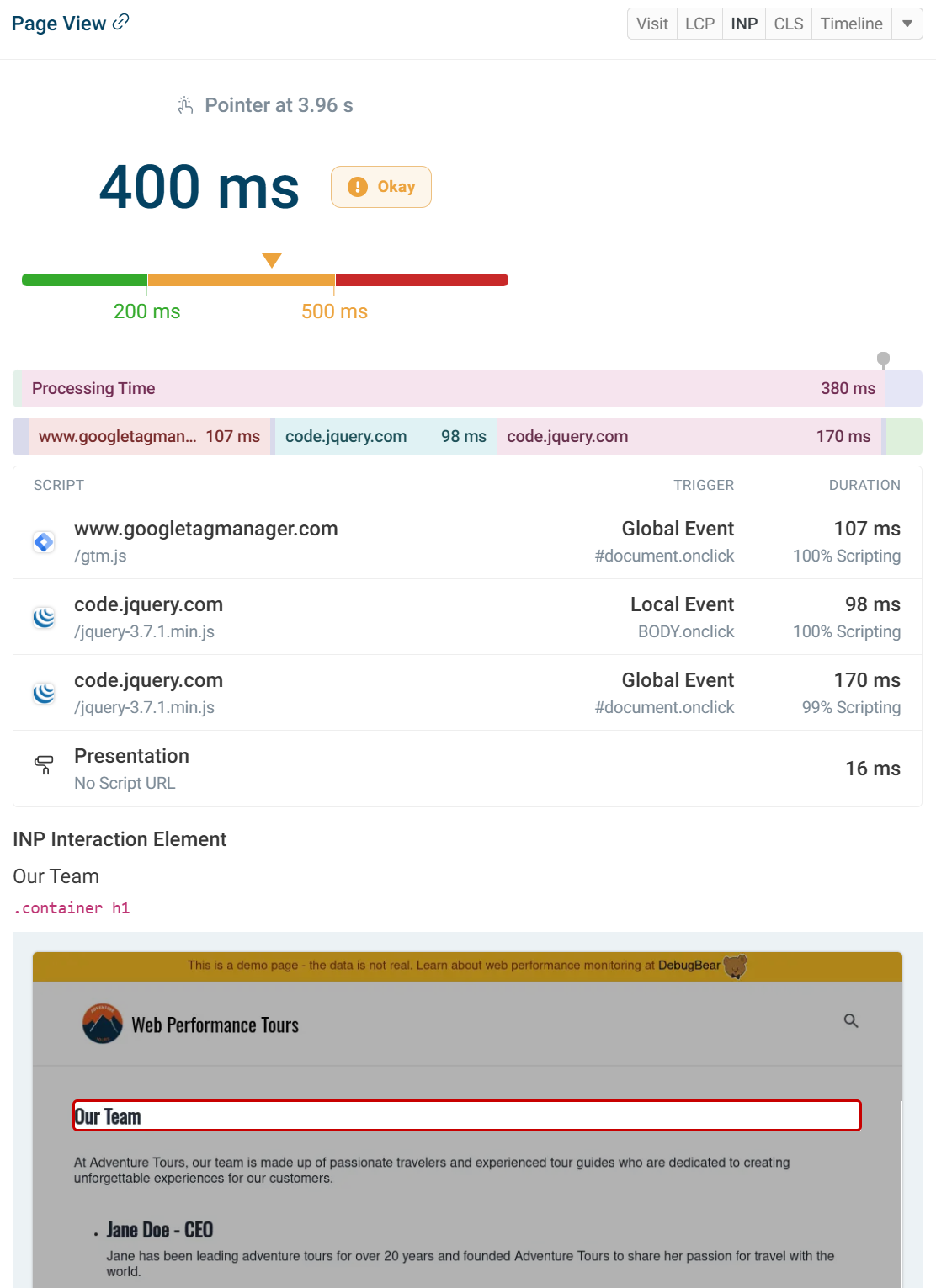
INP Breakdown
Interaction to Next Paint also has a breakdown.
There are three sub-parts to Interaction to Next Paint:
- Input Delay
- Processing Time
- Presentation Delay
This bar shows the 75th percentile for the selected filter.
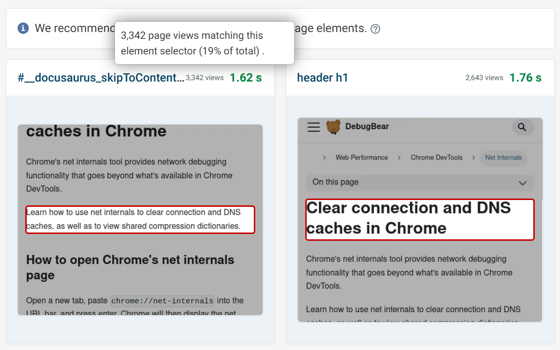
Elements
LCP, CLS and INP all have an elements section highlighting individual scores for different elements on a page.
You can select between text and selector. Applying a URL filter will make it clearer which elements should be optimized.
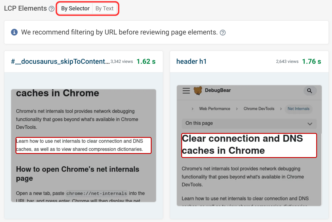
In this example you can see that the LCP for 19% of visitors was the article text, but for 15% of visitors it was the h1. This analysis helps determine which elements should be optimized first for the majority of visitors.
Screenshots are taken independently of the initial RUM data collection and it may not always be possible to take a screenshot. For example, a page may require login or the page may have been updated and the relevant element removed.
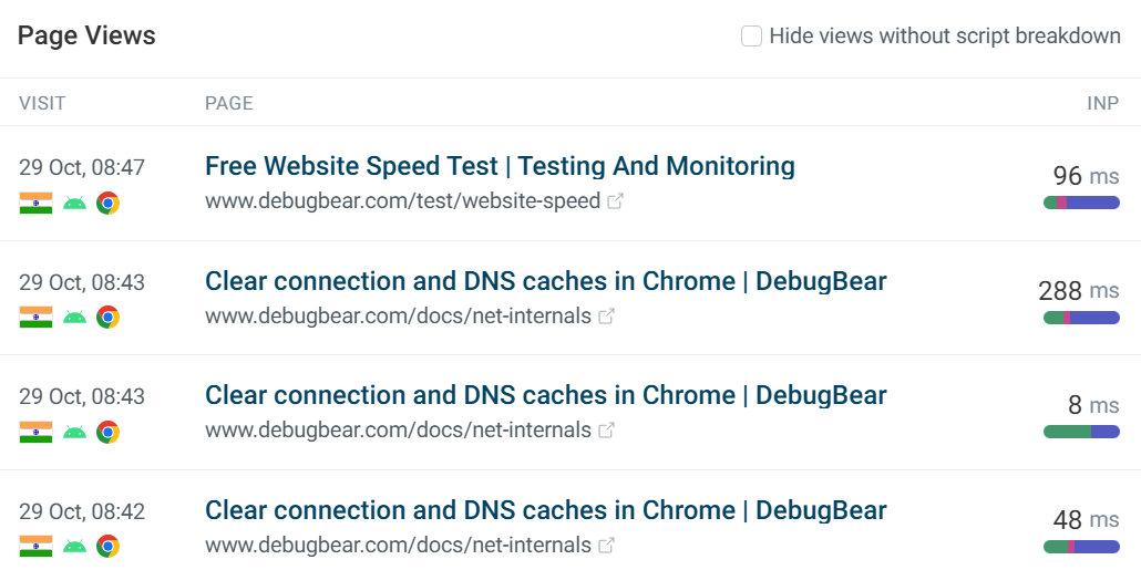
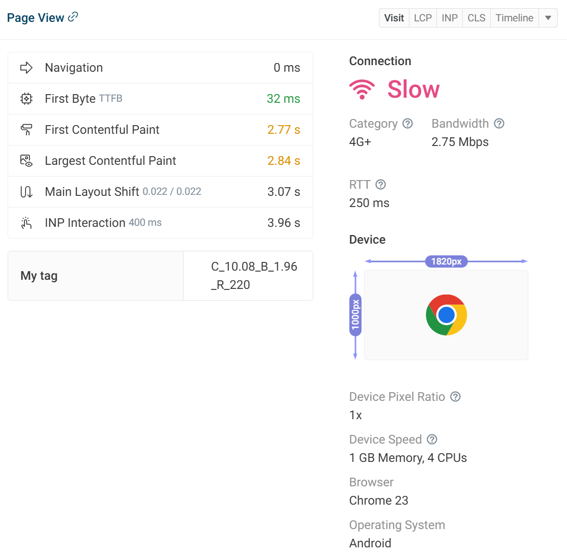
Example Page Views
This table shows the most recent user experiences from the most recent page visits. Each visit will show the URL, country, device, and browser. As well as the metric score for the individual visit.
Clicking into the individual experience will provide details for the metric selected, in this case an INP breakdown highlighting the element, sub-parts and scripts. Each metric has its own dedicated tab.
Connection details like bandwidth and round trip time on the network can give an insight into unexpected results, if the user is on a slower connection then certain metrics could be higher.
On the right side there is an in-depth look at the metric breakdown as well as screenshots of elements when available. You can also switch between metrics. INP components and LCP sub-parts will be visualized in percentages.
The visit tab shares connection details like bandwidth and round trip time on the network, which can give insight into unexpected results. If the user is on a slower connection, then certain metrics could be higher. We can also see metric timings such as FCP.
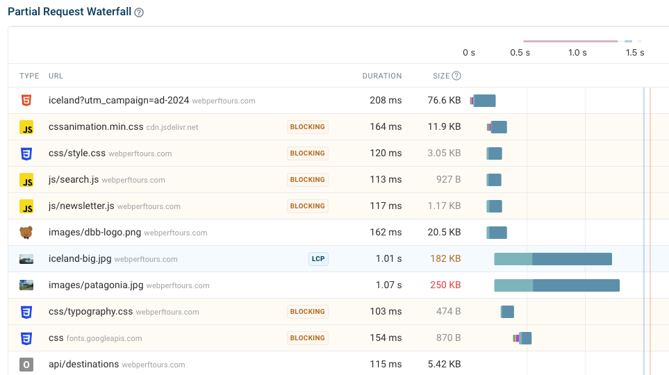
Underneath that information is the partial request waterfall for that particular visit. This visualization shows you what resources are loaded when opening the page, whether they block rendering, and what their resource sizes and request durations are.