Metric Ratings: Good, Needs Improvement, And Poor
DebugBear rates most performance metrics as good, needs improvement, or poor, and colors them green, orange, and red. The same thresholds can be shown behind a chart as rating bands, so you can see how the metric has developed and where you'd need to get to for a good score.
How to show rating bands on a chart
Right-click any chart and select Show Rating Bands.
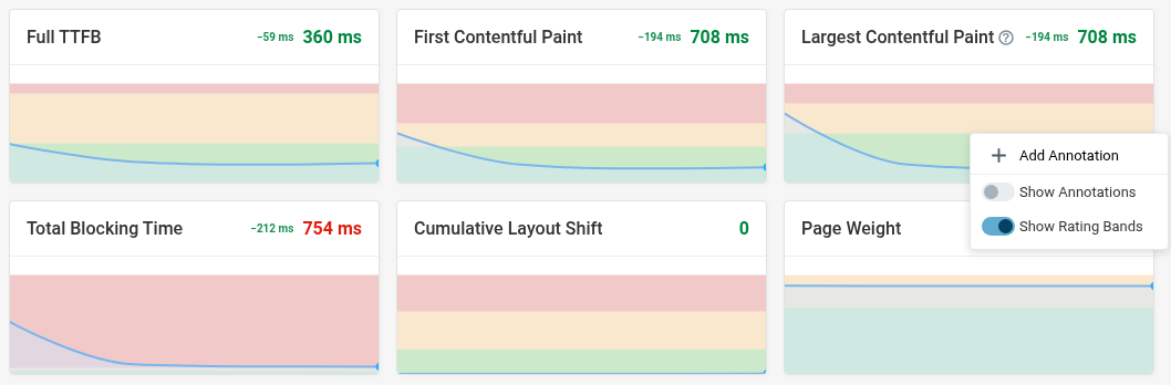
Your browser remembers the setting and applies it to every chart that supports bands, so you only have to turn it on once.
The option only appears when a single rated metric is on the chart's y-axis. Some charts always show the bands, like the Timeline card on each real user monitoring (RUM) metric page.
Show thresholds on a custom dashboard
Custom dashboard charts have their own setting, saved with the dashboard rather than per viewer. To enable the rating bands:
- Open the chart's edit dialog
- Click on the gear icon next to the metric
- Toggle Show Metric Rating Thresholds
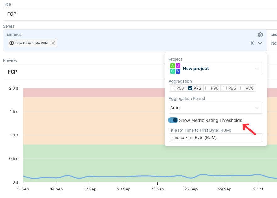
Use it when the thresholds are part of what the dashboard is meant to communicate.
Where the thresholds come from
Ratings are based on existing conventions and DebugBear's own judgment.
Google's Core Web Vitals thresholds
These are published by Google and used for the Core Web Vitals assessment:
| Metric | Good | Poor |
|---|---|---|
| Largest Contentful Paint | 2.5 s or less | over 4 s |
| Interaction to Next Paint | 200 ms or less | over 500 ms |
| Cumulative Layout Shift | 0.1 or less | over 0.25 |
| Time to First Byte | 800 ms or less | over 1.8 s |
Lighthouse scoring thresholds
Metrics that feed the Lighthouse performance score are rated using Lighthouse's own scoring curves. A metric is good at the point where Lighthouse would score it 90 and poor where it would score 50. These depend on the device, because Lighthouse scores mobile and desktop differently:
| Metric | Good (mobile) | Poor (mobile) | Good (desktop) | Poor (desktop) |
|---|---|---|---|---|
| First Contentful Paint | 1.8 s or less | over 3 s | 1.8 s or less | over 3 s |
| Speed Index | 3.4 s or less | over 5.8 s | 1.3 s or less | over 2.3 s |
| Total Blocking Time | 200 ms or less | over 600 ms | 150 ms or less | over 350 ms |
First Contentful Paint has its own Web Vitals thresholds of 1.8 s and 3 s, so DebugBear uses those on both devices instead of Lighthouse's stricter desktop curve.
DebugBear's own assessments
Some metrics have no published standard, so we set thresholds based on what we consider reasonable. For example, page weight is rated good below 2 MB and poor above 4 MB.
Treat these as a sensible default rather than a rule. A 5 MB page of product photography is not automatically broken if metrics like First Contentful Paint and Largest Contentful Paint show that important content still renders quickly.
Which ratings actually matter
Real user Core Web Vitals matter most. These metrics tell you what actual visitors experience, and they are what Google uses as a ranking factor. If you only act on one set of ratings, use the ones in real user monitoring or the Chrome User Experience Report (CrUX) data in your test results.
Synthetic page speed metrics are good for monitoring and optimization. They are based on one pre-defined network and device type, which will be different from those used by the average user. Importantly, synthetic metrics come with in-depth reports and the ability to investigate what change on your website caused a metric regression.
The Lighthouse Performance score combines various page speed metrics, but some like Total Blocking Time don't always have a clear impact on visitor experience.
Diagnostic metrics are for debugging, not grading. If you see an increase in Layout Count, that can help you understand why another page speed metric regressed. But reducing the number of layouts on the page isn't important by itself, especially if each layout is fast.