Histograms
DebugBear Real User Monitoring (RUM) data helps you visualize the distribution of performance metrics with the use of histogram charts. These charts help you identify how many visitors have a fast or slow experience, and understand which factors contribute to performance differences.
Why are histograms useful?
A metric like the 75th percentile Largest Contentful Paint (LCP) for a specific URL only shows part of the story. The histogram shows how performance varies across visitors, from those who experience a fast load to those who experience a much slower one. This helps you see differences in user experiences that averages and percentiles don't expose.
Histograms show how a performance metric is distributed across your visitors, allowing you to see how many users have a fast experience. The data is grouped into buckets, represented by a bar chart.
Because histograms show the full distribution of fast and slow experiences, they can reveal patterns and outliers, helping you understand whether a performance issue affects most visitors or only a smaller group.
How to view histograms
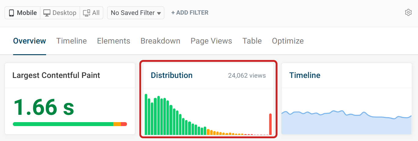
To view histograms in the RUM dashboard, select the metric you want to view from the sidebar. In this example, we've selected Largest Contentful Paint. The Overview tab shows a summary tile for the metric alongside a Distribution chart, giving a quick histogram preview across every recorded page view for that metric.
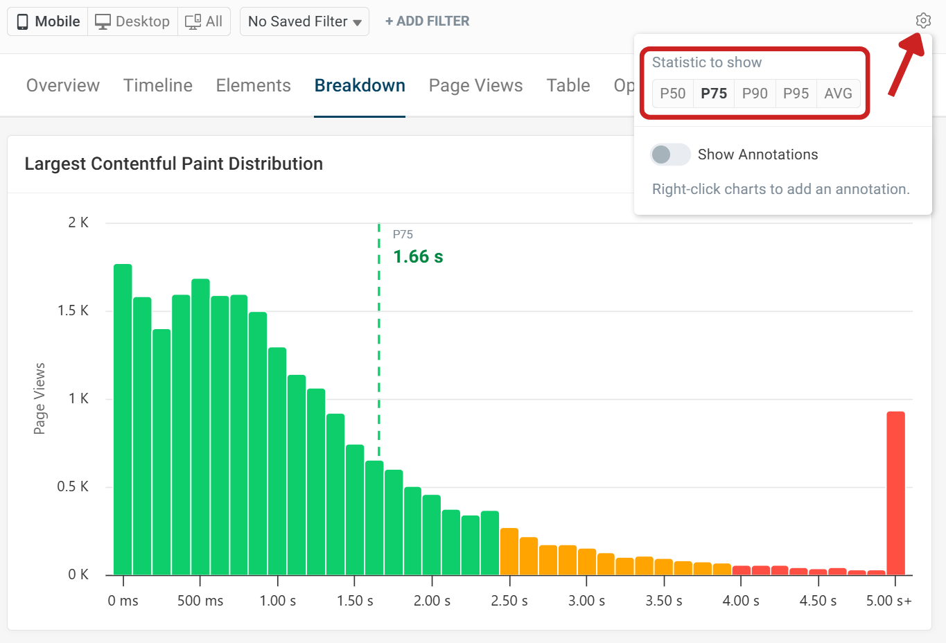
For a more detailed histogram of the metric, select the Breakdown tab.
By default, the 75th percentile is selected, as this is the percentile Google uses for the Chrome User Experience Report (CrUX). The 75th percentile is highlighted with a vertical marker on the chart.
To change the percentile, click the gear icon. There are five different statistics to choose from:
- 50th percentile
- 75th percentile
- 90th percentile
- 95th percentile
- Average
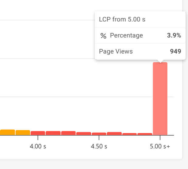
Hovering over a bar in the histogram will show the full details for that bucket. Here we can see that 3.9% of visitors experience an LCP of 5 seconds or more. This accounts for 949 page views in the selected time range.
If we want to learn more about these poorer experiences, we can click the bar to add this group as a filter, allowing us to investigate further by looking at individual page views.
Histogram options
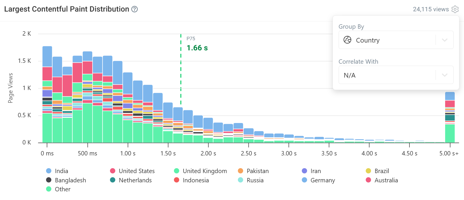
Histograms can be customized to show further insight by selecting the Group By and Correlate With options. In the example below, LCP is grouped by Country. Now each bucket is divided by country. When looking at values below the 75th percentile marker, we can see that the majority of visitors from the United States experience a good LCP range.
Hovering over each bucket will show the breakdown for that LCP range. There are many other Group By options to choose from, including Browser, URL Path, Domain, Browser Type and Navigation Type.
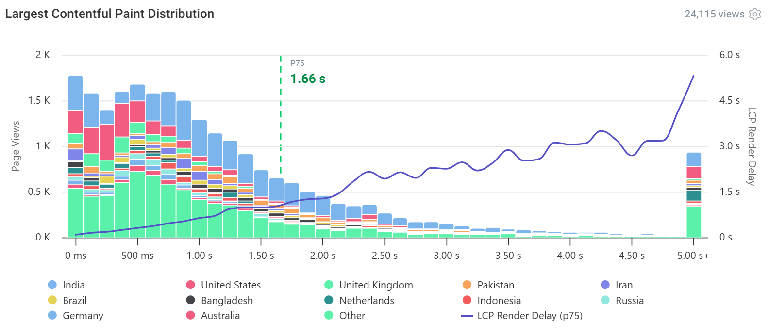
Here, we've used Correlate With to compare LCP ranges with LCP Render Delay. The line represents the 75th percentile of Render Delay for each LCP range. While Render Delay remains relatively low across the faster LCP ranges, we can see a noticeable increase around 2 to 2.5 seconds.
Correlating LCP with other metrics can help surface these patterns and provide additional context when investigating performance issues. Try correlating LCP with different metrics, such as First Contentful Paint (FCP) and Time to First Byte (TTFB), to uncover other patterns that may impact LCP.
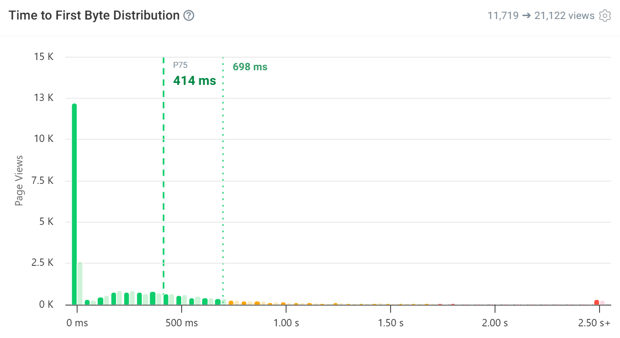
You can also examine histograms from different time periods using the compare toggle. This is a great way to view how recent optimizations have impacted visitors.
The example below compares the current month to the previous month for TTFB. There has been a significant change, with the 75th percentile improving from 698 ms to 414 ms. The histogram chart highlights that the majority of the change comes from the initial bucket.
Conversion tracking
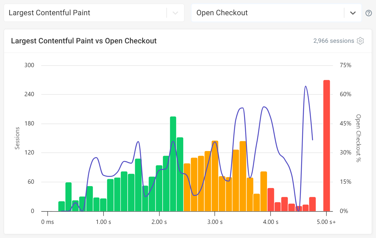
Histograms are also available in the Conversions tab. Conversion tracking allows you to view how metric performance can impact revenue outcomes, such as checkouts or sign-ups. Identify performance ranges associated with higher or lower conversion rates and understand where improving user experience could have a measurable business impact.
In the example below, LCP is correlated with the Open Checkout conversion event across 2,966 sessions. Bars are colored by LCP performance rating (green for good, orange for needs improvement, red for poor), while the line tracks the Open Checkout rate for each LCP bucket. The checkout rate becomes noticeably more volatile once LCP moves into the orange and red ranges, which is often a sign that those slower buckets contain far fewer sessions rather than a genuine conversion benefit from slower load times.
Custom dashboards
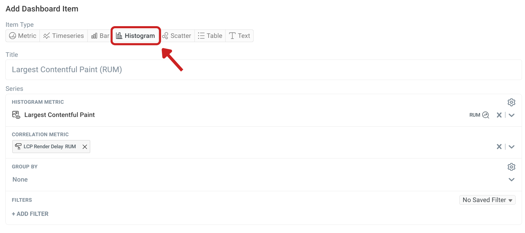
Histograms are also available for Custom Dashboards. When adding a new dashboard item, select Histogram as the item type, then choose a metric (in this example, Largest Contentful Paint) and, optionally, a correlation metric such as LCP Render Delay. You can also group the histogram by a dimension like Country or Browser, or apply filters to focus on a specific segment.
Custom dashboards allow you to show RUM, lab, and CrUX data across a variety of chart types and tables, giving you greater flexibility and customization when creating specialized reports.